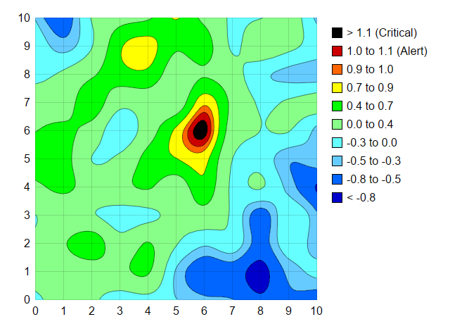
This example demonstrates using a legend box to display the color legend, which is useful for irregularly spaced color scale or for long color labels.
Many of the examples in the documentation uses
ColorAxis to both define and display the color scale. This is useful for evenly spaced contours, which are associated with the ticks and labels on the color axis. If the contours are highly uneven (such as at 0, 1, 2, 50, 195, 200), the labels are also unevenly spaced on the color axis, and some labels may become so close together that they overlap.
This example demonstrates an alternative method of using a
LegendBox to display color legends. The color axis still defines the color scale, but it is not displayed
[Web Version (in ASP)] aspdemo\contourlegend.asp
<%@ language="vbscript" %>
<%
Set cd = CreateObject("ChartDirector.API")

' The x and y coordinates of the grid
dataX = Array(0, 1, 2, 3, 4, 5, 6, 7, 8, 9, 10)
dataY = Array(0, 1, 2, 3, 4, 5, 6, 7, 8, 9, 10)

' Use random numbers for the z values on the XY grid
Set r = cd.RanSeries(999)
dataZ = r.get2DSeries(UBound(dataX) + 1, UBound(dataY) + 1, -0.9, 1.15)

' Create a XYChart object of size 640 x 460 pixels
Set c = cd.XYChart(640, 460)

' Set the plotarea at (30, 25) and of size 400 x 400 pixels. Use semi-transparent grey (0xdd000000)
' horizontal and vertical grid lines
Call c.setPlotArea(50, 25, 400, 400, -1, -1, cd.Transparent, &Hdd000000, -1)

' Set the x and y axis stems to transparent and the label font to 12pt Arial
Call c.xAxis().setColors(cd.Transparent)
Call c.yAxis().setColors(cd.Transparent)
Call c.xAxis().setLabelStyle("Arial", 12)
Call c.yAxis().setLabelStyle("Arial", 12)

' Set the x-axis and y-axis scale
Call c.xAxis().setLinearScale(0, 10, 1)
Call c.yAxis().setLinearScale(0, 10, 1)

' Add a contour layer using the given data
Set layer = c.addContourLayer(dataX, dataY, dataZ)

' Move the grid lines in front of the contour layer
Call c.getPlotArea().moveGridBefore(layer)

' Define the color scale
colorScale = Array(-0.8, &H0066ff, -0.5, &H66ccff, -0.3, &H66ffff, 0, &H88ff88, 0.4, &H00ff00, _
    0.7, &Hffff00, 0.9, &Hff6600, 1.0, &Hcc0000, 1.1)
' Apply the color scale, and specify the underflow and overflow colors for regions exceeding the
' color scale
Call layer.colorAxis().setColorScale(colorScale, &H0000cc, &H000000)

'
' Instead of displaying the color axis, we use a legend box to display the colors. This is useful
' for colors that are unevenly spaced on the color axis.
'

' Add a legend box at (460, 25) with vertical layout, with 12pt Arial font, transparent background
' and border, icon size of 15 x 15 pixels, and line spacing of 8 pixels.
Set b = c.addLegend(460, 25, True, "Arial", 12)
Call b.setBackground(cd.Transparent, cd.Transparent)
Call b.setKeySize(15, 15)
Call b.setKeySpacing(0, 8)

' Add the legend box entries
Call b.addKey("> 1.1 (Critical)", &H000000)
Call b.addKey("1.0 to 1.1 (Alert)", &Hcc0000)
Call b.addKey("0.9 to 1.0", &Hff6600)
Call b.addKey("0.7 to 0.9", &Hffff00)
Call b.addKey("0.4 to 0.7", &H00ff00)
Call b.addKey("0.0 to 0.4", &H88ff88)
Call b.addKey("-0.3 to 0.0", &H66ffff)
Call b.addKey("-0.5 to -0.3", &H66ccff)
Call b.addKey("-0.8 to -0.5", &H0066ff)
Call b.addKey("< -0.8", &H0000cc)

' Output the chart
Set viewer = cd.WebChartViewer(Request, "chart1")
Call viewer.setChart(c, cd.SVG)

' Include tool tip for the chart
viewer.ImageMap = c.getHTMLImageMap("", "", "title='<*cdml*>X: {x|2}<*br*>Y: {y|2}<*br*>Z: {z|2}'")

' Output Javascript chart model to support contour chart tooltips
viewer.ChartModel = c.getJsChartModel()
%>

<!DOCTYPE html>
<html>
<head>
    <title>Contour Color Legend</title>
    <!-- Include ChartDirector Javascript Library to support chart interactions -->
    <script type="text/javascript" src="cdjcv.js"></script>
</head>
<body style="margin:5px 0px 0px 5px">
    <div style="font:bold 18pt verdana;">
        Contour Color Legend
    </div>
    <hr style="border:solid 1px #000080; background:#000080" />
    <div style="font:10pt verdana; margin-bottom:1.5em">
        <a href="viewsource.asp?file=<%= Request("SCRIPT_NAME") %>">View Chart Source Code</a>
    </div>
    <!-- ****** Here is the chart image ****** -->
    <%= viewer.renderHTML() %>
</body>
</html>
[Windows Version (in Visual Basic)] vbdemo\contourlegend.cls
Public Sub createChart(viewer As Object, chartIndex As Integer)

    Dim cd As New ChartDirector.API

    ' The x and y coordinates of the grid
    Dim dataX()
    dataX = Array(0, 1, 2, 3, 4, 5, 6, 7, 8, 9, 10)
    Dim dataY()
    dataY = Array(0, 1, 2, 3, 4, 5, 6, 7, 8, 9, 10)

    ' Use random numbers for the z values on the XY grid
    Dim r As RanSeries
    Set r = cd.RanSeries(999)
    Dim dataZ()
    dataZ = r.get2DSeries(UBound(dataX) + 1, UBound(dataY) + 1, -0.9, 1.15)

    ' Create a XYChart object of size 640 x 460 pixels
    Dim c As XYChart
    Set c = cd.XYChart(640, 460)

    ' Set the plotarea at (30, 25) and of size 400 x 400 pixels. Use semi-transparent grey
    ' (0xdd000000) horizontal and vertical grid lines
    Call c.setPlotArea(50, 25, 400, 400, -1, -1, cd.Transparent, &Hdd000000, -1)

    ' Set the x and y axis stems to transparent and the label font to 12pt Arial
    Call c.xAxis().setColors(cd.Transparent)
    Call c.yAxis().setColors(cd.Transparent)
    Call c.xAxis().setLabelStyle("arial.ttf", 12)
    Call c.yAxis().setLabelStyle("arial.ttf", 12)

    ' Set the x-axis and y-axis scale
    Call c.xAxis().setLinearScale(0, 10, 1)
    Call c.yAxis().setLinearScale(0, 10, 1)

    ' Add a contour layer using the given data
    Dim layer As ContourLayer
    Set layer = c.addContourLayer(dataX, dataY, dataZ)

    ' Move the grid lines in front of the contour layer
    Call c.getPlotArea().moveGridBefore(layer)

    ' Define the color scale
    Dim colorScale()
    colorScale = Array(-0.8, &H0066ff, -0.5, &H66ccff, -0.3, &H66ffff, 0, &H88ff88, 0.4, &H00ff00, _
        0.7, &Hffff00, 0.9, &Hff6600, 1.0, &Hcc0000, 1.1)
    ' Apply the color scale, and specify the underflow and overflow colors for regions exceeding the
    ' color scale
    Call layer.colorAxis().setColorScale(colorScale, &H0000cc, &H000000)

    '
    ' Instead of displaying the color axis, we use a legend box to display the colors. This is
    ' useful for colors that are unevenly spaced on the color axis.
    '

    ' Add a legend box at (460, 25) with vertical layout, with 12pt Arial font, transparent
    ' background and border, icon size of 15 x 15 pixels, and line spacing of 8 pixels.
    Dim b As LegendBox
    Set b = c.addLegend(460, 25, True, "arial.ttf", 12)
    Call b.setBackground(cd.Transparent, cd.Transparent)
    Call b.setKeySize(15, 15)
    Call b.setKeySpacing(0, 8)

    ' Add the legend box entries
    Call b.addKey("> 1.1 (Critical)", &H000000)
    Call b.addKey("1.0 to 1.1 (Alert)", &Hcc0000)
    Call b.addKey("0.9 to 1.0", &Hff6600)
    Call b.addKey("0.7 to 0.9", &Hffff00)
    Call b.addKey("0.4 to 0.7", &H00ff00)
    Call b.addKey("0.0 to 0.4", &H88ff88)
    Call b.addKey("-0.3 to 0.0", &H66ffff)
    Call b.addKey("-0.5 to -0.3", &H66ccff)
    Call b.addKey("-0.8 to -0.5", &H0066ff)
    Call b.addKey("< -0.8", &H0000cc)

    ' Output the chart
    Set viewer.Picture = c.makePicture()

End Sub
© 2021 Advanced Software Engineering Limited. All rights reserved.