[Web Version (in ASP)] aspdemo\datatable.asp
<%@ language="vbscript" %>
<%
Set cd = CreateObject("ChartDirector.API")
' The data for the line chart
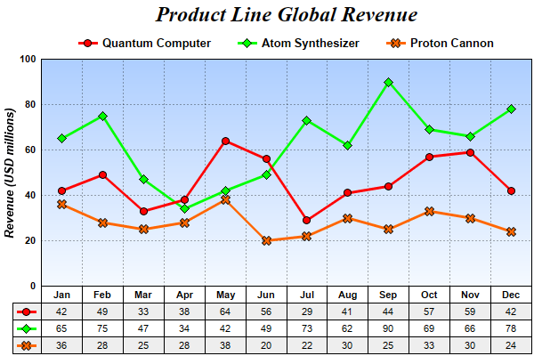
data0 = Array(42, 49, 33, 38, 64, 56, 29, 41, 44, 57, 59, 42)
data1 = Array(65, 75, 47, 34, 42, 49, 73, 62, 90, 69, 66, 78)
data2 = Array(36, 28, 25, 28, 38, 20, 22, 30, 25, 33, 30, 24)
labels = Array("Jan", "Feb", "Mar", "Apr", "May", "Jun", "Jul", "Aug", "Sep", "Oct", "Nov", "Dec")
' Create a XYChart object of size 600 x 400 pixels
Set c = cd.XYChart(600, 400)
' Add a title to the chart using 18pt Times Bold Italic font
Set title = c.addTitle("Product Line Global Revenue", "Times New Roman Bold Italic", 18)
' Tentatively set the plotarea at (50, 55) and of (chart_width - 100) x (chart_height - 120) pixels
' in size. Use a vertical gradient color from sky blue (aaccff) t0 light blue (f9f9ff) as
' background. Set both horizontal and vertical grid lines to dotted semi-transprent black
' (aa000000).
Set plotArea = c.setPlotArea(50, 55, c.getWidth() - 100, c.getHeight() - 120, _
c.linearGradientColor(0, 55, 0, 55 + c.getHeight() - 120, &Haaccff, &Hf9fcff), -1, -1, _
c.dashLineColor(&Haa000000, cd.DotLine), -1)
' Add a legend box and anchored the top center at the horizontal center of the chart, just under the
' title. Use 10pt Arial Bold as font, with transparent background and border.
Set legendBox = c.addLegend(c.getWidth() / 2, title.getHeight(), False, "Arial Bold", 10)
Call legendBox.setAlignment(cd.TopCenter)
Call legendBox.setBackground(cd.Transparent, cd.Transparent)
' Set y-axis title using 10 points Arial Bold Italic font, label style to 8 points Arial Bold, and
' axis color to transparent
Call c.yAxis().setTitle("Revenue (USD millions)", "Arial Bold Italic", 10)
Call c.yAxis().setLabelStyle("Arial Bold", 8)
Call c.yAxis().setColors(cd.Transparent)
' Set y-axis tick density to 30 pixels. ChartDirector auto-scaling will use this as the guideline
' when putting ticks on the y-axis.
Call c.yAxis().setTickDensity(30)
' Add a line layer to the chart
Set layer = c.addLineLayer2()
' Set the line width to 3 pixels
Call layer.setLineWidth(3)
' Add the three data sets to the line layer, using circles, diamands and X shapes as symbols
Call layer.addDataSet(data0, &Hff0000, "Quantum Computer").setDataSymbol(cd.CircleSymbol, 9)
Call layer.addDataSet(data1, &H00ff00, "Atom Synthesizer").setDataSymbol(cd.DiamondSymbol, 11)
Call layer.addDataSet(data2, &Hff6600, "Proton Cannon").setDataSymbol(cd.Cross2Shape(), 11)
' Set the x axis labels
Call c.xAxis().setLabels(labels)
' Convert the labels on the x-axis to a CDMLTable
Set table = c.xAxis().makeLabelTable()
' Set the default top/bottom margins of the cells to 3 pixels
Call table.getStyle().setMargin2(0, 0, 3, 3)
' Use Arial Bold as the font for the first row
Call table.getRowStyle(0).setFontStyle("Arial Bold")
'
' We can add more information to the table. In this sample code, we add the data series and the
' legend icons to the table.
'
' Add 3 more rows to the table. Set the background of the 1st and 3rd rows to light grey (eeeeee).
Call table.appendRow().setBackground(&Heeeeee, cd.LineColor)
Call table.appendRow()
Call table.appendRow().setBackground(&Heeeeee, cd.LineColor)
' Put the values of the 3 data series to the cells in the 3 rows
For i = 0 To UBound(data0)
Call table.setText(i, 1, CStr(data0(i)))
Call table.setText(i, 2, CStr(data1(i)))
Call table.setText(i, 3, CStr(data2(i)))
Next
' Insert a column on the left for the legend icons. Use 5 pixels left/right margins and 3 pixels
' top/bottom margins for the cells in this column.
Call table.insertCol(0).setMargin2(5, 5, 3, 3)
' The top cell is set to transparent, so it is invisible
Call table.getCell(0, 0).setBackground(cd.Transparent, cd.Transparent)
' The other 3 cells are set to the legend icons of the 3 data series
Call table.setText(0, 1, layer.getLegendIcon(0))
Call table.setText(0, 2, layer.getLegendIcon(1))
Call table.setText(0, 3, layer.getLegendIcon(2))
' Layout legend box first, so we can get its size
Call c.layoutLegend()
' Adjust the plot area size, such that the bounding box (inclusive of axes) is 2 pixels from the
' left, right and bottom edge, and is just under the legend box.
Call c.packPlotArea(2, legendBox.getTopY() + legendBox.getHeight(), c.getWidth() - 3, c.getHeight( _
) - 3)
' After determining the exact plot area position, we may adjust the legend box and the title
' positions so that they are centered relative to the plot area (instead of the chart)
Call legendBox.setPos(plotArea.getLeftX() + (plotArea.getWidth() - legendBox.getWidth()) / 2, _
legendBox.getTopY())
Call title.setPos(plotArea.getLeftX() + (plotArea.getWidth() - title.getWidth()) / 2, _
title.getTopY())
' Output the chart
Set viewer = cd.WebChartViewer(Request, "chart1")
Call viewer.setChart(c, cd.SVG)
' Include tool tip for the chart
viewer.ImageMap = c.getHTMLImageMap("", "", _
"title='Revenue of {dataSetName} in {xLabel}: US$ {value}M'")
%>
<!DOCTYPE html>
<html>
<head>
<title>Data Table (1)</title>
<!-- Include ChartDirector Javascript Library to support chart interactions -->
<script type="text/javascript" src="cdjcv.js"></script>
</head>
<body style="margin:5px 0px 0px 5px">
<div style="font:bold 18pt verdana;">
Data Table (1)
</div>
<hr style="border:solid 1px #000080; background:#000080" />
<div style="font:10pt verdana; margin-bottom:1.5em">
<a href="viewsource.asp?file=<%= Request("SCRIPT_NAME") %>">View Chart Source Code</a>
</div>
<!-- ****** Here is the chart image ****** -->
<%= viewer.renderHTML() %>
</body>
</html>
[Windows Version (in Visual Basic)] vbdemo\datatable.cls
Public Sub createChart(viewer As Object, chartIndex As Integer)

    Dim cd As New ChartDirector.API

    ' The data for the line chart
    Dim data0()
    data0 = Array(42, 49, 33, 38, 64, 56, 29, 41, 44, 57, 59, 42)
    Dim data1()
    data1 = Array(65, 75, 47, 34, 42, 49, 73, 62, 90, 69, 66, 78)
    Dim data2()
    data2 = Array(36, 28, 25, 28, 38, 20, 22, 30, 25, 33, 30, 24)
    Dim labels()
    labels = Array("Jan", "Feb", "Mar", "Apr", "May", "Jun", "Jul", "Aug", "Sep", "Oct", "Nov", _
        "Dec")

    ' Create a XYChart object of size 600 x 400 pixels
    Dim c As XYChart
    Set c = cd.XYChart(600, 400)

    ' Add a title to the chart using 18pt Times Bold Italic font
    Dim title As ChartDirector.TextBox
    Set title = c.addTitle("Product Line Global Revenue", "timesbi.ttf", 18)

    ' Tentatively set the plotarea at (50, 55) and of (chart_width - 100) x (chart_height - 120)
    ' pixels in size. Use a vertical gradient color from sky blue (aaccff) t0 light blue (f9f9ff) as
    ' background. Set both horizontal and vertical grid lines to dotted semi-transprent black
    ' (aa000000).
    Dim plotArea As PlotArea
    Set plotArea = c.setPlotArea(50, 55, c.getWidth() - 100, c.getHeight() - 120, _
        c.linearGradientColor(0, 55, 0, 55 + c.getHeight() - 120, &Haaccff, &Hf9fcff), -1, -1, _
        c.dashLineColor(&Haa000000, cd.DotLine), -1)

    ' Add a legend box and anchored the top center at the horizontal center of the chart, just under
    ' the title. Use 10pt Arial Bold as font, with transparent background and border.
    Dim legendBox As LegendBox
    Set legendBox = c.addLegend(c.getWidth() / 2, title.getHeight(), False, "arialbd.ttf", 10)
    Call legendBox.setAlignment(cd.TopCenter)
    Call legendBox.setBackground(cd.Transparent, cd.Transparent)

    ' Set y-axis title using 10 points Arial Bold Italic font, label style to 8 points Arial Bold,
    ' and axis color to transparent
    Call c.yAxis().setTitle("Revenue (USD millions)", "arialbi.ttf", 10)
    Call c.yAxis().setLabelStyle("arialbd.ttf", 8)
    Call c.yAxis().setColors(cd.Transparent)

    ' Set y-axis tick density to 30 pixels. ChartDirector auto-scaling will use this as the
    ' guideline when putting ticks on the y-axis.
    Call c.yAxis().setTickDensity(30)

    ' Add a line layer to the chart
    Dim layer As LineLayer
    Set layer = c.addLineLayer2()

    ' Set the line width to 3 pixels
    Call layer.setLineWidth(3)

    ' Add the three data sets to the line layer, using circles, diamands and X shapes as symbols
    Call layer.addDataSet(data0, &Hff0000, "Quantum Computer").setDataSymbol(cd.CircleSymbol, 9)
    Call layer.addDataSet(data1, &H00ff00, "Atom Synthesizer").setDataSymbol(cd.DiamondSymbol, 11)
    Call layer.addDataSet(data2, &Hff6600, "Proton Cannon").setDataSymbol(cd.Cross2Shape(), 11)

    ' Set the x axis labels
    Call c.xAxis().setLabels(labels)

    ' Convert the labels on the x-axis to a CDMLTable
    Dim table As CDMLTable
    Set table = c.xAxis().makeLabelTable()

    ' Set the default top/bottom margins of the cells to 3 pixels
    Call table.getStyle().setMargin2(0, 0, 3, 3)

    ' Use Arial Bold as the font for the first row
    Call table.getRowStyle(0).setFontStyle("arialbd.ttf")

    '
    ' We can add more information to the table. In this sample code, we add the data series and the
    ' legend icons to the table.
    '

    ' Add 3 more rows to the table. Set the background of the 1st and 3rd rows to light grey
    ' (eeeeee).
    Call table.appendRow().setBackground(&Heeeeee, cd.LineColor)
    Call table.appendRow()
    Call table.appendRow().setBackground(&Heeeeee, cd.LineColor)

    ' Put the values of the 3 data series to the cells in the 3 rows
    Dim i As Long
    For i = 0 To UBound(data0)
        Call table.setText(i, 1, CStr(data0(i)))
        Call table.setText(i, 2, CStr(data1(i)))
        Call table.setText(i, 3, CStr(data2(i)))
    Next

    ' Insert a column on the left for the legend icons. Use 5 pixels left/right margins and 3 pixels
    ' top/bottom margins for the cells in this column.
    Call table.insertCol(0).setMargin2(5, 5, 3, 3)

    ' The top cell is set to transparent, so it is invisible
    Call table.getCell(0, 0).setBackground(cd.Transparent, cd.Transparent)

    ' The other 3 cells are set to the legend icons of the 3 data series
    Call table.setText(0, 1, layer.getLegendIcon(0))
    Call table.setText(0, 2, layer.getLegendIcon(1))
    Call table.setText(0, 3, layer.getLegendIcon(2))

    ' Layout legend box first, so we can get its size
    Call c.layoutLegend()

    ' Adjust the plot area size, such that the bounding box (inclusive of axes) is 2 pixels from the
    ' left, right and bottom edge, and is just under the legend box.
    Call c.packPlotArea(2, legendBox.getTopY() + legendBox.getHeight(), c.getWidth() - 3, _
        c.getHeight() - 3)

    ' After determining the exact plot area position, we may adjust the legend box and the title
    ' positions so that they are centered relative to the plot area (instead of the chart)
    Call legendBox.setPos(plotArea.getLeftX() + (plotArea.getWidth() - legendBox.getWidth()) / 2, _
        legendBox.getTopY())
    Call title.setPos(plotArea.getLeftX() + (plotArea.getWidth() - title.getWidth()) / 2, _
        title.getTopY())

    ' Output the chart
    Set viewer.Picture = c.makePicture()

    'include tool tip for the chart
    viewer.ImageMap = c.getHTMLImageMap("clickable", "", _
        "title='Revenue of {dataSetName} in {xLabel}: US$ {value}M'")

End Sub
© 2021 Advanced Software Engineering Limited. All rights reserved.