[Web Version (in ASP)] aspdemo\dualhbar.asp
<%@ language="vbscript" %>
<%
Set cd = CreateObject("ChartDirector.API")
' The age groups
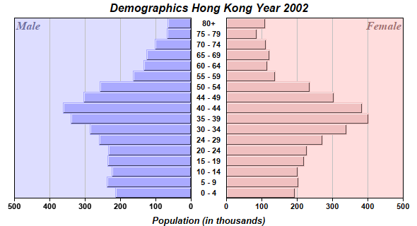
labels = Array("0 - 4", "5 - 9", "10 - 14", "15 - 19", "20 - 24", "24 - 29", "30 - 34", "35 - 39", _
"40 - 44", "44 - 49", "50 - 54", "55 - 59", "60 - 64", "65 - 69", "70 - 74", "75 - 79", "80+")
' The male population (in thousands)
male = Array(215, 238, 225, 236, 235, 260, 286, 340, 363, 305, 259, 164, 135, 127, 102, 68, 66)
' The female population (in thousands)
female = Array(194, 203, 201, 220, 228, 271, 339, 401, 384, 304, 236, 137, 116, 122, 112, 85, 110)
'=============================================================
' Draw the right bar chart
'=============================================================
' Create a XYChart object of size 320 x 300 pixels
Set c = cd.XYChart(320, 300)
' Set the plotarea at (50, 0) and of size 250 x 255 pixels. Use pink (0xffdddd) as the background.
Call c.setPlotArea(50, 0, 250, 255, &Hffdddd)
' Add a custom text label at the top right corner of the right bar chart
Call c.addText(300, 0, "Female", "Times New Roman Bold Italic", 12, &Ha07070).setAlignment( _
cd.TopRight)
' Add the pink (0xf0c0c0) bar chart layer using the female data
Set femaleLayer = c.addBarLayer(female, &Hf0c0c0, "Female")
' Swap the axis so that the bars are drawn horizontally
Call c.swapXY(True)
' Set the bar to touch each others
Call femaleLayer.setBarGap(cd.TouchBar)
' Set the border style of the bars to 1 pixel 3D border
Call femaleLayer.setBorderColor(-1, 1)
' Add a Transparent line layer to the chart using the male data. As it is Transparent, only the
' female bar chart can be seen. We need to put both male and female data in both left and right
' charts, because we want auto-scaling to produce the same scale for both chart.
Call c.addLineLayer(male, cd.Transparent)
' Set the y axis label font to Arial Bold
Call c.yAxis().setLabelStyle("Arial Bold")
' Set the labels between the two bar charts, which can be considered as the x-axis labels for the
' right chart
Set tb = c.xAxis().setLabels(labels)
' Use a fix width of 50 for the labels (height = automatic) with center alignment
Call tb.setSize(50, 0)
Call tb.setAlignment(cd.Center)
' Set the label font to Arial Bold
Call tb.setFontStyle("Arial Bold")
' Disable ticks on the x-axis by setting the tick length to 0
Call c.xAxis().setTickLength(0)
'=============================================================
' Draw the left bar chart
'=============================================================
' Create a XYChart object of size 280 x 300 pixels with a transparent background.
Set c2 = cd.XYChart(280, 300, cd.Transparent)
' Set the plotarea at (20, 0) and of size 250 x 255 pixels. Use pale blue (0xddddff) as the
' background.
Call c2.setPlotArea(20, 0, 250, 255, &Hddddff)
' Add a custom text label at the top left corner of the left bar chart
Call c2.addText(20, 0, "Male", "Times New Roman Bold Italic", 12, &H7070a0)
' Add the pale blue (0xaaaaff) bar chart layer using the male data
Set maleLayer = c2.addBarLayer(male, &Haaaaff, "Male")
' Swap the axis so that the bars are drawn horizontally
Call c2.swapXY(True)
' Reverse the direction of the y-axis so it runs from right to left
Call c2.yAxis().setReverse()
' Set the bar to touch each others
Call maleLayer.setBarGap(cd.TouchBar)
' Set the border style of the bars to 1 pixel 3D border
Call maleLayer.setBorderColor(-1, 1)
' Add a Transparent line layer to the chart using the female data. As it is Transparent, only the
' male bar chart can be seen. We need to put both male and female data in both left and right
' charts, because we want auto-scaling to produce the same scale for both chart.
Call c2.addLineLayer(female, cd.Transparent)
' Set the y axis label font to Arial Bold
Call c2.yAxis().setLabelStyle("Arial Bold")
' Set the x-axis labels for tool tip purposes.
Call c2.xAxis().setLabels(labels)
' Hide the x-axis labels by setting them to Transparent. We only need to display the x-axis labels
' for the right chart.
Call c2.xAxis().setColors(&H000000, cd.Transparent, -1, cd.Transparent)
'=============================================================
' Use a MultiChart to contain both bar charts
'=============================================================
' Create a MultiChart object of size 590 x 320 pixels.
Set m = cd.MultiChart(590, 320)
' Add a title to the chart using Arial Bold Italic font
Call m.addTitle("Demographics Hong Kong Year 2002", "Arial Bold Italic")
' Add another title at the bottom using Arial Bold Italic font
Call m.addTitle2(cd.Bottom, "Population (in thousands)", "Arial Bold Italic", 10)
' Put the right chart at (270, 25)
Call m.addChart(270, 25, c)
' Put the left chart at (0, 25)
Call m.addChart(0, 25, c2)
' Output the chart
Set viewer = cd.WebChartViewer(Request, "chart1")
Call viewer.setChart(m, cd.SVG)
' Include tool tip for the chart
viewer.ImageMap = m.getHTMLImageMap("", "", _
"title='{dataSetName} (Age {xLabel}): Population {value}K'")
%>
<!DOCTYPE html>
<html>
<head>
<title>Dual Horizontal Bar Charts</title>
<!-- Include ChartDirector Javascript Library to support chart interactions -->
<script type="text/javascript" src="cdjcv.js"></script>
</head>
<body style="margin:5px 0px 0px 5px">
<div style="font:bold 18pt verdana;">
Dual Horizontal Bar Charts
</div>
<hr style="border:solid 1px #000080; background:#000080" />
<div style="font:10pt verdana; margin-bottom:1.5em">
<a href="viewsource.asp?file=<%= Request("SCRIPT_NAME") %>">View Chart Source Code</a>
</div>
<!-- ****** Here is the chart image ****** -->
<%= viewer.renderHTML() %>
</body>
</html>
[Windows Version (in Visual Basic)] vbdemo\dualhbar.cls
Public Sub createChart(viewer As Object, chartIndex As Integer)

    Dim cd As New ChartDirector.API

    ' The age groups
    Dim labels()
    labels = Array("0 - 4", "5 - 9", "10 - 14", "15 - 19", "20 - 24", "24 - 29", "30 - 34", _
        "35 - 39", "40 - 44", "44 - 49", "50 - 54", "55 - 59", "60 - 64", "65 - 69", "70 - 74", _
        "75 - 79", "80+")

    ' The male population (in thousands)
    Dim male()
    male = Array(215, 238, 225, 236, 235, 260, 286, 340, 363, 305, 259, 164, 135, 127, 102, 68, 66)

    ' The female population (in thousands)
    Dim female()
    female = Array(194, 203, 201, 220, 228, 271, 339, 401, 384, 304, 236, 137, 116, 122, 112, 85, _
        110)


    '=============================================================
    '    Draw the right bar chart
    '=============================================================

    ' Create a XYChart object of size 320 x 300 pixels
    Dim c As XYChart
    Set c = cd.XYChart(320, 300)

    ' Set the plotarea at (50, 0) and of size 250 x 255 pixels. Use pink (0xffdddd) as the
    ' background.
    Call c.setPlotArea(50, 0, 250, 255, &Hffdddd)

    ' Add a custom text label at the top right corner of the right bar chart
    Call c.addText(300, 0, "Female", "timesbi.ttf", 12, &Ha07070).setAlignment(cd.TopRight)

    ' Add the pink (0xf0c0c0) bar chart layer using the female data
    Dim femaleLayer As BarLayer
    Set femaleLayer = c.addBarLayer(female, &Hf0c0c0, "Female")

    ' Swap the axis so that the bars are drawn horizontally
    Call c.swapXY(True)

    ' Set the bar to touch each others
    Call femaleLayer.setBarGap(cd.TouchBar)

    ' Set the border style of the bars to 1 pixel 3D border
    Call femaleLayer.setBorderColor(-1, 1)

    ' Add a Transparent line layer to the chart using the male data. As it is Transparent, only the
    ' female bar chart can be seen. We need to put both male and female data in both left and right
    ' charts, because we want auto-scaling to produce the same scale for both chart.
    Call c.addLineLayer(male, cd.Transparent)

    ' Set the y axis label font to Arial Bold
    Call c.yAxis().setLabelStyle("arialbd.ttf")

    ' Set the labels between the two bar charts, which can be considered as the x-axis labels for
    ' the right chart
    Dim tb As ChartDirector.TextBox
    Set tb = c.xAxis().setLabels(labels)

    ' Use a fix width of 50 for the labels (height = automatic) with center alignment
    Call tb.setSize(50, 0)
    Call tb.setAlignment(cd.Center)

    ' Set the label font to Arial Bold
    Call tb.setFontStyle("arialbd.ttf")

    ' Disable ticks on the x-axis by setting the tick length to 0
    Call c.xAxis().setTickLength(0)

    '=============================================================
    '    Draw the left bar chart
    '=============================================================

    ' Create a XYChart object of size 280 x 300 pixels with a transparent background.
    Dim c2 As XYChart
    Set c2 = cd.XYChart(280, 300, cd.Transparent)

    ' Set the plotarea at (20, 0) and of size 250 x 255 pixels. Use pale blue (0xddddff) as the
    ' background.
    Call c2.setPlotArea(20, 0, 250, 255, &Hddddff)

    ' Add a custom text label at the top left corner of the left bar chart
    Call c2.addText(20, 0, "Male", "timesbi.ttf", 12, &H7070a0)

    ' Add the pale blue (0xaaaaff) bar chart layer using the male data
    Dim maleLayer As BarLayer
    Set maleLayer = c2.addBarLayer(male, &Haaaaff, "Male")

    ' Swap the axis so that the bars are drawn horizontally
    Call c2.swapXY(True)

    ' Reverse the direction of the y-axis so it runs from right to left
    Call c2.yAxis().setReverse()

    ' Set the bar to touch each others
    Call maleLayer.setBarGap(cd.TouchBar)

    ' Set the border style of the bars to 1 pixel 3D border
    Call maleLayer.setBorderColor(-1, 1)

    ' Add a Transparent line layer to the chart using the female data. As it is Transparent, only
    ' the male bar chart can be seen. We need to put both male and female data in both left and
    ' right charts, because we want auto-scaling to produce the same scale for both chart.
    Call c2.addLineLayer(female, cd.Transparent)

    ' Set the y axis label font to Arial Bold
    Call c2.yAxis().setLabelStyle("arialbd.ttf")

    ' Set the x-axis labels for tool tip purposes.
    Call c2.xAxis().setLabels(labels)

    ' Hide the x-axis labels by setting them to Transparent. We only need to display the x-axis
    ' labels for the right chart.
    Call c2.xAxis().setColors(&H000000, cd.Transparent, -1, cd.Transparent)

    '=============================================================
    '    Use a MultiChart to contain both bar charts
    '=============================================================

    ' Create a MultiChart object of size 590 x 320 pixels.
    Dim m As MultiChart
    Set m = cd.MultiChart(590, 320)

    ' Add a title to the chart using Arial Bold Italic font
    Call m.addTitle("Demographics Hong Kong Year 2002", "arialbi.ttf")

    ' Add another title at the bottom using Arial Bold Italic font
    Call m.addTitle2(cd.Bottom, "Population (in thousands)", "arialbi.ttf", 10)

    ' Put the right chart at (270, 25)
    Call m.addChart(270, 25, c)

    ' Put the left chart at (0, 25)
    Call m.addChart(0, 25, c2)

    ' Output the chart
    Set viewer.Picture = m.makePicture()

    'include tool tip for the chart
    viewer.ImageMap = m.getHTMLImageMap("clickable", "", _
        "title='{dataSetName} (Age {xLabel}): Population {value}K'")

End Sub
© 2021 Advanced Software Engineering Limited. All rights reserved.