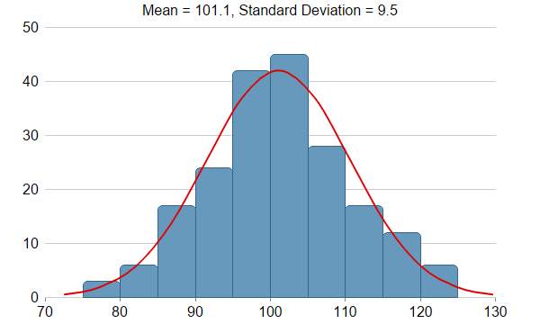
The example demonstrates creating a histogram with a bell curve.
A histogram is chart plotting the distribution of numerical data. Typically, this is by plotting count of objects that fall within certain data ranges. The most common data representation is bars, as a bar can represent the count with its height, and the data range with its position and its width.
One of the most common types of distribution is the normal distribution. So it is common to add a normal distribution curve (also known as the bell curve) on the chart.
In this example, the histogram is achieved by using a bar layer (
BarLayer), and the normal distribution curve by using a spline layer (
SplineLayer). About half of the code in this example is in computing the data to be passed to the bar layer and spline layer, and the other half creating the chart. The
ArrayMath utility class is used to obtain the max, min, mean and standard deviation, thereby simplifying the computation code.
[Web Version (in ASP)] aspdemo\histogram.asp
<%@ language="vbscript" %>
<%
Set cd = CreateObject("ChartDirector.API")

'
' This example demonstrates creating a histogram with a bell curve from raw data. About half of the
' code is to sort the raw data into slots and to generate the points on the bell curve. The
' remaining half of the code is the actual charting code.
'

' Generate a random guassian distributed data series as the input data for this example.
Set r = cd.RanSeries(66)
samples = r.getGaussianSeries(200, 100, 10)

'
' Classify the numbers into slots. In this example, the slot width is 5 units.
'
slotSize = 5

' Compute the min and max values, and extend them to the slot boundary.
Set m = cd.ArrayMath(samples)
minX = Int(m.min() / slotSize) * slotSize
maxX = Int(m.max() / slotSize) * slotSize + slotSize

' We can now determine the number of slots
slotCount = Int((maxX - minX) / slotSize + 0.5)
ReDim frequency(slotCount - 1)

' Count the data points contained in each slot
For i = 0 To UBound(samples)
    slotIndex = Int((samples(i) - minX) / slotSize)
    frequency(slotIndex) = frequency(slotIndex) + 1
Next

'
' Compute Normal Distribution Curve
'

' The mean and standard deviation of the data
mean = m.avg()
stdDev = m.stdDev()

' The normal distribution curve (bell curve) is a standard statistics curve. We need to vertically
' scale it to make it proportion to the frequency count.
scaleFactor = slotSize * (UBound(samples) + 1) / stdDev / Sqr(2 * 3.1416)

' In this example, we plot the bell curve up to 3 standard deviations.
stdDevWidth = 3.0

' We generate 4 points per standard deviation to be joined with a spline curve.
bellCurveResolution = Int(stdDevWidth * 4 + 1)
ReDim bellCurve(bellCurveResolution - 1)
For i = 0 To bellCurveResolution - 1
    z = 2 * i * stdDevWidth / (bellCurveResolution - 1) - stdDevWidth
    bellCurve(i) = Exp(-z * z / 2) * scaleFactor
Next

'
' At this stage, we have obtained all data and can plot the chart.
'

' Create a XYChart object of size 600 x 360 pixels
Set c = cd.XYChart(600, 360)

' Set the plotarea at (50, 30) and of size 500 x 300 pixels, with transparent background and border
' and light grey (0xcccccc) horizontal grid lines
Call c.setPlotArea(50, 30, 500, 300, cd.Transparent, -1, cd.Transparent, &Hcccccc)

' Display the mean and standard deviation on the chart

Call c.addTitle("Mean = " & c.formatValue(mean, "{value|1}") & ", Standard Deviation = " & _
    c.formatValue(stdDev, "{value|2}"), "Arial")


' Set the x and y axis label font to 12pt Arial
Call c.xAxis().setLabelStyle("Arial", 12)
Call c.yAxis().setLabelStyle("Arial", 12)

' Set the x and y axis stems to transparent, and the x-axis tick color to grey (0x888888)
Call c.xAxis().setColors(cd.Transparent, cd.TextColor, cd.TextColor, &H888888)
Call c.yAxis().setColors(cd.Transparent)

' Draw the bell curve as a spline layer in red (0xdd0000) with 2-pixel line width
Set bellLayer = c.addSplineLayer(bellCurve, &Hdd0000)
Call bellLayer.setXData2(mean - stdDevWidth * stdDev, mean + stdDevWidth * stdDev)
Call bellLayer.setLineWidth(2)
' No tooltip is needed for the spline layer
Call bellLayer.setHTMLImageMap("{disable}")

' Draw the histogram as bars in blue (0x6699bb) with dark blue (0x336688) border
Set histogramLayer = c.addBarLayer(frequency, &H6699bb)
Call histogramLayer.setBorderColor(&H336688)
' The center of the bars span from minX + half_bar_width to maxX - half_bar_width
Call histogramLayer.setXData2(minX + slotSize / 2.0, maxX - slotSize / 2.0)
' Configure the bars to touch each other with no gap in between
Call histogramLayer.setBarGap(cd.TouchBar)
' Use rounded corners for decoration
Call histogramLayer.setRoundedCorners()
' Tool tip for the histogram
Call histogramLayer.setHTMLImageMap("", "", "title='{value}'")

' ChartDirector by default will extend the x-axis scale by 0.5 unit to cater for the bar width. It
' is because a bar plotted at x actually occupies (x +/- half_bar_width), and the bar width is
' normally 1 for label based x-axis. However, this chart is using a linear x-axis instead of label
' based. So we disable the automatic extension and add a dummy layer to extend the x-axis scale to
' cover minX to maxX.
Call c.xAxis().setIndent(False)
Call c.addLineLayer2().setXData(minX, maxX)

' For the automatic y-axis labels, set the minimum spacing to 40 pixels.
Call c.yAxis().setTickDensity(40)

' Output the chart
Set viewer = cd.WebChartViewer(Request, "chart1")
Call viewer.setChart(c, cd.SVG)

' Include tool tip for the chart
viewer.ImageMap = c.getHTMLImageMap("")
%>

<!DOCTYPE html>
<html>
<head>
    <title>Histogram with Bell Curve</title>
    <!-- Include ChartDirector Javascript Library to support chart interactions -->
    <script type="text/javascript" src="cdjcv.js"></script>
</head>
<body style="margin:5px 0px 0px 5px">
    <div style="font:bold 18pt verdana;">
        Histogram with Bell Curve
    </div>
    <hr style="border:solid 1px #000080; background:#000080" />
    <div style="font:10pt verdana; margin-bottom:1.5em">
        <a href="viewsource.asp?file=<%= Request("SCRIPT_NAME") %>">View Chart Source Code</a>
    </div>
    <!-- ****** Here is the chart image ****** -->
    <%= viewer.renderHTML() %>
</body>
</html>
[Windows Version (in Visual Basic)] vbdemo\histogram.cls
Public Sub createChart(viewer As Object, chartIndex As Integer)

    Dim cd As New ChartDirector.API

    '
    ' This example demonstrates creating a histogram with a bell curve from raw data. About half of
    ' the code is to sort the raw data into slots and to generate the points on the bell curve. The
    ' remaining half of the code is the actual charting code.
    '

    ' Generate a random guassian distributed data series as the input data for this example.
    Dim r As RanSeries
    Set r = cd.RanSeries(66)
    Dim samples()
    samples = r.getGaussianSeries(200, 100, 10)

    '
    ' Classify the numbers into slots. In this example, the slot width is 5 units.
    '
    Dim slotSize As Long
    slotSize = 5

    ' Compute the min and max values, and extend them to the slot boundary.
    Dim m As ArrayMath
    Set m = cd.ArrayMath(samples)
    Dim minX As Double
    minX = Int(m.min() / slotSize) * slotSize
    Dim maxX As Double
    maxX = Int(m.max() / slotSize) * slotSize + slotSize

    ' We can now determine the number of slots
    Dim slotCount As Long
    slotCount = Int((maxX - minX + 0.5) / slotSize)
    ReDim frequency(slotCount - 1)

    ' Count the data points contained in each slot
    Dim i As Long
    For i = 0 To UBound(samples)
        Dim slotIndex As Long
        slotIndex = Int((samples(i) - minX) / slotSize)
        frequency(slotIndex) = frequency(slotIndex) + 1
    Next

    '
    ' Compute Normal Distribution Curve
    '

    ' The mean and standard deviation of the data
    Dim mean As Double
    mean = m.avg()
    Dim stdDev As Double
    stdDev = m.stdDev()

    ' The normal distribution curve (bell curve) is a standard statistics curve. We need to
    ' vertically scale it to make it proportion to the frequency count.
    Dim scaleFactor As Double
    scaleFactor = slotSize * (UBound(samples) + 1) / stdDev / Sqr(6.2832)

    ' In this example, we plot the bell curve up to 3 standard deviations.
    Dim stdDevWidth As Double
    stdDevWidth = 3.0

    ' We generate 4 points per standard deviation to be joined with a spline curve.
    Dim bellCurveResolution As Long
    bellCurveResolution = Int(stdDevWidth * 4 + 1)
    ReDim bellCurve(bellCurveResolution - 1)
    For i = 0 To UBound(bellCurve)
        Dim z As Double
        z = (2 * i - UBound(bellCurve)) * stdDevWidth / UBound(bellCurve)
        bellCurve(i) = Exp(-z * z / 2) * scaleFactor
    Next

    '
    ' At this stage, we have obtained all data and can plot the chart.
    '

    ' Create a XYChart object of size 600 x 360 pixels
    Dim c As XYChart
    Set c = cd.XYChart(600, 360)

    ' Set the plotarea at (50, 30) and of size 500 x 300 pixels, with transparent background and
    ' border and light grey (0xcccccc) horizontal grid lines
    Call c.setPlotArea(50, 30, 500, 300, cd.Transparent, -1, cd.Transparent, &Hcccccc)

    ' Display the mean and standard deviation on the chart

    Call c.addTitle("Mean = " & c.formatValue(mean, "{value|1}") & ", Standard Deviation = " & _
        c.formatValue(stdDev, "{value|2}"), "arial.ttf")


    ' Set the x and y axis label font to 12pt Arial
    Call c.xAxis().setLabelStyle("arial.ttf", 12)
    Call c.yAxis().setLabelStyle("arial.ttf", 12)

    ' Set the x and y axis stems to transparent, and the x-axis tick color to grey (0x888888)
    Call c.xAxis().setColors(cd.Transparent, cd.TextColor, cd.TextColor, &H888888)
    Call c.yAxis().setColors(cd.Transparent)

    ' Draw the bell curve as a spline layer in red (0xdd0000) with 2-pixel line width
    Dim bellLayer As SplineLayer
    Set bellLayer = c.addSplineLayer(bellCurve, &Hdd0000)
    Call bellLayer.setXData2(mean - stdDevWidth * stdDev, mean + stdDevWidth * stdDev)
    Call bellLayer.setLineWidth(2)
    ' No tooltip is needed for the spline layer
    Call bellLayer.setHTMLImageMap("{disable}")

    ' Draw the histogram as bars in blue (0x6699bb) with dark blue (0x336688) border
    Dim histogramLayer As BarLayer
    Set histogramLayer = c.addBarLayer(frequency, &H6699bb)
    Call histogramLayer.setBorderColor(&H336688)
    ' The center of the bars span from minX + half_bar_width to maxX - half_bar_width
    Call histogramLayer.setXData2(minX + slotSize / 2.0, maxX - slotSize / 2.0)
    ' Configure the bars to touch each other with no gap in between
    Call histogramLayer.setBarGap(cd.TouchBar)
    ' Use rounded corners for decoration
    Call histogramLayer.setRoundedCorners()
    ' Tool tip for the histogram
    Call histogramLayer.setHTMLImageMap("", "", "title='{value}'")

    ' ChartDirector by default will extend the x-axis scale by 0.5 unit to cater for the bar width.
    ' It is because a bar plotted at x actually occupies (x +/- half_bar_width), and the bar width
    ' is normally 1 for label based x-axis. However, this chart is using a linear x-axis instead of
    ' label based. So we disable the automatic extension and add a dummy layer to extend the x-axis
    ' scale to cover minX to maxX.
    Call c.xAxis().setIndent(False)
    Call c.addLineLayer2().setXData(minX, maxX)

    ' For the automatic y-axis labels, set the minimum spacing to 40 pixels.
    Call c.yAxis().setTickDensity(40)

    ' Output the chart
    Set viewer.Picture = c.makePicture()

    ' Include tool tip for the chart
    viewer.ImageMap = c.getHTMLImageMap("clickable")

End Sub
© 2021 Advanced Software Engineering Limited. All rights reserved.