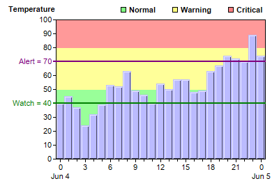
This example demonstrates adding marks and zones to the chart, and adding custom legend keys to represent the zones.
A "mark" is a line drawn in the plot area. The purple "Alert" line and the green "Watch" line on the chart are mark lines. It is added to the chart using
Axis.addMark.
Mark lines can be horizontal or vertical, depending on which axis the marks are defined on. Marks can be drawn on the front of the plot area (the default), or at the back like grid lines. This is configured using
Mark.setDrawOnTop.
A "zone" is a color band on the back of the plot area. In this example, the red, yellow and green areas are zones. They are added to the chart using
Axis.addZone. Like marks, zones can be horizontal or vertical.
In this example,
LegendBox.addKey is used to add the names of the zones to the legend box as custom entries.
[Web Version (in ASP)] aspdemo\markzone.asp
<%@ language="vbscript" %>
<%
Set cd = CreateObject("ChartDirector.API")

' The data for the chart
data = Array(40, 45, 37, 24, 32, 39, 53, 52, 63, 49, 46, 40, 54, 50, 57, 57, 48, 49, 63, 67, 74, _
    72, 70, 89, 74)
labels = Array("0<*br*>Jun 4", "1", "2", "3", "4", "5", "6", "7", "8", "9", "10", "11", "12", _
    "13", "14", "15", "16", "17", "18", "19", "20", "21", "22", "23", "0<*br*>Jun 5")

' Create a XYChart object of size 400 x 270 pixels
Set c = cd.XYChart(400, 270)

' Set the plotarea at (80, 60) and of size 300 x 200 pixels. Turn off the grid lines by setting
' their colors to Transparent.
Call c.setPlotArea(80, 28, 300, 200).setGridColor(cd.Transparent)

' Add a title to the y axis
Set textbox = c.yAxis().setTitle("Temperature")

' Set the y axis title upright (font angle = 0)
Call textbox.setFontAngle(0)

' Put the y axis title on top of the axis
Call textbox.setAlignment(cd.TopLeft2)

' Add green (0x99ff99), yellow (0xffff99) and red (0xff9999) zones to the y axis to represent the
' ranges 0 - 50, 50 - 80, and 80 - max.
Call c.yAxis().addZone(0, 50, &H99ff99)
Call c.yAxis().addZone(50, 80, &Hffff99)
Call c.yAxis().addZone(80, 9999, &Hff9999)

' Add a purple (0x800080) mark at y = 70 using a line width of 2.
Call c.yAxis().addMark(70, &H800080, "Alert = 70").setLineWidth(2)

' Add a green (0x008000) mark at y = 40 using a line width of 2.
Call c.yAxis().addMark(40, &H008000, "Watch = 40").setLineWidth(2)

' Add a legend box at (165, 0) (top right of the chart) using 8pt Arial font. and horizontal layout.
Set legend = c.addLegend(165, 0, False, "Arial Bold", 8)

' Disable the legend box boundary by setting the colors to Transparent
Call legend.setBackground(cd.Transparent, cd.Transparent)

' Add 3 custom entries to the legend box to represent the 3 zones
Call legend.addKey("Normal", &H80ff80)
Call legend.addKey("Warning", &Hffff80)
Call legend.addKey("Critical", &Hff8080)

' Set the labels on the x axis.
Call c.xAxis().setLabels(labels)

' Display 1 out of 3 labels on the x-axis. Show minor ticks for remaining labels.
Call c.xAxis().setLabelStep(3, 1)

' Add a 3D bar layer with the given data
Set layer = c.addBarLayer(data, &Hbbbbff)

' Set the bar gap to 0 so that the bars are packed tightly
Call layer.setBarGap(0)

' Set the border color of the bars same as the fill color, with 1 pixel 3D border effect.
Call layer.setBorderColor(cd.SameAsMainColor, 1)

' Output the chart
Set viewer = cd.WebChartViewer(Request, "chart1")
Call viewer.setChart(c, cd.SVG)

' Include tool tip for the chart
viewer.ImageMap = c.getHTMLImageMap("", "", "title='Temperature at {x}:00 = {value} C'")
%>

<!DOCTYPE html>
<html>
<head>
    <title>Marks and Zones (1)</title>
    <!-- Include ChartDirector Javascript Library to support chart interactions -->
    <script type="text/javascript" src="cdjcv.js"></script>
</head>
<body style="margin:5px 0px 0px 5px">
    <div style="font:bold 18pt verdana;">
        Marks and Zones (1)
    </div>
    <hr style="border:solid 1px #000080; background:#000080" />
    <div style="font:10pt verdana; margin-bottom:1.5em">
        <a href="viewsource.asp?file=<%= Request("SCRIPT_NAME") %>">View Chart Source Code</a>
    </div>
    <!-- ****** Here is the chart image ****** -->
    <%= viewer.renderHTML() %>
</body>
</html>
[Windows Version (in Visual Basic)] vbdemo\markzone.cls
Public Sub createChart(viewer As Object, chartIndex As Integer)

    Dim cd As New ChartDirector.API

    ' The data for the chart
    Dim data()
    data = Array(40, 45, 37, 24, 32, 39, 53, 52, 63, 49, 46, 40, 54, 50, 57, 57, 48, 49, 63, 67, _
        74, 72, 70, 89, 74)
    Dim labels()
    labels = Array("0<*br*>Jun 4", "1", "2", "3", "4", "5", "6", "7", "8", "9", "10", "11", "12", _
        "13", "14", "15", "16", "17", "18", "19", "20", "21", "22", "23", "0<*br*>Jun 5")

    ' Create a XYChart object of size 400 x 270 pixels
    Dim c As XYChart
    Set c = cd.XYChart(400, 270)

    ' Set the plotarea at (80, 60) and of size 300 x 200 pixels. Turn off the grid lines by setting
    ' their colors to Transparent.
    Call c.setPlotArea(80, 28, 300, 200).setGridColor(cd.Transparent)

    ' Add a title to the y axis
    Dim textbox As ChartDirector.TextBox
    Set textbox = c.yAxis().setTitle("Temperature")

    ' Set the y axis title upright (font angle = 0)
    Call textbox.setFontAngle(0)

    ' Put the y axis title on top of the axis
    Call textbox.setAlignment(cd.TopLeft2)

    ' Add green (0x99ff99), yellow (0xffff99) and red (0xff9999) zones to the y axis to represent
    ' the ranges 0 - 50, 50 - 80, and 80 - max.
    Call c.yAxis().addZone(0, 50, &H99ff99)
    Call c.yAxis().addZone(50, 80, &Hffff99)
    Call c.yAxis().addZone(80, 9999, &Hff9999)

    ' Add a purple (0x800080) mark at y = 70 using a line width of 2.
    Call c.yAxis().addMark(70, &H800080, "Alert = 70").setLineWidth(2)

    ' Add a green (0x008000) mark at y = 40 using a line width of 2.
    Call c.yAxis().addMark(40, &H008000, "Watch = 40").setLineWidth(2)

    ' Add a legend box at (165, 0) (top right of the chart) using 8pt Arial font. and horizontal
    ' layout.
    Dim legend As LegendBox
    Set legend = c.addLegend(165, 0, False, "arialbd.ttf", 8)

    ' Disable the legend box boundary by setting the colors to Transparent
    Call legend.setBackground(cd.Transparent, cd.Transparent)

    ' Add 3 custom entries to the legend box to represent the 3 zones
    Call legend.addKey("Normal", &H80ff80)
    Call legend.addKey("Warning", &Hffff80)
    Call legend.addKey("Critical", &Hff8080)

    ' Set the labels on the x axis.
    Call c.xAxis().setLabels(labels)

    ' Display 1 out of 3 labels on the x-axis. Show minor ticks for remaining labels.
    Call c.xAxis().setLabelStep(3, 1)

    ' Add a 3D bar layer with the given data
    Dim layer As BarLayer
    Set layer = c.addBarLayer(data, &Hbbbbff)

    ' Set the bar gap to 0 so that the bars are packed tightly
    Call layer.setBarGap(0)

    ' Set the border color of the bars same as the fill color, with 1 pixel 3D border effect.
    Call layer.setBorderColor(cd.SameAsMainColor, 1)

    ' Output the chart
    Set viewer.Picture = c.makePicture()

    'include tool tip for the chart
    viewer.ImageMap = c.getHTMLImageMap("clickable", "", _
        "title='Temperature at {x}:00 = {value} C'")

End Sub
© 2021 Advanced Software Engineering Limited. All rights reserved.