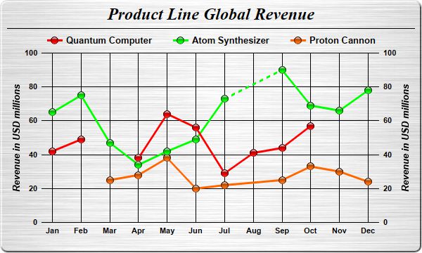
This example demonstrates various methods to representing missing data points. It also demonstrates automatic resizing of the plot area to fit the chart.
In ChartDirector, a data series may contain missing values, represented using the
NoValue predefined constant. In a line layer, by default, a missing value is represented as a gap in the line. In other words, the line will be broken.
LineLayer.setGapColor can be used to configure the line layer to join through the NoValue point instead, using a line segment that can be of a different color and/or style.
In this example, the three data series all contain
NoValue points. The red line demonstrates the default behaviour of using a gap to representing the NoValue point. The green line demonstrates joining through the NoValue point with a dash line. The orange line demonstrates joining through the NoValue point with the same line style as for joining normal data points.
After the entire chart is configured, the
XYChart.packPlotArea method is used to adjust the plot area size, so as to fit the plot area and the axes in a given bounding box.
[Web Version (in ASP)] aspdemo\missingpoints.asp
<%@ language="vbscript" %>
<%
Set cd = CreateObject("ChartDirector.API")

' The data for the chart
data0 = Array(42, 49, cd.NoValue, 38, 64, 56, 29, 41, 44, 57)
data1 = Array(65, 75, 47, 34, 42, 49, 73, cd.NoValue, 90, 69, 66, 78)
data2 = Array(cd.NoValue, cd.NoValue, 25, 28, 38, 20, 22, cd.NoValue, 25, 33, 30, 24)
labels = Array("Jan", "Feb", "Mar", "Apr", "May", "Jun", "Jul", "Aug", "Sep", "Oct", "Nov", "Dec")

' Create a XYChart object of size 600 x 360 pixels. Set background color to brushed silver, with a 2
' pixel 3D border. Use rounded corners.
Set c = cd.XYChart(600, 360, cd.brushedSilverColor(), cd.Transparent, 2)
Call c.setRoundedFrame()

' Add a title using 18pt Times New Roman Bold Italic font. #Set top/bottom margins to 6 pixels.
Set title = c.addTitle("Product Line Global Revenue", "Times New Roman Bold Italic", 18)
Call title.setMargin2(0, 0, 6, 6)

' Add a separator line just under the title
Call c.addLine(10, title.getHeight(), c.getWidth() - 11, title.getHeight(), cd.LineColor)

' Add a legend box where the top-center is anchored to the horizontal center of the chart, just
' under the title. Use horizontal layout and 10 points Arial Bold font, and transparent background
' and border.
Set legendBox = c.addLegend(c.getWidth() / 2, title.getHeight(), False, "Arial Bold", 10)
Call legendBox.setAlignment(cd.TopCenter)
Call legendBox.setBackground(cd.Transparent, cd.Transparent)

' Tentatively set the plotarea at (70, 75) and of 460 x 240 pixels in size. Use transparent border
' and black (000000) grid lines
Call c.setPlotArea(70, 75, 460, 240, -1, -1, cd.Transparent, &H000000, -1)

' Set the x axis labels
Call c.xAxis().setLabels(labels)

' Show the same scale on the left and right y-axes
Call c.syncYAxis()

' Set y-axis tick density to 30 pixels. ChartDirector auto-scaling will use this as the guideline
' when putting ticks on the y-axis.
Call c.yAxis().setTickDensity(30)

' Set all axes to transparent
Call c.xAxis().setColors(cd.Transparent)
Call c.yAxis().setColors(cd.Transparent)
Call c.yAxis2().setColors(cd.Transparent)

' Set the x-axis margins to 15 pixels, so that the horizontal grid lines can extend beyond the
' leftmost and rightmost vertical grid lines
Call c.xAxis().setMargin(15, 15)

' Set axis label style to 8pt Arial Bold
Call c.xAxis().setLabelStyle("Arial Bold", 8)
Call c.yAxis().setLabelStyle("Arial Bold", 8)
Call c.yAxis2().setLabelStyle("Arial Bold", 8)

' Add axis title using 10pt Arial Bold Italic font
Call c.yAxis().setTitle("Revenue in USD millions", "Arial Bold Italic", 10)
Call c.yAxis2().setTitle("Revenue in USD millions", "Arial Bold Italic", 10)

' Add the first line. The missing data will be represented as gaps in the line (the default
' behaviour)
Set layer0 = c.addLineLayer2()
Call layer0.addDataSet(data0, &Hff0000, "Quantum Computer").setDataSymbol(cd.GlassSphere2Shape, 11)
Call layer0.setLineWidth(3)

' Add the second line. The missing data will be represented by using dash lines to bridge the gap
Set layer1 = c.addLineLayer2()
Call layer1.addDataSet(data1, &H00ff00, "Atom Synthesizer").setDataSymbol(cd.GlassSphere2Shape, 11)
Call layer1.setLineWidth(3)
Call layer1.setGapColor(c.dashLineColor(&H00ff00))

' Add the third line. The missing data will be ignored - just join the gap with the original line
' style.
Set layer2 = c.addLineLayer2()
Call layer2.addDataSet(data2, &Hff6600, "Proton Cannon").setDataSymbol(cd.GlassSphere2Shape, 11)
Call layer2.setLineWidth(3)
Call layer2.setGapColor(cd.SameAsMainColor)

' layout the legend so we can get the height of the legend box
Call c.layoutLegend()

' Adjust the plot area size, such that the bounding box (inclusive of axes) is 15 pixels from the
' left edge, just under the legend box, 16 pixels from the right edge, and 25 pixels from the bottom
' edge.
Call c.packPlotArea(15, legendBox.getTopY() + legendBox.getHeight(), c.getWidth() - 16, _
    c.getHeight() - 25)

' Output the chart
Set viewer = cd.WebChartViewer(Request, "chart1")
Call viewer.setChart(c, cd.SVG)

' Include tool tip for the chart
viewer.ImageMap = c.getHTMLImageMap("", "", _
    "title='Revenue of {dataSetName} in {xLabel}: US$ {value}M'")
%>

<!DOCTYPE html>
<html>
<head>
    <title>Missing Data Points</title>
    <!-- Include ChartDirector Javascript Library to support chart interactions -->
    <script type="text/javascript" src="cdjcv.js"></script>
</head>
<body style="margin:5px 0px 0px 5px">
    <div style="font:bold 18pt verdana;">
        Missing Data Points
    </div>
    <hr style="border:solid 1px #000080; background:#000080" />
    <div style="font:10pt verdana; margin-bottom:1.5em">
        <a href="viewsource.asp?file=<%= Request("SCRIPT_NAME") %>">View Chart Source Code</a>
    </div>
    <!-- ****** Here is the chart image ****** -->
    <%= viewer.renderHTML() %>
</body>
</html>
[Windows Version (in Visual Basic)] vbdemo\missingpoints.cls
Public Sub createChart(viewer As Object, chartIndex As Integer)

    Dim cd As New ChartDirector.API

    ' The data for the chart
    Dim data0()
    data0 = Array(42, 49, cd.NoValue, 38, 64, 56, 29, 41, 44, 57)
    Dim data1()
    data1 = Array(65, 75, 47, 34, 42, 49, 73, cd.NoValue, 90, 69, 66, 78)
    Dim data2()
    data2 = Array(cd.NoValue, cd.NoValue, 25, 28, 38, 20, 22, cd.NoValue, 25, 33, 30, 24)
    Dim labels()
    labels = Array("Jan", "Feb", "Mar", "Apr", "May", "Jun", "Jul", "Aug", "Sep", "Oct", "Nov", _
        "Dec")

    ' Create a XYChart object of size 600 x 360 pixels. Set background color to brushed silver, with
    ' a 2 pixel 3D border. Use rounded corners.
    Dim c As XYChart
    Set c = cd.XYChart(600, 360, cd.brushedSilverColor(), cd.Transparent, 2)
    Call c.setRoundedFrame()

    ' Add a title using 18pt Times New Roman Bold Italic font. #Set top/bottom margins to 6 pixels.
    Dim title As ChartDirector.TextBox
    Set title = c.addTitle("Product Line Global Revenue", "timesbi.ttf", 18)
    Call title.setMargin2(0, 0, 6, 6)

    ' Add a separator line just under the title
    Call c.addLine(10, title.getHeight(), c.getWidth() - 11, title.getHeight(), cd.LineColor)

    ' Add a legend box where the top-center is anchored to the horizontal center of the chart, just
    ' under the title. Use horizontal layout and 10 points Arial Bold font, and transparent
    ' background and border.
    Dim legendBox As LegendBox
    Set legendBox = c.addLegend(c.getWidth() / 2, title.getHeight(), False, "arialbd.ttf", 10)
    Call legendBox.setAlignment(cd.TopCenter)
    Call legendBox.setBackground(cd.Transparent, cd.Transparent)

    ' Tentatively set the plotarea at (70, 75) and of 460 x 240 pixels in size. Use transparent
    ' border and black (000000) grid lines
    Call c.setPlotArea(70, 75, 460, 240, -1, -1, cd.Transparent, &H000000, -1)

    ' Set the x axis labels
    Call c.xAxis().setLabels(labels)

    ' Show the same scale on the left and right y-axes
    Call c.syncYAxis()

    ' Set y-axis tick density to 30 pixels. ChartDirector auto-scaling will use this as the
    ' guideline when putting ticks on the y-axis.
    Call c.yAxis().setTickDensity(30)

    ' Set all axes to transparent
    Call c.xAxis().setColors(cd.Transparent)
    Call c.yAxis().setColors(cd.Transparent)
    Call c.yAxis2().setColors(cd.Transparent)

    ' Set the x-axis margins to 15 pixels, so that the horizontal grid lines can extend beyond the
    ' leftmost and rightmost vertical grid lines
    Call c.xAxis().setMargin(15, 15)

    ' Set axis label style to 8pt Arial Bold
    Call c.xAxis().setLabelStyle("arialbd.ttf", 8)
    Call c.yAxis().setLabelStyle("arialbd.ttf", 8)
    Call c.yAxis2().setLabelStyle("arialbd.ttf", 8)

    ' Add axis title using 10pt Arial Bold Italic font
    Call c.yAxis().setTitle("Revenue in USD millions", "arialbi.ttf", 10)
    Call c.yAxis2().setTitle("Revenue in USD millions", "arialbi.ttf", 10)

    ' Add the first line. The missing data will be represented as gaps in the line (the default
    ' behaviour)
    Dim layer0 As LineLayer
    Set layer0 = c.addLineLayer2()
    Call layer0.addDataSet(data0, &Hff0000, "Quantum Computer").setDataSymbol( _
        cd.GlassSphere2Shape, 11)
    Call layer0.setLineWidth(3)

    ' Add the second line. The missing data will be represented by using dash lines to bridge the
    ' gap
    Dim layer1 As LineLayer
    Set layer1 = c.addLineLayer2()
    Call layer1.addDataSet(data1, &H00ff00, "Atom Synthesizer").setDataSymbol( _
        cd.GlassSphere2Shape, 11)
    Call layer1.setLineWidth(3)
    Call layer1.setGapColor(c.dashLineColor(&H00ff00))

    ' Add the third line. The missing data will be ignored - just join the gap with the original
    ' line style.
    Dim layer2 As LineLayer
    Set layer2 = c.addLineLayer2()
    Call layer2.addDataSet(data2, &Hff6600, "Proton Cannon").setDataSymbol(cd.GlassSphere2Shape, _
        11)
    Call layer2.setLineWidth(3)
    Call layer2.setGapColor(cd.SameAsMainColor)

    ' layout the legend so we can get the height of the legend box
    Call c.layoutLegend()

    ' Adjust the plot area size, such that the bounding box (inclusive of axes) is 15 pixels from
    ' the left edge, just under the legend box, 16 pixels from the right edge, and 25 pixels from
    ' the bottom edge.
    Call c.packPlotArea(15, legendBox.getTopY() + legendBox.getHeight(), c.getWidth() - 16, _
        c.getHeight() - 25)

    ' Output the chart
    Set viewer.Picture = c.makePicture()

    'include tool tip for the chart
    viewer.ImageMap = c.getHTMLImageMap("clickable", "", _
        "title='Revenue of {dataSetName} in {xLabel}: US$ {value}M'")

End Sub
© 2021 Advanced Software Engineering Limited. All rights reserved.