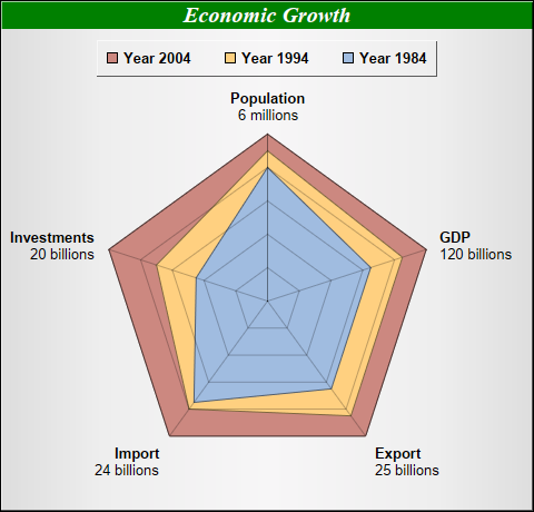
This example demonstrates a stacked radar chart.
This example is similar to the previous Multi-Radar Chart example, except the data are stacked before passing to ChartDirector.
ChartDirector 7.0 (ASP/COM/VB Edition)
Stacked Radar Chart
Source Code Listing
<%@ language="vbscript" %>
<%
Set cd = CreateObject("ChartDirector.API")

' The data for the chart
data0 = Array(100, 100, 100, 100, 100)
data1 = Array(90, 85, 85, 80, 70)
data2 = Array(80, 65, 65, 75, 45)

' The labels for the chart
labels = Array("Population<*br*><*font=Arial*>6 millions", "GDP<*br*><*font=Arial*>120 billions", _
    "Export<*br*><*font=Arial*>25 billions", "Import<*br*><*font=Arial*>24 billions", _
    "Investments<*br*><*font=Arial*>20 billions")

' Create a PolarChart object of size 480 x 460 pixels. Set background color to silver, with 1 pixel
' 3D border effect
Set c = cd.PolarChart(480, 460, cd.silverColor(), &H000000, 1)

' Add a title to the chart using 15pt Times Bold Italic font. The title text is white (ffffff) on a
' deep green (008000) background
Call c.addTitle("Economic Growth", "Times New Roman Bold Italic", 15, &Hffffff).setBackground( _
    &H008000)

' Set plot area center at (240, 270), with 150 pixels radius
Call c.setPlotArea(240, 270, 150)

' Use 1 pixel width semi-transparent black (c0000000) lines as grid lines
Call c.setGridColor(&Hc0000000, 1, &Hc0000000, 1)

' Add a legend box at top-center of plot area (240, 35) using horizontal layout. Use 10pt Arial Bold
' font, with silver background and 1 pixel 3D border effect.
Set b = c.addLegend(240, 35, False, "Arial Bold", 10)
Call b.setAlignment(cd.TopCenter)
Call b.setBackground(cd.silverColor(), cd.Transparent, 1)

' Add area layers of different colors to represent the data
Call c.addAreaLayer(data0, &Hcc8880, "Year 2004")
Call c.addAreaLayer(data1, &Hffd080, "Year 1994")
Call c.addAreaLayer(data2, &Ha0bce0, "Year 1984")

' Set the labels to the angular axis as spokes.
Call c.angularAxis().setLabels(labels)

' Set radial axis from 0 - 100 with a tick every 20 units
Call c.radialAxis().setLinearScale(0, 100, 20)

' Just show the radial axis as a grid line. Hide the axis labels by setting the label color to
' Transparent
Call c.radialAxis().setColors(&Hc0000000, cd.Transparent)

' Output the chart
Set viewer = cd.WebChartViewer(Request, "chart1")
Call viewer.setChart(c, cd.SVG)

' Include tool tip for the chart
viewer.ImageMap = c.getHTMLImageMap("", "", "title='Current {label}: {value}% in {dataSetName}'")
%>

<!DOCTYPE html>
<html>
<head>
    <title>Stacked Radar Chart</title>
    <!-- Include ChartDirector Javascript Library to support chart interactions -->
    <script type="text/javascript" src="cdjcv.js"></script>
</head>
<body style="margin:5px 0px 0px 5px">
    <div style="font:bold 18pt verdana;">
        Stacked Radar Chart
    </div>
    <hr style="border:solid 1px #000080; background:#000080" />
    <div style="font:10pt verdana; margin-bottom:1.5em">
        <a href="viewsource.asp?file=<%= Request("SCRIPT_NAME") %>">View Chart Source Code</a>
    </div>
    <!-- ****** Here is the chart image ****** -->
    <%= viewer.renderHTML() %>
</body>
</html>Public Sub createChart(viewer As Object, chartIndex As Integer)
Dim cd As New ChartDirector.API
' The data for the chart
Dim data0()
data0 = Array(100, 100, 100, 100, 100)
Dim data1()
data1 = Array(90, 85, 85, 80, 70)
Dim data2()
data2 = Array(80, 65, 65, 75, 45)
' The labels for the chart
Dim labels()
labels = Array("Population<*br*><*font=arial.ttf*>6 millions", _
"GDP<*br*><*font=arial.ttf*>120 billions", "Export<*br*><*font=arial.ttf*>25 billions", _
"Import<*br*><*font=arial.ttf*>24 billions", _
"Investments<*br*><*font=arial.ttf*>20 billions")
' Create a PolarChart object of size 480 x 460 pixels. Set background color to silver, with 1
' pixel 3D border effect
Dim c As PolarChart
Set c = cd.PolarChart(480, 460, cd.silverColor(), &H000000, 1)
' Add a title to the chart using 15pt Times Bold Italic font. The title text is white (ffffff)
' on a deep green (008000) background
Call c.addTitle("Economic Growth", "timesbi.ttf", 15, &Hffffff).setBackground(&H008000)
' Set plot area center at (240, 270), with 150 pixels radius
Call c.setPlotArea(240, 270, 150)
' Use 1 pixel width semi-transparent black (c0000000) lines as grid lines
Call c.setGridColor(&Hc0000000, 1, &Hc0000000, 1)
' Add a legend box at top-center of plot area (240, 35) using horizontal layout. Use 10pt Arial
' Bold font, with silver background and 1 pixel 3D border effect.
Dim b As LegendBox
Set b = c.addLegend(240, 35, False, "arialbd.ttf", 10)
Call b.setAlignment(cd.TopCenter)
Call b.setBackground(cd.silverColor(), cd.Transparent, 1)
' Add area layers of different colors to represent the data
Call c.addAreaLayer(data0, &Hcc8880, "Year 2004")
Call c.addAreaLayer(data1, &Hffd080, "Year 1994")
Call c.addAreaLayer(data2, &Ha0bce0, "Year 1984")
' Set the labels to the angular axis as spokes.
Call c.angularAxis().setLabels(labels)
' Set radial axis from 0 - 100 with a tick every 20 units
Call c.radialAxis().setLinearScale(0, 100, 20)
' Just show the radial axis as a grid line. Hide the axis labels by setting the label color to
' Transparent
Call c.radialAxis().setColors(&Hc0000000, cd.Transparent)
' Output the chart
Set viewer.Picture = c.makePicture()
'include tool tip for the chart
viewer.ImageMap = c.getHTMLImageMap("clickable", "", _
"title='Current {label}: {value}% in {dataSetName}'")
End Sub