[Windows Forms - C# version] NetWinCharts\CSharpWinCharts\histogram.cs
using System;
using ChartDirector;
namespace CSharpChartExplorer
{
public class histogram : DemoModule
{
//Name of demo module
public string getName() { return "Histogram with Bell Curve"; }
//Number of charts produced in this demo module
public int getNoOfCharts() { return 1; }
//Main code for creating chart.
//Note: the argument chartIndex is unused because this demo only has 1 chart.
public void createChart(WinChartViewer viewer, int chartIndex)
{
//
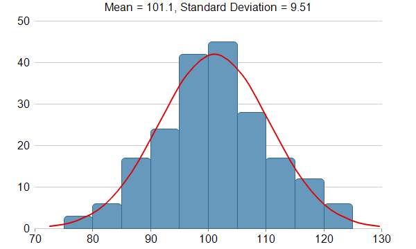
// This example demonstrates creating a histogram with a bell curve from raw data. About
// half of the code is to sort the raw data into slots and to generate the points on the
// bell curve. The remaining half of the code is the actual charting code.
//
// Generate a random guassian distributed data series as the input data for this
// example.
RanSeries r = new RanSeries(66);
double[] samples = r.getGaussianSeries(200, 100, 10);
//
// Classify the numbers into slots. In this example, the slot width is 5 units.
//
double slotSize = 5;
// Compute the min and max values, and extend them to the slot boundary.
ArrayMath m = new ArrayMath(samples);
double minX = (int)(m.min() / slotSize) * slotSize;
double maxX = (int)(m.max() / slotSize) * slotSize + slotSize;
// We can now determine the number of slots
int slotCount = (int)((maxX - minX) / slotSize + 0.5);
double[] frequency = new double[slotCount];
// Count the data points contained in each slot
for(int i = 0; i < samples.Length; ++i) {
int slotIndex = (int)((samples[i] - minX) / slotSize);
frequency[slotIndex] = frequency[slotIndex] + 1;
}
//
// Compute Normal Distribution Curve
//
// The mean and standard deviation of the data
double mean = m.avg();
double stdDev = m.stdDev();
// The normal distribution curve (bell curve) is a standard statistics curve. We need to
// vertically scale it to make it proportion to the frequency count.
double scaleFactor = slotSize * samples.Length / stdDev / Math.Sqrt(2 * 3.1416);
// In this example, we plot the bell curve up to 3 standard deviations.
double stdDevWidth = 3.0;
// We generate 4 points per standard deviation to be joined with a spline curve.
int bellCurveResolution = (int)(stdDevWidth * 4 + 1);
double[] bellCurve = new double[bellCurveResolution];
for(int i = 0; i < bellCurveResolution; ++i) {
double z = 2 * i * stdDevWidth / (bellCurveResolution - 1) - stdDevWidth;
bellCurve[i] = Math.Exp(-z * z / 2) * scaleFactor;
}
//
// At this stage, we have obtained all data and can plot the chart.
//
// Create a XYChart object of size 600 x 360 pixels
XYChart c = new XYChart(600, 360);
// Set the plotarea at (50, 30) and of size 500 x 300 pixels, with transparent
// background and border and light grey (0xcccccc) horizontal grid lines
c.setPlotArea(50, 30, 500, 300, Chart.Transparent, -1, Chart.Transparent, 0xcccccc);
// Display the mean and standard deviation on the chart
c.addTitle("Mean = " + c.formatValue(mean, "{value|1}") + ", Standard Deviation = " +
c.formatValue(stdDev, "{value|2}"), "Arial");
// Set the x and y axis label font to 12pt Arial
c.xAxis().setLabelStyle("Arial", 12);
c.yAxis().setLabelStyle("Arial", 12);
// Set the x and y axis stems to transparent, and the x-axis tick color to grey
// (0x888888)
c.xAxis().setColors(Chart.Transparent, Chart.TextColor, Chart.TextColor, 0x888888);
c.yAxis().setColors(Chart.Transparent);
// Draw the bell curve as a spline layer in red (0xdd0000) with 2-pixel line width
SplineLayer bellLayer = c.addSplineLayer(bellCurve, 0xdd0000);
bellLayer.setXData2(mean - stdDevWidth * stdDev, mean + stdDevWidth * stdDev);
bellLayer.setLineWidth(2);
// No tooltip is needed for the spline layer
bellLayer.setHTMLImageMap("{disable}");
// Draw the histogram as bars in blue (0x6699bb) with dark blue (0x336688) border
BarLayer histogramLayer = c.addBarLayer(frequency, 0x6699bb);
histogramLayer.setBorderColor(0x336688);
// The center of the bars span from minX + half_bar_width to maxX - half_bar_width
histogramLayer.setXData2(minX + slotSize / 2.0, maxX - slotSize / 2.0);
// Configure the bars to touch each other with no gap in between
histogramLayer.setBarGap(Chart.TouchBar);
// Use rounded corners for decoration
histogramLayer.setRoundedCorners();
// Tool tip for the histogram
histogramLayer.setHTMLImageMap("", "", "title='{value}'");
// ChartDirector by default will extend the x-axis scale by 0.5 unit to cater for the
// bar width. It is because a bar plotted at x actually occupies (x +/- half_bar_width),
// and the bar width is normally 1 for label based x-axis. However, this chart is using
// a linear x-axis instead of label based. So we disable the automatic extension and add
// a dummy layer to extend the x-axis scale to cover minX to maxX.
c.xAxis().setIndent(false);
c.addLineLayer2().setXData(minX, maxX);
// For the automatic y-axis labels, set the minimum spacing to 40 pixels.
c.yAxis().setTickDensity(40);
// Output the chart
viewer.Chart = c;
// Include tool tip for the chart
viewer.ImageMap = c.getHTMLImageMap("clickable");
}
}
}
[Windows Forms - VB Version] NetWinCharts\VBNetWinCharts\histogram.vb
Imports System
Imports Microsoft.VisualBasic
Imports ChartDirector

Public Class histogram
    Implements DemoModule

    'Name of demo module
    Public Function getName() As String Implements DemoModule.getName
        Return "Histogram with Bell Curve"
    End Function

    'Number of charts produced in this demo module
    Public Function getNoOfCharts() As Integer Implements DemoModule.getNoOfCharts
        Return 1
    End Function

    'Main code for creating chart.
    'Note: the argument chartIndex is unused because this demo only has 1 chart.
    Public Sub createChart(viewer As WinChartViewer, chartIndex As Integer) _
        Implements DemoModule.createChart

        '
        ' This example demonstrates creating a histogram with a bell curve from raw data. About half
        ' of the code is to sort the raw data into slots and to generate the points on the bell
        ' curve. The remaining half of the code is the actual charting code.
        '

        ' Generate a random guassian distributed data series as the input data for this example.
        Dim r As RanSeries = New RanSeries(66)
        Dim samples() As Double = r.getGaussianSeries(200, 100, 10)

        '
        ' Classify the numbers into slots. In this example, the slot width is 5 units.
        '
        Dim slotSize As Double = 5

        ' Compute the min and max values, and extend them to the slot boundary.
        Dim m As ArrayMath = New ArrayMath(samples)
        Dim minX As Double = Int(m.min() / slotSize) * slotSize
        Dim maxX As Double = Int(m.max() / slotSize) * slotSize + slotSize

        ' We can now determine the number of slots
        Dim slotCount As Integer = Int((maxX - minX) / slotSize + 0.5)
        Dim frequency(slotCount - 1) As Double

        ' Count the data points contained in each slot
        For i As Integer = 0 To UBound(samples)
            Dim slotIndex As Integer = Int((samples(i) - minX) / slotSize)
            frequency(slotIndex) = frequency(slotIndex) + 1
        Next

        '
        ' Compute Normal Distribution Curve
        '

        ' The mean and standard deviation of the data
        Dim mean As Double = m.avg()
        Dim stdDev As Double = m.stdDev()

        ' The normal distribution curve (bell curve) is a standard statistics curve. We need to
        ' vertically scale it to make it proportion to the frequency count.
        Dim scaleFactor As Double = slotSize * (UBound(samples) + 1) / stdDev / Math.Sqrt(2 * _
            3.1416)

        ' In this example, we plot the bell curve up to 3 standard deviations.
        Dim stdDevWidth As Double = 3.0

        ' We generate 4 points per standard deviation to be joined with a spline curve.
        Dim bellCurveResolution As Integer = Int(stdDevWidth * 4 + 1)
        Dim bellCurve(bellCurveResolution - 1) As Double
        For i As Integer = 0 To bellCurveResolution - 1
            Dim z As Double = 2 * i * stdDevWidth / (bellCurveResolution - 1) - stdDevWidth
            bellCurve(i) = Math.Exp(-z * z / 2) * scaleFactor
        Next

        '
        ' At this stage, we have obtained all data and can plot the chart.
        '

        ' Create a XYChart object of size 600 x 360 pixels
        Dim c As XYChart = New XYChart(600, 360)

        ' Set the plotarea at (50, 30) and of size 500 x 300 pixels, with transparent background and
        ' border and light grey (0xcccccc) horizontal grid lines
        c.setPlotArea(50, 30, 500, 300, Chart.Transparent, -1, Chart.Transparent, &Hcccccc)

        ' Display the mean and standard deviation on the chart

        c.addTitle("Mean = " & c.formatValue(mean, "{value|1}") & ", Standard Deviation = " & _
            c.formatValue(stdDev, "{value|2}"), "Arial")


        ' Set the x and y axis label font to 12pt Arial
        c.xAxis().setLabelStyle("Arial", 12)
        c.yAxis().setLabelStyle("Arial", 12)

        ' Set the x and y axis stems to transparent, and the x-axis tick color to grey (0x888888)
        c.xAxis().setColors(Chart.Transparent, Chart.TextColor, Chart.TextColor, &H888888)
        c.yAxis().setColors(Chart.Transparent)

        ' Draw the bell curve as a spline layer in red (0xdd0000) with 2-pixel line width
        Dim bellLayer As SplineLayer = c.addSplineLayer(bellCurve, &Hdd0000)
        bellLayer.setXData2(mean - stdDevWidth * stdDev, mean + stdDevWidth * stdDev)
        bellLayer.setLineWidth(2)
        ' No tooltip is needed for the spline layer
        bellLayer.setHTMLImageMap("{disable}")

        ' Draw the histogram as bars in blue (0x6699bb) with dark blue (0x336688) border
        Dim histogramLayer As BarLayer = c.addBarLayer(frequency, &H6699bb)
        histogramLayer.setBorderColor(&H336688)
        ' The center of the bars span from minX + half_bar_width to maxX - half_bar_width
        histogramLayer.setXData2(minX + slotSize / 2.0, maxX - slotSize / 2.0)
        ' Configure the bars to touch each other with no gap in between
        histogramLayer.setBarGap(Chart.TouchBar)
        ' Use rounded corners for decoration
        histogramLayer.setRoundedCorners()
        ' Tool tip for the histogram
        histogramLayer.setHTMLImageMap("", "", "title='{value}'")

        ' ChartDirector by default will extend the x-axis scale by 0.5 unit to cater for the bar
        ' width. It is because a bar plotted at x actually occupies (x +/- half_bar_width), and the
        ' bar width is normally 1 for label based x-axis. However, this chart is using a linear
        ' x-axis instead of label based. So we disable the automatic extension and add a dummy layer
        ' to extend the x-axis scale to cover minX to maxX.
        c.xAxis().setIndent(False)
        c.addLineLayer2().setXData(minX, maxX)

        ' For the automatic y-axis labels, set the minimum spacing to 40 pixels.
        c.yAxis().setTickDensity(40)

        ' Output the chart
        viewer.Chart = c

        ' Include tool tip for the chart
        viewer.ImageMap = c.getHTMLImageMap("clickable")

    End Sub

End Class
[WPF - C#] NetWPFCharts\CSharpWPFCharts\histogram.cs
using System;
using ChartDirector;

namespace CSharpWPFCharts
{
    public class histogram : DemoModule
    {
        //Name of demo module
        public string getName() { return "Histogram with Bell Curve"; }

        //Number of charts produced in this demo module
        public int getNoOfCharts() { return 1; }

        //Main code for creating chart.
        //Note: the argument chartIndex is unused because this demo only has 1 chart.
        public void createChart(WPFChartViewer viewer, int chartIndex)
        {
            //
            // This example demonstrates creating a histogram with a bell curve from raw data. About
            // half of the code is to sort the raw data into slots and to generate the points on the
            // bell curve. The remaining half of the code is the actual charting code.
            //

            // Generate a random guassian distributed data series as the input data for this
            // example.
            RanSeries r = new RanSeries(66);
            double[] samples = r.getGaussianSeries(200, 100, 10);

            //
            // Classify the numbers into slots. In this example, the slot width is 5 units.
            //
            double slotSize = 5;

            // Compute the min and max values, and extend them to the slot boundary.
            ArrayMath m = new ArrayMath(samples);
            double minX = (int)(m.min() / slotSize) * slotSize;
            double maxX = (int)(m.max() / slotSize) * slotSize + slotSize;

            // We can now determine the number of slots
            int slotCount = (int)((maxX - minX) / slotSize + 0.5);
            double[] frequency = new double[slotCount];

            // Count the data points contained in each slot
            for(int i = 0; i < samples.Length; ++i) {
                int slotIndex = (int)((samples[i] - minX) / slotSize);
                frequency[slotIndex] = frequency[slotIndex] + 1;
            }

            //
            // Compute Normal Distribution Curve
            //

            // The mean and standard deviation of the data
            double mean = m.avg();
            double stdDev = m.stdDev();

            // The normal distribution curve (bell curve) is a standard statistics curve. We need to
            // vertically scale it to make it proportion to the frequency count.
            double scaleFactor = slotSize * samples.Length / stdDev / Math.Sqrt(2 * 3.1416);

            // In this example, we plot the bell curve up to 3 standard deviations.
            double stdDevWidth = 3.0;

            // We generate 4 points per standard deviation to be joined with a spline curve.
            int bellCurveResolution = (int)(stdDevWidth * 4 + 1);
            double[] bellCurve = new double[bellCurveResolution];
            for(int i = 0; i < bellCurveResolution; ++i) {
                double z = 2 * i * stdDevWidth / (bellCurveResolution - 1) - stdDevWidth;
                bellCurve[i] = Math.Exp(-z * z / 2) * scaleFactor;
            }

            //
            // At this stage, we have obtained all data and can plot the chart.
            //

            // Create a XYChart object of size 600 x 360 pixels
            XYChart c = new XYChart(600, 360);

            // Set the plotarea at (50, 30) and of size 500 x 300 pixels, with transparent
            // background and border and light grey (0xcccccc) horizontal grid lines
            c.setPlotArea(50, 30, 500, 300, Chart.Transparent, -1, Chart.Transparent, 0xcccccc);

            // Display the mean and standard deviation on the chart

            c.addTitle("Mean = " + c.formatValue(mean, "{value|1}") + ", Standard Deviation = " +
                c.formatValue(stdDev, "{value|2}"), "Arial");


            // Set the x and y axis label font to 12pt Arial
            c.xAxis().setLabelStyle("Arial", 12);
            c.yAxis().setLabelStyle("Arial", 12);

            // Set the x and y axis stems to transparent, and the x-axis tick color to grey
            // (0x888888)
            c.xAxis().setColors(Chart.Transparent, Chart.TextColor, Chart.TextColor, 0x888888);
            c.yAxis().setColors(Chart.Transparent);

            // Draw the bell curve as a spline layer in red (0xdd0000) with 2-pixel line width
            SplineLayer bellLayer = c.addSplineLayer(bellCurve, 0xdd0000);
            bellLayer.setXData2(mean - stdDevWidth * stdDev, mean + stdDevWidth * stdDev);
            bellLayer.setLineWidth(2);
            // No tooltip is needed for the spline layer
            bellLayer.setHTMLImageMap("{disable}");

            // Draw the histogram as bars in blue (0x6699bb) with dark blue (0x336688) border
            BarLayer histogramLayer = c.addBarLayer(frequency, 0x6699bb);
            histogramLayer.setBorderColor(0x336688);
            // The center of the bars span from minX + half_bar_width to maxX - half_bar_width
            histogramLayer.setXData2(minX + slotSize / 2.0, maxX - slotSize / 2.0);
            // Configure the bars to touch each other with no gap in between
            histogramLayer.setBarGap(Chart.TouchBar);
            // Use rounded corners for decoration
            histogramLayer.setRoundedCorners();
            // Tool tip for the histogram
            histogramLayer.setHTMLImageMap("", "", "title='{value}'");

            // ChartDirector by default will extend the x-axis scale by 0.5 unit to cater for the
            // bar width. It is because a bar plotted at x actually occupies (x +/- half_bar_width),
            // and the bar width is normally 1 for label based x-axis. However, this chart is using
            // a linear x-axis instead of label based. So we disable the automatic extension and add
            // a dummy layer to extend the x-axis scale to cover minX to maxX.
            c.xAxis().setIndent(false);
            c.addLineLayer2().setXData(minX, maxX);

            // For the automatic y-axis labels, set the minimum spacing to 40 pixels.
            c.yAxis().setTickDensity(40);

            // Output the chart
            viewer.Chart = c;

            // Include tool tip for the chart
            viewer.ImageMap = c.getHTMLImageMap("clickable");
        }
    }
}
[ASP.NET Web Forms - C# version] NetWebCharts\CSharpASP\histogram.aspx
(Click here on how to convert this code to code-behind style.)<%@ Page Language="C#" Debug="true" %>
<%@ Import Namespace="ChartDirector" %>
<%@ Register TagPrefix="chart" Namespace="ChartDirector" Assembly="netchartdir" %>
<!DOCTYPE html>
<script runat="server">
//
// Page Load event handler
//
protected void Page_Load(object sender, EventArgs e)
{
//
// This example demonstrates creating a histogram with a bell curve from raw data. About half of
// the code is to sort the raw data into slots and to generate the points on the bell curve. The
// remaining half of the code is the actual charting code.
//
// Generate a random guassian distributed data series as the input data for this example.
RanSeries r = new RanSeries(66);
double[] samples = r.getGaussianSeries(200, 100, 10);
//
// Classify the numbers into slots. In this example, the slot width is 5 units.
//
double slotSize = 5;
// Compute the min and max values, and extend them to the slot boundary.
ArrayMath m = new ArrayMath(samples);
double minX = (int)(m.min() / slotSize) * slotSize;
double maxX = (int)(m.max() / slotSize) * slotSize + slotSize;
// We can now determine the number of slots
int slotCount = (int)((maxX - minX) / slotSize + 0.5);
double[] frequency = new double[slotCount];
// Count the data points contained in each slot
for(int i = 0; i < samples.Length; ++i) {
int slotIndex = (int)((samples[i] - minX) / slotSize);
frequency[slotIndex] = frequency[slotIndex] + 1;
}
//
// Compute Normal Distribution Curve
//
// The mean and standard deviation of the data
double mean = m.avg();
double stdDev = m.stdDev();
// The normal distribution curve (bell curve) is a standard statistics curve. We need to
// vertically scale it to make it proportion to the frequency count.
double scaleFactor = slotSize * samples.Length / stdDev / Math.Sqrt(2 * 3.1416);
// In this example, we plot the bell curve up to 3 standard deviations.
double stdDevWidth = 3.0;
// We generate 4 points per standard deviation to be joined with a spline curve.
int bellCurveResolution = (int)(stdDevWidth * 4 + 1);
double[] bellCurve = new double[bellCurveResolution];
for(int i = 0; i < bellCurveResolution; ++i) {
double z = 2 * i * stdDevWidth / (bellCurveResolution - 1) - stdDevWidth;
bellCurve[i] = Math.Exp(-z * z / 2) * scaleFactor;
}
//
// At this stage, we have obtained all data and can plot the chart.
//
// Create a XYChart object of size 600 x 360 pixels
XYChart c = new XYChart(600, 360);
// Set the plotarea at (50, 30) and of size 500 x 300 pixels, with transparent background and
// border and light grey (0xcccccc) horizontal grid lines
c.setPlotArea(50, 30, 500, 300, Chart.Transparent, -1, Chart.Transparent, 0xcccccc);
// Display the mean and standard deviation on the chart
c.addTitle("Mean = " + c.formatValue(mean, "{value|1}") + ", Standard Deviation = " +
c.formatValue(stdDev, "{value|2}"), "Arial");
// Set the x and y axis label font to 12pt Arial
c.xAxis().setLabelStyle("Arial", 12);
c.yAxis().setLabelStyle("Arial", 12);
// Set the x and y axis stems to transparent, and the x-axis tick color to grey (0x888888)
c.xAxis().setColors(Chart.Transparent, Chart.TextColor, Chart.TextColor, 0x888888);
c.yAxis().setColors(Chart.Transparent);
// Draw the bell curve as a spline layer in red (0xdd0000) with 2-pixel line width
SplineLayer bellLayer = c.addSplineLayer(bellCurve, 0xdd0000);
bellLayer.setXData2(mean - stdDevWidth * stdDev, mean + stdDevWidth * stdDev);
bellLayer.setLineWidth(2);
// No tooltip is needed for the spline layer
bellLayer.setHTMLImageMap("{disable}");
// Draw the histogram as bars in blue (0x6699bb) with dark blue (0x336688) border
BarLayer histogramLayer = c.addBarLayer(frequency, 0x6699bb);
histogramLayer.setBorderColor(0x336688);
// The center of the bars span from minX + half_bar_width to maxX - half_bar_width
histogramLayer.setXData2(minX + slotSize / 2.0, maxX - slotSize / 2.0);
// Configure the bars to touch each other with no gap in between
histogramLayer.setBarGap(Chart.TouchBar);
// Use rounded corners for decoration
histogramLayer.setRoundedCorners();
// Tool tip for the histogram
histogramLayer.setHTMLImageMap("", "", "title='{value}'");
// ChartDirector by default will extend the x-axis scale by 0.5 unit to cater for the bar width.
// It is because a bar plotted at x actually occupies (x +/- half_bar_width), and the bar width
// is normally 1 for label based x-axis. However, this chart is using a linear x-axis instead of
// label based. So we disable the automatic extension and add a dummy layer to extend the x-axis
// scale to cover minX to maxX.
c.xAxis().setIndent(false);
c.addLineLayer2().setXData(minX, maxX);
// For the automatic y-axis labels, set the minimum spacing to 40 pixels.
c.yAxis().setTickDensity(40);
// Output the chart
WebChartViewer1.Image = c.makeWebImage(Chart.SVG);
// Include tool tip for the chart
WebChartViewer1.ImageMap = c.getHTMLImageMap("");
}
</script>
<html>
<head>
<script type="text/javascript" src="cdjcv.js"></script>
</head>
<body>
<chart:WebChartViewer id="WebChartViewer1" runat="server" />
</body>
</html>
[ASP.NET Web Forms - VB Version] NetWebCharts\VBNetASP\histogram.aspx
(Click here on how to convert this code to code-behind style.)<%@ Page Language="VB" Debug="true" %>
<%@ Import Namespace="ChartDirector" %>
<%@ Register TagPrefix="chart" Namespace="ChartDirector" Assembly="netchartdir" %>
<!DOCTYPE html>
<script runat="server">
'
' Page Load event handler
'
Protected Sub Page_Load(ByVal sender As System.Object, ByVal e As System.EventArgs)
'
' This example demonstrates creating a histogram with a bell curve from raw data. About half of
' the code is to sort the raw data into slots and to generate the points on the bell curve. The
' remaining half of the code is the actual charting code.
'
' Generate a random guassian distributed data series as the input data for this example.
Dim r As RanSeries = New RanSeries(66)
Dim samples() As Double = r.getGaussianSeries(200, 100, 10)
'
' Classify the numbers into slots. In this example, the slot width is 5 units.
'
Dim slotSize As Double = 5
' Compute the min and max values, and extend them to the slot boundary.
Dim m As ArrayMath = New ArrayMath(samples)
Dim minX As Double = Int(m.min() / slotSize) * slotSize
Dim maxX As Double = Int(m.max() / slotSize) * slotSize + slotSize
' We can now determine the number of slots
Dim slotCount As Integer = Int((maxX - minX) / slotSize + 0.5)
Dim frequency(slotCount - 1) As Double
' Count the data points contained in each slot
For i As Integer = 0 To UBound(samples)
Dim slotIndex As Integer = Int((samples(i) - minX) / slotSize)
frequency(slotIndex) = frequency(slotIndex) + 1
Next
'
' Compute Normal Distribution Curve
'
' The mean and standard deviation of the data
Dim mean As Double = m.avg()
Dim stdDev As Double = m.stdDev()
' The normal distribution curve (bell curve) is a standard statistics curve. We need to
' vertically scale it to make it proportion to the frequency count.
Dim scaleFactor As Double = slotSize * (UBound(samples) + 1) / stdDev / Math.Sqrt(2 * 3.1416)
' In this example, we plot the bell curve up to 3 standard deviations.
Dim stdDevWidth As Double = 3.0
' We generate 4 points per standard deviation to be joined with a spline curve.
Dim bellCurveResolution As Integer = Int(stdDevWidth * 4 + 1)
Dim bellCurve(bellCurveResolution - 1) As Double
For i As Integer = 0 To bellCurveResolution - 1
Dim z As Double = 2 * i * stdDevWidth / (bellCurveResolution - 1) - stdDevWidth
bellCurve(i) = Math.Exp(-z * z / 2) * scaleFactor
Next
'
' At this stage, we have obtained all data and can plot the chart.
'
' Create a XYChart object of size 600 x 360 pixels
Dim c As XYChart = New XYChart(600, 360)
' Set the plotarea at (50, 30) and of size 500 x 300 pixels, with transparent background and
' border and light grey (0xcccccc) horizontal grid lines
c.setPlotArea(50, 30, 500, 300, Chart.Transparent, -1, Chart.Transparent, &Hcccccc)
' Display the mean and standard deviation on the chart
c.addTitle("Mean = " & c.formatValue(mean, "{value|1}") & ", Standard Deviation = " & _
c.formatValue(stdDev, "{value|2}"), "Arial")
' Set the x and y axis label font to 12pt Arial
c.xAxis().setLabelStyle("Arial", 12)
c.yAxis().setLabelStyle("Arial", 12)
' Set the x and y axis stems to transparent, and the x-axis tick color to grey (0x888888)
c.xAxis().setColors(Chart.Transparent, Chart.TextColor, Chart.TextColor, &H888888)
c.yAxis().setColors(Chart.Transparent)
' Draw the bell curve as a spline layer in red (0xdd0000) with 2-pixel line width
Dim bellLayer As SplineLayer = c.addSplineLayer(bellCurve, &Hdd0000)
bellLayer.setXData2(mean - stdDevWidth * stdDev, mean + stdDevWidth * stdDev)
bellLayer.setLineWidth(2)
' No tooltip is needed for the spline layer
bellLayer.setHTMLImageMap("{disable}")
' Draw the histogram as bars in blue (0x6699bb) with dark blue (0x336688) border
Dim histogramLayer As BarLayer = c.addBarLayer(frequency, &H6699bb)
histogramLayer.setBorderColor(&H336688)
' The center of the bars span from minX + half_bar_width to maxX - half_bar_width
histogramLayer.setXData2(minX + slotSize / 2.0, maxX - slotSize / 2.0)
' Configure the bars to touch each other with no gap in between
histogramLayer.setBarGap(Chart.TouchBar)
' Use rounded corners for decoration
histogramLayer.setRoundedCorners()
' Tool tip for the histogram
histogramLayer.setHTMLImageMap("", "", "title='{value}'")
' ChartDirector by default will extend the x-axis scale by 0.5 unit to cater for the bar width.
' It is because a bar plotted at x actually occupies (x +/- half_bar_width), and the bar width
' is normally 1 for label based x-axis. However, this chart is using a linear x-axis instead of
' label based. So we disable the automatic extension and add a dummy layer to extend the x-axis
' scale to cover minX to maxX.
c.xAxis().setIndent(False)
c.addLineLayer2().setXData(minX, maxX)
' For the automatic y-axis labels, set the minimum spacing to 40 pixels.
c.yAxis().setTickDensity(40)
' Output the chart
WebChartViewer1.Image = c.makeWebImage(Chart.SVG)
' Include tool tip for the chart
WebChartViewer1.ImageMap = c.getHTMLImageMap("")
End Sub
</script>
<html>
<head>
<script type="text/javascript" src="cdjcv.js"></script>
</head>
<body>
<chart:WebChartViewer id="WebChartViewer1" runat="server" />
</body>
</html>
[ASP.NET MVC - Controller] NetMvcCharts\Controllers\HistogramController.cs
using System;
using System.Web.Mvc;
using ChartDirector;

namespace NetMvcCharts.Controllers
{
    public class HistogramController : Controller
    {
        //
        // Default Action
        //
        public ActionResult Index()
        {
            ViewBag.Title = "Histogram with Bell Curve";
            createChart(ViewBag.Viewer = new RazorChartViewer(HttpContext, "chart1"));
            return View("~/Views/Shared/ChartView.cshtml");
        }

        //
        // Create chart
        //
        private void createChart(RazorChartViewer viewer)
        {
            //
            // This example demonstrates creating a histogram with a bell curve from raw data. About half
            // of the code is to sort the raw data into slots and to generate the points on the bell
            // curve. The remaining half of the code is the actual charting code.
            //

            // Generate a random guassian distributed data series as the input data for this example.
            RanSeries r = new RanSeries(66);
            double[] samples = r.getGaussianSeries(200, 100, 10);

            //
            // Classify the numbers into slots. In this example, the slot width is 5 units.
            //
            double slotSize = 5;

            // Compute the min and max values, and extend them to the slot boundary.
            ArrayMath m = new ArrayMath(samples);
            double minX = (int)(m.min() / slotSize) * slotSize;
            double maxX = (int)(m.max() / slotSize) * slotSize + slotSize;

            // We can now determine the number of slots
            int slotCount = (int)((maxX - minX) / slotSize + 0.5);
            double[] frequency = new double[slotCount];

            // Count the data points contained in each slot
            for(int i = 0; i < samples.Length; ++i) {
                int slotIndex = (int)((samples[i] - minX) / slotSize);
                frequency[slotIndex] = frequency[slotIndex] + 1;
            }

            //
            // Compute Normal Distribution Curve
            //

            // The mean and standard deviation of the data
            double mean = m.avg();
            double stdDev = m.stdDev();

            // The normal distribution curve (bell curve) is a standard statistics curve. We need to
            // vertically scale it to make it proportion to the frequency count.
            double scaleFactor = slotSize * samples.Length / stdDev / Math.Sqrt(2 * 3.1416);

            // In this example, we plot the bell curve up to 3 standard deviations.
            double stdDevWidth = 3.0;

            // We generate 4 points per standard deviation to be joined with a spline curve.
            int bellCurveResolution = (int)(stdDevWidth * 4 + 1);
            double[] bellCurve = new double[bellCurveResolution];
            for(int i = 0; i < bellCurveResolution; ++i) {
                double z = 2 * i * stdDevWidth / (bellCurveResolution - 1) - stdDevWidth;
                bellCurve[i] = Math.Exp(-z * z / 2) * scaleFactor;
            }

            //
            // At this stage, we have obtained all data and can plot the chart.
            //

            // Create a XYChart object of size 600 x 360 pixels
            XYChart c = new XYChart(600, 360);

            // Set the plotarea at (50, 30) and of size 500 x 300 pixels, with transparent background and
            // border and light grey (0xcccccc) horizontal grid lines
            c.setPlotArea(50, 30, 500, 300, Chart.Transparent, -1, Chart.Transparent, 0xcccccc);

            // Display the mean and standard deviation on the chart

            c.addTitle("Mean = " + c.formatValue(mean, "{value|1}") + ", Standard Deviation = " +
                c.formatValue(stdDev, "{value|2}"), "Arial");


            // Set the x and y axis label font to 12pt Arial
            c.xAxis().setLabelStyle("Arial", 12);
            c.yAxis().setLabelStyle("Arial", 12);

            // Set the x and y axis stems to transparent, and the x-axis tick color to grey (0x888888)
            c.xAxis().setColors(Chart.Transparent, Chart.TextColor, Chart.TextColor, 0x888888);
            c.yAxis().setColors(Chart.Transparent);

            // Draw the bell curve as a spline layer in red (0xdd0000) with 2-pixel line width
            SplineLayer bellLayer = c.addSplineLayer(bellCurve, 0xdd0000);
            bellLayer.setXData2(mean - stdDevWidth * stdDev, mean + stdDevWidth * stdDev);
            bellLayer.setLineWidth(2);
            // No tooltip is needed for the spline layer
            bellLayer.setHTMLImageMap("{disable}");

            // Draw the histogram as bars in blue (0x6699bb) with dark blue (0x336688) border
            BarLayer histogramLayer = c.addBarLayer(frequency, 0x6699bb);
            histogramLayer.setBorderColor(0x336688);
            // The center of the bars span from minX + half_bar_width to maxX - half_bar_width
            histogramLayer.setXData2(minX + slotSize / 2.0, maxX - slotSize / 2.0);
            // Configure the bars to touch each other with no gap in between
            histogramLayer.setBarGap(Chart.TouchBar);
            // Use rounded corners for decoration
            histogramLayer.setRoundedCorners();
            // Tool tip for the histogram
            histogramLayer.setHTMLImageMap("", "", "title='{value}'");

            // ChartDirector by default will extend the x-axis scale by 0.5 unit to cater for the bar
            // width. It is because a bar plotted at x actually occupies (x +/- half_bar_width), and the
            // bar width is normally 1 for label based x-axis. However, this chart is using a linear
            // x-axis instead of label based. So we disable the automatic extension and add a dummy layer
            // to extend the x-axis scale to cover minX to maxX.
            c.xAxis().setIndent(false);
            c.addLineLayer2().setXData(minX, maxX);

            // For the automatic y-axis labels, set the minimum spacing to 40 pixels.
            c.yAxis().setTickDensity(40);

            // Output the chart
            viewer.Image = c.makeWebImage(Chart.SVG);

            // Include tool tip for the chart
            viewer.ImageMap = c.getHTMLImageMap("");
        }
    }
}
[ASP.NET MVC - View] NetMvcCharts\Views\Shared\ChartView.cshtml
@{ Layout = null; }

<!DOCTYPE html>

<html>
<head>
    <meta name="viewport" content="width=device-width" />
    <title>@ViewBag.Title</title>
    <style>
        @ViewBag.Style
    </style>
    @Scripts.Render("~/Scripts/cdjcv.js")
</head>
<body style="margin:5px 0px 0px 5px">
    <div style="font:bold 18pt verdana;">
        @ViewBag.Title
    </div>
    <hr style="border:solid 1px #000080; background:#000080" />
    <div>
        @{
            if (ViewBag.Viewer is Array)
            {
                // Display multiple charts
                for (int i = 0; i < ViewBag.Viewer.Length; ++i)
                {
                    @:@Html.Raw(ViewBag.Viewer[i].RenderHTML())
                }
            }
            else
            {
                // Display one chart only
                @:@Html.Raw(ViewBag.Viewer.RenderHTML())
            }
        }
    </div>
</body>
</html>
© 2023 Advanced Software Engineering Limited. All rights reserved.