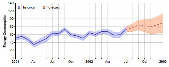
This example demonstrates using x zone colors - colors that change at certain x value thresholds.
In this example, a x zone colors are used as the color of the line, and as the fill color of the band surrounding the line.
The x zone color for the line is configured to change from solid blue color to a red dash line color upon reaching a certain x value threshold. The x zone color for the band is configured to change from semi-transparent blue to semi-transparent red upon reaching the same threshold.
X zone colors are created using
Layer.xZoneColor. You can use a x zone color in any ChartDirector API that expects a color. For instance, you can use a x zone color as background color, fill color of data sets, line color, etc.
A single x zone color can support one threshold value and change between two colors. The two colors can be any colors, including another x zone color. You may create x zone colors with multiple thresholds by cascading multiple x zone colors this way.
perldemo\xzonecolor.pl
#!/usr/bin/perl

# The ChartDirector for Perl module is assumed to be in "../lib"
use File::Basename;
use lib (dirname($0)."/../lib") =~ /(.*)/;

use perlchartdir;

# The data for the chart
my $data = [50, 55, 47, 34, 42, 49, 63, 62, 73, 59, 56, 50, 64, 60, 67, 67, 58, 59, 73, 77, 84, 82,
    80, 84, 89];

# The error data representing the error band around the data points
my $errData = [5, 6, 5.1, 6.5, 6.6, 8, 5.4, 5.1, 4.6, 5.0, 5.2, 6.0, 4.9, 5.6, 4.8, 6.2, 7.4, 7.1,
    6.5, 9.6, 12.1, 15.3, 18.5, 20.9, 24.1];

# The timestamps for the data
my $labels = [perlchartdir::chartTime(2001, 1, 1), perlchartdir::chartTime(2001, 2, 1),
    perlchartdir::chartTime(2001, 3, 1), perlchartdir::chartTime(2001, 4, 1),
    perlchartdir::chartTime(2001, 5, 1), perlchartdir::chartTime(2001, 6, 1),
    perlchartdir::chartTime(2001, 7, 1), perlchartdir::chartTime(2001, 8, 1),
    perlchartdir::chartTime(2001, 9, 1), perlchartdir::chartTime(2001, 10, 1),
    perlchartdir::chartTime(2001, 11, 1), perlchartdir::chartTime(2001, 12, 1),
    perlchartdir::chartTime(2002, 1, 1), perlchartdir::chartTime(2002, 2, 1),
    perlchartdir::chartTime(2002, 3, 1), perlchartdir::chartTime(2002, 4, 1),
    perlchartdir::chartTime(2002, 5, 1), perlchartdir::chartTime(2002, 6, 1),
    perlchartdir::chartTime(2002, 7, 1), perlchartdir::chartTime(2002, 8, 1),
    perlchartdir::chartTime(2002, 9, 1), perlchartdir::chartTime(2002, 10, 1),
    perlchartdir::chartTime(2002, 11, 1), perlchartdir::chartTime(2002, 12, 1),
    perlchartdir::chartTime(2003, 1, 1)];

# Create a XYChart object of size 550 x 220 pixels
my $c = new XYChart(550, 220);

# Set the plot area at (50, 10) and of size 480 x 180 pixels. Enabled both vertical and horizontal
# grids by setting their colors to light grey (cccccc)
$c->setPlotArea(50, 10, 480, 180)->setGridColor(0xcccccc, 0xcccccc);

# Add a legend box (50, 10) (top of plot area) using horizontal layout. Use 8pt Arial font. Disable
# bounding box (set border to transparent).
my $legendBox = $c->addLegend(50, 10, 0, "", 8);
$legendBox->setBackground($perlchartdir::Transparent);

# Add keys to the legend box to explain the color zones
$legendBox->addKey("Historical", 0x9999ff);
$legendBox->addKey("Forecast", 0xff9966);

# Add a title to the y axis.
$c->yAxis()->setTitle("Energy Consumption");

# Set the labels on the x axis
$c->xAxis()->setLabels2($labels);

# Set multi-style axis label formatting. Use Arial Bold font for yearly labels and display them as
# "yyyy". Use default font for monthly labels and display them as "mmm". Replace some labels with
# minor ticks to ensure the labels are at least 3 units apart.
$c->xAxis()->setMultiFormat(perlchartdir::StartOfYearFilter(), "<*font=Arial Bold*>{value|yyyy}",
    perlchartdir::StartOfMonthFilter(), "{value|mmm}", 3);

# Add a line layer to the chart
my $layer = $c->addLineLayer2();

# Create the color to draw the data line. The line is blue (0x333399) to the left of x = 18, and
# become a red (0xd04040) dash line to the right of x = 18.
my $lineColor = $layer->xZoneColor(18, 0x333399, $c->dashLineColor(0xd04040, $perlchartdir::DashLine
    ));

# Add the data line
$layer->addDataSet($data, $lineColor);

# Create the color to draw the err zone. The color is semi-transparent blue (0x809999ff) to the left
# of x = 18, and become semi-transparent red (0x80ff9966) to the right of x = 18.
my $errColor = $layer->xZoneColor(18, 0x809999ff, 0x80ff9966);

# Add the upper border of the err zone
$layer->addDataSet(new ArrayMath($data)->add($errData)->result(), $errColor);

# Add the lower border of the err zone
$layer->addDataSet(new ArrayMath($data)->sub($errData)->result(), $errColor);

# Set the default line width to 2 pixels
$layer->setLineWidth(2);

# Color the region between the err zone lines
$c->addInterLineLayer($layer->getLine(1), $layer->getLine(2), $errColor);

# Output the chart
$c->makeChart("xzonecolor.png");
© 2021 Advanced Software Engineering Limited. All rights reserved.