This example extends the
Simple Bar Chart (1) example by including bar labels on the bars, and decorating the bars with rounded corners and gradient shading.
pythondemo\barlabel.py
#!/usr/bin/python
# The ChartDirector for Python module is assumed to be in "../lib"
import sys, os
sys.path.insert(0, os.path.join(os.path.abspath(sys.path[0]), "..", "lib"))
from pychartdir import *
# The data for the bar chart
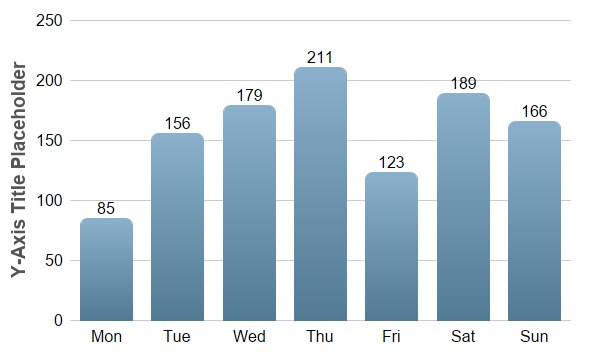
data = [85, 156, 179, 211, 123, 189, 166]
# The labels for the bar chart
labels = ["Mon", "Tue", "Wed", "Thu", "Fri", "Sat", "Sun"]
# Create a XYChart object of size 600 x 360 pixels
c = XYChart(600, 360)
# Set the plotarea at (70, 20) and of size 500 x 300 pixels, with transparent background and border
# and light grey (0xcccccc) horizontal grid lines
c.setPlotArea(70, 20, 500, 300, Transparent, -1, Transparent, 0xcccccc)
# Set the x and y axis stems to transparent and the label font to 12pt Arial
c.xAxis().setColors(Transparent)
c.yAxis().setColors(Transparent)
c.xAxis().setLabelStyle("Arial", 12)
c.yAxis().setLabelStyle("Arial", 12)
# Add a blue (0x6699bb) bar chart layer using the given data
layer = c.addBarLayer(data, 0x6699bb)
# Use bar gradient lighting with the light intensity from 0.8 to 1.3
layer.setBorderColor(Transparent, barLighting(0.8, 1.3))
# Set rounded corners for bars
layer.setRoundedCorners()
# Display labela on top of bars using 12pt Arial font
layer.setAggregateLabelStyle("Arial", 12)
# Set the labels on the x axis.
c.xAxis().setLabels(labels)
# For the automatic y-axis labels, set the minimum spacing to 40 pixels.
c.yAxis().setTickDensity(40)
# Add a title to the y axis using dark grey (0x555555) 14pt Arial Bold font
c.yAxis().setTitle("Y-Axis Title Placeholder", "Arial Bold", 14, 0x555555)
# Output the chart
c.makeChart("barlabel.png")
© 2021 Advanced Software Engineering Limited. All rights reserved.