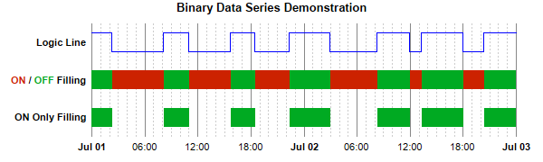
pythondemo\binaryseries.py
#!/usr/bin/python

# The ChartDirector for Python module is assumed to be in "../lib"
import sys, os
sys.path.insert(0, os.path.join(os.path.abspath(sys.path[0]), "..", "lib"))

from pychartdir import *

# The data for the chart
dataY = [1, 0, 1, 0, 1, 0, 1, 0, 1, 0, 1, 0, 1, 1]
dataX = [chartTime(2008, 7, 1, 0, 0, 0), chartTime(2008, 7, 1, 2, 17, 2), chartTime(2008, 7, 1, 8,
    5, 30), chartTime(2008, 7, 1, 10, 54, 10), chartTime(2008, 7, 1, 15, 40, 0), chartTime(2008, 7,
    1, 18, 22, 20), chartTime(2008, 7, 1, 22, 17, 14), chartTime(2008, 7, 2, 2, 55, 50), chartTime(
    2008, 7, 2, 8, 17, 14), chartTime(2008, 7, 2, 11, 55, 50), chartTime(2008, 7, 2, 13, 17, 14),
    chartTime(2008, 7, 2, 17, 55, 50), chartTime(2008, 7, 2, 20, 17, 14), chartTime(2008, 7, 3, 0,
    0, 0)]

# In this example, we only use position 1, 3, 5 for the data series. Positions 0, 2, 4, 6 are empty
# and serve as gaps.
labels = ["", "ON Only Filling", "",
    "<*font,color=cc2200*>ON<*/font*> / <*font,color=00aa22*>OFF<*/font*> Filling", "",
    "Logic Line", ""]

# Create a XYChart object of size 600 x 180 pixels
c = XYChart(600, 180)

# Add a title to the chart using 10 points Arial Bold font. Set top/bottom margins to 12 pixels.
title = c.addTitle("Binary Data Series Demonstration", "Arial Bold", 10)

# Tentatively set the plotarea at (100, 30) and of size 470 x 120 pixels. Use transparent border.
# Use grey (888888) solid line and light grey (ccccc) dotted line as major and minor vertical grid
# lines.
c.setPlotArea(100, 30, 470, 120, -1, -1, Transparent).setGridColor(Transparent, 0x888888,
    Transparent, c.dashLineColor(0xcccccc, DotLine))

# Set axes to transparent
c.xAxis().setColors(Transparent)
c.yAxis().setColors(Transparent)

# Set the y axis labels
c.yAxis().setLabels(labels)

# Set y-axis label style to 8pt Arial Bold
c.yAxis().setLabelStyle("Arial Bold", 8)

# Set x-axis major and minor tick density to 50 and 5 pixels. ChartDirector auto-scaling will use
# this as the guideline when putting ticks on the x-axis.
c.xAxis().setTickDensity(50, 5)

# Use "<*font=Arial Bold*>{value|mmm dd}" for the first label of an hour, and "{value|hh:nn}" for
# all other labels.
c.xAxis().setMultiFormat(StartOfDayFilter(), "<*font=Arial Bold*>{value|mmm dd}", AllPassFilter(),
    "{value|hh:nn}")

#
# A Logic Line can be achieved using a StepLineLayer in ChartDirector
#

# Shift the data by 4.5, so instead of 0 - 1, it is now 4.5 to 5.5, or fluctuate around the y = 5
# (Logic Line label) position.
shiftedLine0 = ArrayMath(dataY).add(4.5).result()

# Add step lines using the original and the reversed data
layer0 = c.addStepLineLayer(shiftedLine0, 0x0000ff)
layer0.setXData(dataX)

#
# To perform ON/OFF filling, we draw the logic line, and its reverse, and fill the region in between
#

# Shift the data by 2.5, so instead of 0 - 1, it is now 2.5 to 3.5, or fluctuate around the y = 3
# (ON/OFF Filing label) position.
shiftedLine1 = ArrayMath(dataY).add(2.5).result()
# Reverse the data, so the 0 becomes 1 and 1 becomes 0, and shift it as well.
reverseShiftedLine1 = ArrayMath(dataY).mul(-1).add(3.5).result()

# Add step lines using the original and the reversed data
layer1 = c.addStepLineLayer(shiftedLine1, Transparent)
layer1.addDataSet(reverseShiftedLine1, Transparent)
layer1.setXData(dataX)

# Fill the region between the two step lines with green (00aa22) or red (cc2200), depending on
# whether the original or the reserve is higher.
c.addInterLineLayer(layer1.getLine(0), layer1.getLine(1), 0x00aa22, 0xcc2200)

#
# The ON Only filling is the same as ON/OFF filling, except the OFF filling color is transparent
#

# Shift the data by 0.5, so instead of 0 - 1, it is now 0.5 to 1.5, or fluctuate around the y = 1
# (ON Only Filing label) position.
shiftedLine2 = ArrayMath(dataY).add(0.5).result()
# Reverse the data, so the 0 becomes 1 and 1 becomes 0, and shift it as well.
reverseShiftedLine2 = ArrayMath(dataY).mul(-1).add(1.5).result()

# Add step lines using the original and the reversed data
layer2 = c.addStepLineLayer(shiftedLine2, Transparent)
layer2.addDataSet(reverseShiftedLine2, Transparent)
layer2.setXData(dataX)

# Fill the region between the two step lines with green (00aa22) or transparent, depending on
# whether the original or the reserve is higher.
c.addInterLineLayer(layer2.getLine(0), layer2.getLine(1), 0x00aa22, Transparent)

# Adjust the plot area size, such that the bounding box (inclusive of axes) is 10 pixels from the
# left edge, 10 pixels  below the title, 30 pixels from the right edge, and 10 pixels above the
# bottom edge.
c.packPlotArea(10, title.getHeight() + 10, c.getWidth() - 30, c.getHeight() - 10)

# Output the chart
c.makeChart("binaryseries.png")
© 2021 Advanced Software Engineering Limited. All rights reserved.