This example extends the
Simple Line Chart example by decorating the chart using a number of chart formatting features.
In this example, random data is used. They are generated using a ChartDirector utility class
RanTable. RanTable simulates a database table with the cells filled with random numbers. The columns of the table can be retrieved as arrays using
RanTable.getCol.
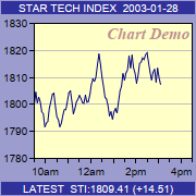
pythondemo\compactline.py
#!/usr/bin/python

# The ChartDirector for Python module is assumed to be in "../lib"
import sys, os
sys.path.insert(0, os.path.join(os.path.abspath(sys.path[0]), "..", "lib"))

from pychartdir import *

#
#    We use a random number generator to simulate the data from 9:30am to 4:30pm with one data point
#    every 4 minutes. The total number of points during that period is 106.  (7 hours x 15
#    points/hour + 1)
#
noOfPoints = 106

# Assume we have not reached the end of the day yet, and only 85 points are available. Create a
# random table object of 1 col x 85 rows, using 9 as seed.
rantable = RanTable(9, 1, 85)

# Set the 1st column to start with 1800 and with random delta from -5 to 5.
rantable.setCol(0, 1800, -5, 5)

# Get the data as the 1st column of the random table
data = rantable.getCol(0)

# The x-axis labels for the chart
labels = ["-", "10am", "-", " ", "-", "12am", "-", " ", "-", "2pm", "-", " ", "-", "4pm", "-"]

#
#    Now we obtain the data into arrays, we can start to draw the chart using ChartDirector
#

# Create a XYChart object of size 180 x 180 pixels with a blue background (0x9c9cce)
c = XYChart(180, 180, 0x9c9cce)

# Add titles to the top and bottom of the chart using 7.5pt Arial font. The text is white 0xffffff
# on a deep blue 0x31319C background.
c.addTitle2(Top, "STAR TECH INDEX  2003-01-28", "Arial", 7.5, 0xffffff, 0x31319c)
c.addTitle2(Bottom, "LATEST  STI:1809.41 (+14.51)", "Arial", 7.5, 0xffffff, 0x31319c)

# Set the plotarea at (31, 21) and of size 145 x 124 pixels, with a pale yellow (0xffffc8)
# background.
c.setPlotArea(31, 21, 145, 124, 0xffffc8)

# Add custom text at (176, 21) (top right corner of plotarea) using 11pt Times Bold Italic font/red
# (0xc09090) color
c.addText(176, 21, "Chart Demo", "Times New Roman Bold Italic", 11, 0xc09090).setAlignment(TopRight)

# Use 7.5pt Arial as the y axis label font
c.yAxis().setLabelStyle("", 7.5)

# Set the labels on the x axis by spreading the labels evenly between the first point (index = 0)
# and the last point (index = noOfPoints - 1)
c.xAxis().setLinearScale(0, noOfPoints - 1, labels)

# Use 7.5pt Arial as the x axis label font
c.xAxis().setLabelStyle("", 7.5)

# Add a deep blue (0x000080) line layer to the chart
c.addLineLayer(data, 0x000080)

# Output the chart
c.makeChart("compactline.png")
© 2021 Advanced Software Engineering Limited. All rights reserved.