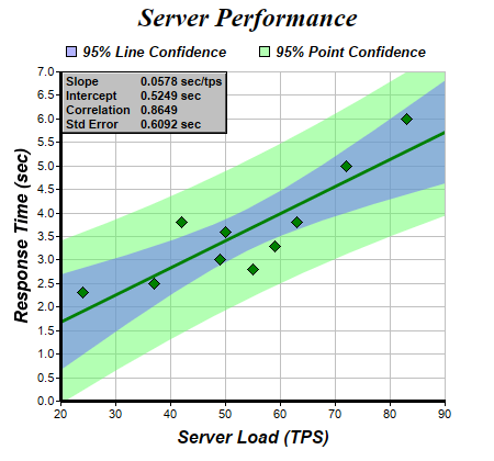
This example demonstrates adding confidence bands to a trend line. It also demonstrates how to display linear regression parameters on the chart.
In linear regression, the data points are assumed to be related by:
y = m * x + c + err
where m and c are constants, and err is a random variable. Linear regression estimates m, c and err based on available data.
As m and c are estimated values, the trend line y = m * x + c may be inaccurate. In ChartDirector, the uncertainties can be represented as a confidence band using
TrendLayer.addConfidenceBand. For example, the 95% confidence band means there are 95% probability that the "real" trend line is in that band.
To predict a data point (infer y given x), we use y = m * x + c + err. As m, c and err are estimated values, the predicted data point may be inaccurate. In ChartDirector, the uncertainties can be represented as a prediction band using
TrendLayer.addPredictionBand.
Note that the prediction band is always wider than the confidence band because of the extra uncertainties contributed by the err term.
In ChartDirector, the linear regression parameters slope, intercept, correlation coefficient and standard error can be obtained by using
TrendLayer.getSlope,
TrendLayer.getIntercept,
TrendLayer.getCorrelation and
TrendLayer.getStdError. (Please refer to appropriate statistics text books for explanation of these values.)
In this example, the linear regression parameters are formatted into a table using
CDML, which is then added to the chart as custom text box using
BaseChart.addText.
pythondemo\confidenceband.py
#!/usr/bin/python

# The ChartDirector for Python module is assumed to be in "../lib"
import sys, os
sys.path.insert(0, os.path.join(os.path.abspath(sys.path[0]), "..", "lib"))

from pychartdir import *

# The XY data of the first data series
dataX = [50, 55, 37, 24, 42, 49, 63, 72, 83, 59]
dataY = [3.6, 2.8, 2.5, 2.3, 3.8, 3.0, 3.8, 5.0, 6.0, 3.3]

# Create a XYChart object of size 450 x 420 pixels
c = XYChart(450, 420)

# Set the plotarea at (55, 65) and of size 350 x 300 pixels, with white background and a light grey
# border (0xc0c0c0). Turn on both horizontal and vertical grid lines with light grey color
# (0xc0c0c0)
c.setPlotArea(55, 65, 350, 300, 0xffffff, -1, 0xc0c0c0, 0xc0c0c0, -1)

# Add a title to the chart using 18 point Times Bold Itatic font.
c.addTitle("Server Performance", "Times New Roman Bold Italic", 18)

# Add titles to the axes using 12pt Arial Bold Italic font
c.yAxis().setTitle("Response Time (sec)", "Arial Bold Italic", 12)
c.xAxis().setTitle("Server Load (TPS)", "Arial Bold Italic", 12)

# Set the axes line width to 3 pixels
c.yAxis().setWidth(3)
c.xAxis().setWidth(3)

# Add a scatter layer using (dataX, dataY)
c.addScatterLayer(dataX, dataY, "", DiamondSymbol, 11, 0x008000)

# Add a trend line layer for (dataX, dataY)
trendLayer = c.addTrendLayer2(dataX, dataY, 0x008000)

# Set the line width to 3 pixels
trendLayer.setLineWidth(3)

# Add a 95% confidence band for the line
trendLayer.addConfidenceBand(0.95, 0x806666ff)

# Add a 95% confidence band (prediction band) for the points
trendLayer.addPredictionBand(0.95, 0x8066ff66)

# Add a legend box at (50, 30) (top of the chart) with horizontal layout. Use 10pt Arial Bold Italic
# font. Set the background and border color to Transparent.
legendBox = c.addLegend(50, 30, 0, "Arial Bold Italic", 10)
legendBox.setBackground(Transparent)

# Add entries to the legend box
legendBox.addKey("95% Line Confidence", 0x806666ff)
legendBox.addKey("95% Point Confidence", 0x8066ff66)

# Display the trend line parameters as a text table formatted using CDML
textbox = c.addText(56, 65,
    "<*block*>Slope\nIntercept\nCorrelation\nStd Error<*/*>   <*block*>%.4f sec/tps\n%.4f sec\n" \
    "%.4f\n%.4f sec<*/*>" % (trendLayer.getSlope(), trendLayer.getIntercept(),
    trendLayer.getCorrelation(), trendLayer.getStdError()), "Arial Bold", 8)

# Set the background of the text box to light grey, with a black border, and 1 pixel 3D border
textbox.setBackground(0xc0c0c0, 0, 1)

# Output the chart
c.makeChart("confidenceband.png")
© 2021 Advanced Software Engineering Limited. All rights reserved.