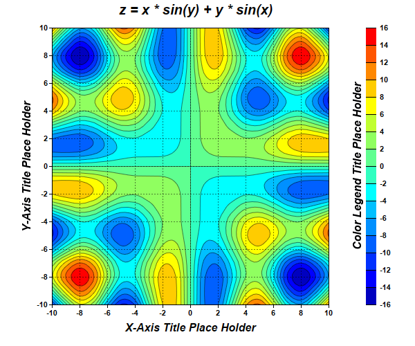
This example demonstrates creating a contour chart.
pythondemo\contour.py
#!/usr/bin/python

# The ChartDirector for Python module is assumed to be in "../lib"
import sys, os
sys.path.insert(0, os.path.join(os.path.abspath(sys.path[0]), "..", "lib"))

from pychartdir import *
import math

# The x and y coordinates of the grid
dataX = [-10, -9, -8, -7, -6, -5, -4, -3, -2, -1, 0, 1, 2, 3, 4, 5, 6, 7, 8, 9, 10]
dataY = [-10, -9, -8, -7, -6, -5, -4, -3, -2, -1, 0, 1, 2, 3, 4, 5, 6, 7, 8, 9, 10]

# The values at the grid points. In this example, we will compute the values using the formula z = x
# * sin(y) + y * sin(x).
dataZ = [0] * (len(dataX) * len(dataY))
for yIndex in range(0, len(dataY)) :
    y = dataY[yIndex]
    for xIndex in range(0, len(dataX)) :
        x = dataX[xIndex]
        dataZ[yIndex * len(dataX) + xIndex] = x * math.sin(y) + y * math.sin(x)

# Create a XYChart object of size 600 x 500 pixels
c = XYChart(600, 500)

# Add a title to the chart using 15 points Arial Bold Italic font
c.addTitle("z = x * sin(y) + y * sin(x)      ", "Arial Bold Italic", 15)

# Set the plotarea at (75, 40) and of size 400 x 400 pixels. Use semi-transparent black (80000000)
# dotted lines for both horizontal and vertical grid lines
c.setPlotArea(75, 40, 400, 400, -1, -1, -1, c.dashLineColor(0x80000000, DotLine), -1)

# Set x-axis and y-axis title using 12 points Arial Bold Italic font
c.xAxis().setTitle("X-Axis Title Place Holder", "Arial Bold Italic", 12)
c.yAxis().setTitle("Y-Axis Title Place Holder", "Arial Bold Italic", 12)

# Set x-axis and y-axis labels to use Arial Bold font
c.xAxis().setLabelStyle("Arial Bold")
c.yAxis().setLabelStyle("Arial Bold")

# When auto-scaling, use tick spacing of 40 pixels as a guideline
c.yAxis().setTickDensity(40)
c.xAxis().setTickDensity(40)

# Add a contour layer using the given data
layer = c.addContourLayer(dataX, dataY, dataZ)

# Move the grid lines in front of the contour layer
c.getPlotArea().moveGridBefore(layer)

# Add a color axis (the legend) in which the top left corner is anchored at (505, 40). Set the
# length to 400 pixels and the labels on the right side.
cAxis = layer.setColorAxis(505, 40, TopLeft, 400, Right)

# Add a title to the color axis using 12 points Arial Bold Italic font
cAxis.setTitle("Color Legend Title Place Holder", "Arial Bold Italic", 12)

# Set color axis labels to use Arial Bold font
cAxis.setLabelStyle("Arial Bold")

# Output the chart
c.makeChart("contour.png")
© 2021 Advanced Software Engineering Limited. All rights reserved.