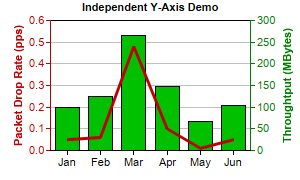
This example demonstrates a chart with two independent y-axis.
ChartDirector supports arbitrary number of axes. The first two x and y axes are most commonly used and can be retrieved using
XYChart.xAxis,
XYChart.xAxis2,
XYChart.yAxis and
XYChart.yAxis2. These axes are by default put at the edges of the plot area.
By default, a data set will bind to the primary y-axis. This can be modified by using
DataSet.setUseYAxis or
DataSet.setUseYAxis2.
The y-axes in this example are of different colors. This is achieved by using
Axis.setColors.
pythondemo\dualyaxis.py
#!/usr/bin/python

# The ChartDirector for Python module is assumed to be in "../lib"
import sys, os
sys.path.insert(0, os.path.join(os.path.abspath(sys.path[0]), "..", "lib"))

from pychartdir import *

# The data for the chart
data0 = [0.05, 0.06, 0.48, 0.1, 0.01, 0.05]
data1 = [100, 125, 265, 147, 67, 105]
labels = ["Jan", "Feb", "Mar", "Apr", "May", "Jun"]

# Create a XYChart object of size 300 x 180 pixels
c = XYChart(300, 180)

# Set the plot area at (50, 20) and of size 200 x 130 pixels
c.setPlotArea(50, 20, 200, 130)

# Add a title to the chart using 8pt Arial Bold font
c.addTitle("Independent Y-Axis Demo", "Arial Bold", 8)

# Set the labels on the x axis.
c.xAxis().setLabels(labels)

# Add a title to the primary (left) y axis
c.yAxis().setTitle("Packet Drop Rate (pps)")

# Set the axis, label and title colors for the primary y axis to red (0xc00000) to match the first
# data set
c.yAxis().setColors(0xc00000, 0xc00000, 0xc00000)

# Add a title to the secondary (right) y axis
c.yAxis2().setTitle("Throughtput (MBytes)")

# set the axis, label and title colors for the primary y axis to green (0x008000) to match the
# second data set
c.yAxis2().setColors(0x008000, 0x008000, 0x008000)

# Add a line layer to for the first data set using red (0xc00000) color with a line width to 3
# pixels
c.addLineLayer(data0, 0xc00000).setLineWidth(3)

# Add a bar layer to for the second data set using green (0x00C000) color. Bind the second data set
# to the secondary (right) y axis
c.addBarLayer(data1, 0x00c000).setUseYAxis2()

# Output the chart
c.makeChart("dualyaxis.png")
© 2021 Advanced Software Engineering Limited. All rights reserved.