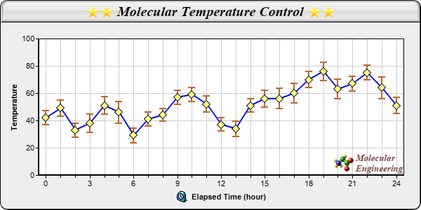
This example demonstrates combining a line layer with a box-whisker layer to draw a line with error symbols.
The blue line and the yellow diamond symbols are from the line layer, created using
XYChart.addLineLayer2,
Layer.addDataSet, and
DataSet.setDataSymbol.
The error symbols come from the box-whisker layer, created using
XYChart.addBoxWhiskerLayer. In this example, the "box" parts of the box- whisker symbols are disabled by setting the data for the box and median to empty arrays. As a result, only the "whisker" parts of the box-whisker symbols are visible and they become the error symbols.
The maximum and minimum marks in this example is computed by adding/subtracting the error value to/from the data value using a ChartDirector utility class
ArrayMath.
pythondemo\errline.py
#!/usr/bin/python

# The ChartDirector for Python module is assumed to be in "../lib"
import sys, os
sys.path.insert(0, os.path.join(os.path.abspath(sys.path[0]), "..", "lib"))

from pychartdir import *

# The data with error information
data = [42, 49, 33, 38, 51, 46, 29, 41, 44, 57, 59, 52, 37, 34, 51, 56, 56, 60, 70, 76, 63, 67, 75,
    64, 51]
errData = [5, 6, 5.1, 6.5, 6.6, 8, 5.4, 5.1, 4.6, 5.0, 5.2, 6.0, 4.9, 5.6, 4.8, 6.2, 7.4, 7.1, 6.0,
    6.6, 7.1, 5.3, 5.5, 7.9, 6.1]

# The labels for the chart
labels = ["0", "1", "2", "3", "4", "5", "6", "7", "8", "9", "10", "11", "12", "13", "14", "15",
    "16", "17", "18", "19", "20", "21", "22", "23", "24"]

# Create a XYChart object of size 600 x 300 pixels, with a light grey (eeeeee) background, black
# border, 1 pixel 3D border effect and rounded corners.
c = XYChart(600, 300, 0xeeeeee, 0x000000, 1)
c.setRoundedFrame()

# Set the plotarea at (55, 55) and of size 520 x 195 pixels, with white (ffffff) background. Set
# horizontal and vertical grid lines to grey (cccccc).
c.setPlotArea(55, 55, 520, 195, 0xffffff, -1, -1, 0xcccccc, 0xcccccc)

# Add a title box to the chart using 15pt Times Bold Italic font. The title is in CDML and includes
# embedded images for highlight. The text is on a light grey (dddddd) background, with glass
# lighting effect.
c.addTitle(
    "<*block,valign=absmiddle*><*img=star.png*><*img=star.png*> Molecular Temperature Control " \
    "<*img=star.png*><*img=star.png*><*/*>", "Times New Roman Bold Italic", 15).setBackground(
    0xdddddd, 0, glassEffect())

# Add a title to the y axis
c.yAxis().setTitle("Temperature")

# Add a title to the x axis using CMDL
c.xAxis().setTitle("<*block,valign=absmiddle*><*img=clock.png*>  Elapsed Time (hour)<*/*>")

# Set the labels on the x axis.
c.xAxis().setLabels(labels)

# Display 1 out of 3 labels on the x-axis. Show minor ticks for remaining labels.
c.xAxis().setLabelStep(3, 1)

# Set the axes width to 2 pixels
c.xAxis().setWidth(2)
c.yAxis().setWidth(2)

# Add a line layer to the chart
lineLayer = c.addLineLayer2()

# Add a blue (0xff) data set to the line layer, with yellow (0xffff80) diamond symbols
lineLayer.addDataSet(data, 0x0000ff).setDataSymbol(DiamondSymbol, 12, 0xffff80)

# Set the line width to 2 pixels
lineLayer.setLineWidth(2)

# Add a box whisker layer to the chart. Use the upper and lower mark of the box whisker layer to act
# as error zones. The upper and lower marks are computed using the ArrayMath object.
errLayer = c.addBoxWhiskerLayer(None, None, ArrayMath(data).add(errData).result(), ArrayMath(data
    ).sub(errData).result(), data, Transparent, 0xbb6633)

# Set the line width to 2 pixels
errLayer.setLineWidth(2)

# Set the error zone to occupy half the space between the symbols
errLayer.setDataGap(0.5)

# Add a custom CDML text at the bottom right of the plot area as the logo
c.addText(575, 247,
    "<*block,valign=absmiddle*><*img=small_molecule.png*> <*block*><*font=Times New Roman Bold " \
    "Italic,size=10,color=804040*>Molecular\nEngineering<*/*>").setAlignment(BottomRight)

# Output the chart
c.makeChart("errline.png")
© 2021 Advanced Software Engineering Limited. All rights reserved.