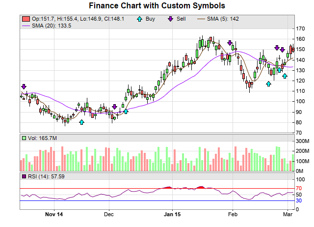
This example demonstrates adding custom symbols to a finance chart.
The custom symbols are achieved by using
XYChart.addScatterLayer to add a scatter layer to the main price chart. The data for the scatter layer is an array of the same length as the timestamps array, which are used to specify the position of the symbols. For trading sessions that do not require symbols,
NoValue can be used as the data value.
The scatter symbols in this example are arrows created with
pychartdir.ArrowShape. Different types of symbols are created using different scatter layers. The arrows are positioned at the high or low values, and shifted upwards or downwards with
DataSet.setSymbolOffset to avoid overlapping with the candlesticks.
pythondemo\financesymbols.py
#!/usr/bin/python

# The ChartDirector for Python module is assumed to be in "../lib"
import sys, os
sys.path.insert(0, os.path.join(os.path.abspath(sys.path[0]), "..", "lib"))

from FinanceChart import *

# Create a finance chart demo containing 100 days of data
noOfDays = 100

# To compute moving averages starting from the first day, we need to get extra data points before
# the first day
extraDays = 30

# In this exammple, we use a random number generator utility to simulate the data. We set up the
# random table to create 6 cols x (noOfDays + extraDays) rows, using 9 as the seed.
rantable = RanTable(9, 6, noOfDays + extraDays)

# Set the 1st col to be the timeStamp, starting from Sep 4, 2014, with each row representing one
# day, and counting week days only (jump over Sat and Sun)
rantable.setDateCol(0, chartTime(2014, 9, 4), 86400, 1)

# Set the 2nd, 3rd, 4th and 5th columns to be high, low, open and close data. The open value starts
# from 100, and the daily change is random from -5 to 5.
rantable.setHLOCCols(1, 100, -5, 5)

# Set the 6th column as the vol data from 5 to 25 million
rantable.setCol(5, 50000000, 250000000)

# Now we read the data from the table into arrays
timeStamps = rantable.getCol(0)
highData = rantable.getCol(1)
lowData = rantable.getCol(2)
openData = rantable.getCol(3)
closeData = rantable.getCol(4)
volData = rantable.getCol(5)

# Custom data series should be of the same length as the OHLC data series
buySignal = [0] * len(closeData)
sellSignal = [0] * len(closeData)

#
# The following is just an arbitrary algorithm to create some meaningless buySignal and sellSignal.
# They are just for demonstrating the charting engine. Please do not use them for actual trading.
#

sma5 = ArrayMath(closeData).movAvg(5).result()
sma20 = ArrayMath(closeData).movAvg(20).result()

for i in range(0, len(sma5)) :
    buySignal[i] = NoValue
    sellSignal[i] = NoValue
    if i > 0 :
        if (sma5[i - 1] <= sma20[i - 1]) and (sma5[i] > sma20[i]) :
            buySignal[i] = lowData[i]
        if (sma5[i - 1] >= sma20[i - 1]) and (sma5[i] < sma20[i]) :
            sellSignal[i] = highData[i]

# Create a FinanceChart object of width 640 pixels
c = FinanceChart(640)

# Add a title to the chart
c.addTitle("Finance Chart with Custom Symbols")

# Set the data into the finance chart object
c.setData(timeStamps, highData, lowData, openData, closeData, volData, extraDays)

# Add the main chart with 240 pixels in height
mainChart = c.addMainChart(240)

# Add buy signal symbols to the main chart, using cyan (0x00ffff) upward pointing arrows as symbols
buyLayer = mainChart.addScatterLayer(None, buySignal, "Buy", ArrowShape(0, 1, 0.4, 0.4), 11,
    0x00ffff)
# Shift the symbol lower by 20 pixels
buyLayer.getDataSet(0).setSymbolOffset(0, 20)

# Add sell signal symbols to the main chart, using purple (0x9900cc) downward pointing arrows as
# symbols
sellLayer = mainChart.addScatterLayer(None, sellSignal, "Sell", ArrowShape(180, 1, 0.4, 0.4), 11,
    0x9900cc)
# Shift the symbol higher by 20 pixels
sellLayer.getDataSet(0).setSymbolOffset(0, -20)

# Add a 5 period simple moving average to the main chart, using brown color
c.addSimpleMovingAvg(5, 0x663300)

# Add a 20 period simple moving average to the main chart, using purple color
c.addSimpleMovingAvg(20, 0x9900ff)

# Add candlestick symbols to the main chart, using green/red for up/down days
c.addCandleStick(0x66ff66, 0xff6666)

# Add a volume indicator chart (75 pixels high) after the main chart, using green/red/grey for
# up/down/flat days
c.addVolIndicator(75, 0x99ff99, 0xff9999, 0x808080)

# Append a 14-days RSI indicator chart (75 pixels high) after the main chart. The main RSI line is
# purple (800080). Set threshold region to +/- 20 (that is, RSI = 50 +/- 25). The upper/lower
# threshold regions will be filled with red (ff0000)/blue (0000ff).
c.addRSI(75, 14, 0x800080, 20, 0xff0000, 0x0000ff)

# Output the chart
c.makeChart("financesymbols.png")
© 2021 Advanced Software Engineering Limited. All rights reserved.