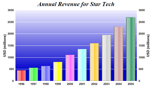
This example demonstrates using glass shading effect for bars and gradient color for plot area background. It also demonstrates axis labels on both sides of the plot area.
Glass lighting is a complex shading effect that gives a look and feel of tinted glass or semi-transparent plastic material. This effect involves glare and variation of lighting caused by reflection and refraction inside the material.
pythondemo\glasslightbar.py
#!/usr/bin/python

# The ChartDirector for Python module is assumed to be in "../lib"
import sys, os
sys.path.insert(0, os.path.join(os.path.abspath(sys.path[0]), "..", "lib"))

from pychartdir import *

# The data for the bar chart
data = [450, 560, 630, 800, 1100, 1350, 1600, 1950, 2300, 2700]

# The labels for the bar chart
labels = ["1996", "1997", "1998", "1999", "2000", "2001", "2002", "2003", "2004", "2005"]

# Create a XYChart object of size 600 x 360 pixels
c = XYChart(600, 360)

# Set the plotarea at (60, 40) and of size 480 x 280 pixels. Use a vertical gradient color from
# light blue (eeeeff) to deep blue (0000cc) as background. Set border and grid lines to white
# (ffffff).
c.setPlotArea(60, 40, 480, 280, c.linearGradientColor(60, 40, 60, 280, 0xeeeeff, 0x0000cc), -1,
    0xffffff, 0xffffff)

# Add a title to the chart using 18pt Times Bold Italic font
c.addTitle("Annual Revenue for Star Tech", "Times New Roman Bold Italic", 18)

# Add a multi-color bar chart layer using the supplied data. Use glass lighting effect with light
# direction from the left.
c.addBarLayer3(data).setBorderColor(Transparent, glassEffect(NormalGlare, Left))

# Set the x axis labels
c.xAxis().setLabels(labels)

# Show the same scale on the left and right y-axes
c.syncYAxis()

# Set the left y-axis and right y-axis title using 10pt Arial Bold font
c.yAxis().setTitle("USD (millions)", "Arial Bold", 10)
c.yAxis2().setTitle("USD (millions)", "Arial Bold", 10)

# Set all axes to transparent
c.xAxis().setColors(Transparent)
c.yAxis().setColors(Transparent)
c.yAxis2().setColors(Transparent)

# Set the label styles of all axes to 8pt Arial Bold font
c.xAxis().setLabelStyle("Arial Bold", 8)
c.yAxis().setLabelStyle("Arial Bold", 8)
c.yAxis2().setLabelStyle("Arial Bold", 8)

# Output the chart
c.makeChart("glasslightbar.png")
© 2021 Advanced Software Engineering Limited. All rights reserved.