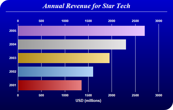
This example demonstrates using bar gradient shading for a horizontal bar chart. It also demonstrates using gradient color background, partially rounded frame, and automatic resizing of the plot area to fit the chart.
pythondemo\gradientbar.py
#!/usr/bin/python

# The ChartDirector for Python module is assumed to be in "../lib"
import sys, os
sys.path.insert(0, os.path.join(os.path.abspath(sys.path[0]), "..", "lib"))

from pychartdir import *

# The data for the bar chart
data = [1350, 1600, 1950, 2300, 2700]

# The labels for the bar chart
labels = ["2001", "2002", "2003", "2004", "2005"]

# The colors for the bars
colors = [0xcc0000, 0x66aaee, 0xeebb22, 0xcccccc, 0xcc88ff]

# Create a PieChart object of size 600 x 380 pixels.
c = XYChart(600, 380)

# Use the white on black palette, which means the default text and line colors are white
c.setColors(whiteOnBlackPalette)

# Use a vertical gradient color from blue (0000cc) to deep blue (000044) as background. Use rounded
# corners of 30 pixels radius for the top-left and bottom-right corners.
c.setBackground(c.linearGradientColor(0, 0, 0, c.getHeight(), 0x0000cc, 0x000044))
c.setRoundedFrame(0xffffff, 30, 0, 30, 0)

# Add a title using 18pt Times New Roman Bold Italic font. Add 6 pixels top and bottom margins to
# the title.
title = c.addTitle("Annual Revenue for Star Tech", "Times New Roman Bold Italic", 18)
title.setMargin2(0, 0, 6, 6)

# Add a separator line in white color just under the title
c.addLine(20, title.getHeight(), c.getWidth() - 21, title.getHeight(), 0xffffff)

# Tentatively set the plotarea at (70, 80) and of 480 x 240 pixels in size. Use transparent border
# and white grid lines
c.setPlotArea(70, 80, 480, 240, -1, -1, Transparent, 0xffffff)

# Swap the axis so that the bars are drawn horizontally
c.swapXY()

# Add a multi-color bar chart layer using the supplied data. Use bar gradient lighting with the
# light intensity from 0.75 to 2.0
c.addBarLayer3(data, colors).setBorderColor(Transparent, barLighting(0.75, 2.0))

# Set the labels on the x axis.
c.xAxis().setLabels(labels)

# Show the same scale on the left and right y-axes
c.syncYAxis()

# Set the bottom y-axis title using 10pt Arial Bold font
c.yAxis().setTitle("USD (millions)", "Arial Bold", 10)

# Set y-axes to transparent
c.yAxis().setColors(Transparent)
c.yAxis2().setColors(Transparent)

# Disable ticks on the x-axis by setting the tick color to transparent
c.xAxis().setTickColor(Transparent)

# Set the label styles of all axes to 8pt Arial Bold font
c.xAxis().setLabelStyle("Arial Bold", 8)
c.yAxis().setLabelStyle("Arial Bold", 8)
c.yAxis2().setLabelStyle("Arial Bold", 8)

# Adjust the plot area size, such that the bounding box (inclusive of axes) is 30 pixels from the
# left edge, 25 pixels below the title, 50 pixels from the right edge, and 25 pixels from the bottom
# edge.
c.packPlotArea(30, title.getHeight() + 25, c.getWidth() - 50, c.getHeight() - 25)

# Output the chart
c.makeChart("gradientbar.png")
© 2021 Advanced Software Engineering Limited. All rights reserved.