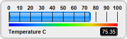
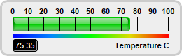
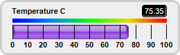
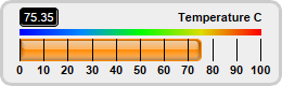
This example demonstrates horizontal bar meters in different orientations.
In a horizontal bar meter, the scale labels can be positioned above the meter scale or below it. This is controlled by the last argument to
LinearMeter.setMeter, which can be
Top or
Bottom,
The title and value readout added using
BaseChart.addText can be put at any position. In this example, we put them at the opposite side to the scale labels.
pythondemo\hbarmeterorientation.py
#!/usr/bin/python

# The ChartDirector for Python module is assumed to be in "../lib"
import sys, os
sys.path.insert(0, os.path.join(os.path.abspath(sys.path[0]), "..", "lib"))

from pychartdir import *

def createChart(chartIndex) :

    # The value to display on the meter
    value = 75.35

    # The bar colors for the meters
    barColor = [0x0088ff, 0x00cc00, 0x8833dd, 0xff8800]

    # Create a LinearMeter object of size 260 x 80 pixels with very light grey (0xeeeeee) backgruond
    # and a light grey (0xccccccc) 3-pixel thick rounded frame
    m = LinearMeter(260, 80, 0xeeeeee, 0xcccccc)
    m.setRoundedFrame(Transparent)
    m.setThickFrame(3)

    # This example demonstrates putting the text labels at the top or bottom. This is by setting the
    # label alignment, as well as the scale, color scale and label positions.
    alignment = [Top, Top, Bottom, Bottom]
    meterYPos = [24, 24, 36, 36]
    labelYPos = [65, 65, 16, 16]
    colorScalePos = [48, 48, 27, 27]

    # Set the scale region
    m.setMeter(18, meterYPos[chartIndex], 222, 20, alignment[chartIndex])

    # Set meter scale from 0 - 100, with a tick every 10 units
    m.setScale(0, 100, 10)

    # Add a 5-pixel thick smooth color scale
    smoothColorScale = [0, 0x0000ff, 25, 0x0088ff, 50, 0x00ff00, 75, 0xdddd00, 100, 0xff0000]
    m.addColorScale(smoothColorScale, colorScalePos[chartIndex], 5)

    # Add a bar from 0 to value with glass effect and 4 pixel rounded corners
    m.addBar(0, value, barColor[chartIndex], glassEffect(NormalGlare, Top), 4)

    #
    # In this example, some charts have the "Temperauture" label on the left side and the value
    # readout on the right side, and some charts have the reverse
    #

    if chartIndex % 2 == 0 :
        # Add a label on the left side using 8pt Arial Bold font
        m.addText(15, labelYPos[chartIndex], "Temperature C", "Arial Bold", 8, TextColor, Left)

        # Add a text box on the right side. Display the value using white (0xffffff) 8pt Arial Bold
        # font on a black (0x000000) background with depressed rounded border.
        t = m.addText(240, labelYPos[chartIndex], m.formatValue(value, "2"), "Arial", 8, 0xffffff,
            Right)
        t.setBackground(0x000000, 0x000000, -1)
        t.setRoundedCorners(3)
    else :
        # Add a label on the right side using 8pt Arial Bold font
        m.addText(243, labelYPos[chartIndex], "Temperature C", "Arial Bold", 8, TextColor, Right)

        # Add a text box on the left side. Display the value using white (0xffffff) 8pt Arial Bold
        # font on a black (0x000000) background with depressed rounded border.
        t = m.addText(18, labelYPos[chartIndex], m.formatValue(value, "2"), "Arial", 8, 0xffffff,
            Left)
        t.setBackground(0x000000, 0x000000, -1)
        t.setRoundedCorners(3)

    # Output the chart
    m.makeChart("hbarmeterorientation%s.png" % chartIndex)


createChart(0)
createChart(1)
createChart(2)
createChart(3)
© 2021 Advanced Software Engineering Limited. All rights reserved.