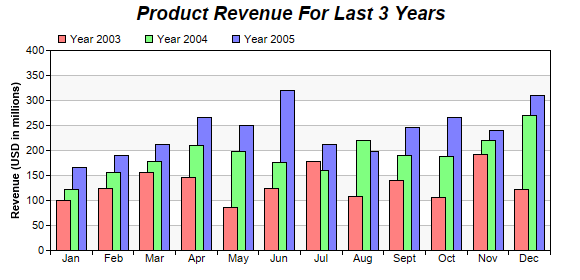
This example demonstrates a multi-bar chart in which the bars within a cluster overlaps.
The overlapping effect is configured using
BarLayer.setOverlapRatio. This method allows you to specify overlapping ratio and order. In this example, the overlapping ratio is 0.5, while the default overlapping order is used. The default order is that the first data set will stay on top of the second data set, and so on.
pythondemo\overlapbar.py
#!/usr/bin/python

# The ChartDirector for Python module is assumed to be in "../lib"
import sys, os
sys.path.insert(0, os.path.join(os.path.abspath(sys.path[0]), "..", "lib"))

from pychartdir import *

# The data for the bar chart
data0 = [100, 125, 156, 147, 87, 124, 178, 109, 140, 106, 192, 122]
data1 = [122, 156, 179, 211, 198, 177, 160, 220, 190, 188, 220, 270]
data2 = [167, 190, 213, 267, 250, 320, 212, 199, 245, 267, 240, 310]
labels = ["Jan", "Feb", "Mar", "Apr", "May", "Jun", "Jul", "Aug", "Sept", "Oct", "Nov", "Dec"]

# Create a XYChart object of size 580 x 280 pixels
c = XYChart(580, 280)

# Add a title to the chart using 14pt Arial Bold Italic font
c.addTitle("Product Revenue For Last 3 Years", "Arial Bold Italic", 14)

# Set the plot area at (50, 50) and of size 500 x 200. Use two alternative background colors (f8f8f8
# and ffffff)
c.setPlotArea(50, 50, 500, 200, 0xf8f8f8, 0xffffff)

# Add a legend box at (50, 25) using horizontal layout. Use 8pt Arial as font, with transparent
# background.
c.addLegend(50, 25, 0, "Arial", 8).setBackground(Transparent)

# Set the x axis labels
c.xAxis().setLabels(labels)

# Draw the ticks between label positions (instead of at label positions)
c.xAxis().setTickOffset(0.5)

# Add a multi-bar layer with 3 data sets
layer = c.addBarLayer2(Side)
layer.addDataSet(data0, 0xff8080, "Year 2003")
layer.addDataSet(data1, 0x80ff80, "Year 2004")
layer.addDataSet(data2, 0x8080ff, "Year 2005")

# Set 50% overlap between bars
layer.setOverlapRatio(0.5)

# Add a title to the y-axis
c.yAxis().setTitle("Revenue (USD in millions)")

# Output the chart
c.makeChart("overlapbar.png")
© 2021 Advanced Software Engineering Limited. All rights reserved.