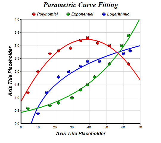
This example demonstrates parametric curve fitting.
In addition to linear regression, ChartDirector also supports polynomial, exponential and logarithmic regression. To create these curves, a
TrendLayer object is created using
XYChart.addTrendLayer, and the regressive type is set using
TrendLayer.setRegressionType.
pythondemo\paramcurve.py
#!/usr/bin/python

# The ChartDirector for Python module is assumed to be in "../lib"
import sys, os
sys.path.insert(0, os.path.join(os.path.abspath(sys.path[0]), "..", "lib"))

from pychartdir import *

# The XY data of the first data series
dataX0 = [10, 35, 17, 4, 22, 29, 45, 52, 63, 39]
dataY0 = [2.0, 3.2, 2.7, 1.2, 2.8, 2.9, 3.1, 3.0, 2.3, 3.3]

# The XY data of the second data series
dataX1 = [30, 35, 17, 4, 22, 59, 43, 52, 63, 39]
dataY1 = [1.0, 1.3, 0.7, 0.6, 0.8, 3.0, 1.8, 2.3, 3.4, 1.5]

# The XY data of the third data series
dataX2 = [28, 35, 15, 10, 22, 60, 46, 64, 39]
dataY2 = [2.0, 2.2, 1.2, 0.4, 1.8, 2.7, 2.4, 2.8, 2.4]

# Create a XYChart object of size 540 x 480 pixels
c = XYChart(540, 480)

# Set the plotarea at (70, 65) and of size 400 x 350 pixels, with white background and a light grey
# border (0xc0c0c0). Turn on both horizontal and vertical grid lines with light grey color
# (0xc0c0c0)
c.setPlotArea(70, 65, 400, 350, 0xffffff, -1, 0xc0c0c0, 0xc0c0c0, -1)

# Add a legend box with the top center point anchored at (270, 30). Use horizontal layout. Use 10pt
# Arial Bold Italic font. Set the background and border color to Transparent.
legendBox = c.addLegend(270, 30, 0, "Arial Bold Italic", 10)
legendBox.setAlignment(TopCenter)
legendBox.setBackground(Transparent, Transparent)

# Add a title to the chart using 18 point Times Bold Itatic font.
c.addTitle("Parametric Curve Fitting", "Times New Roman Bold Italic", 18)

# Add titles to the axes using 12pt Arial Bold Italic font
c.yAxis().setTitle("Axis Title Placeholder", "Arial Bold Italic", 12)
c.xAxis().setTitle("Axis Title Placeholder", "Arial Bold Italic", 12)

# Set the axes line width to 3 pixels
c.yAxis().setWidth(3)
c.xAxis().setWidth(3)

# Add a scatter layer using (dataX0, dataY0)
c.addScatterLayer(dataX0, dataY0, "Polynomial", GlassSphere2Shape, 11, 0xff0000)

# Add a degree 2 polynomial trend line layer for (dataX0, dataY0)
trend0 = c.addTrendLayer2(dataX0, dataY0, 0xff0000)
trend0.setLineWidth(3)
trend0.setRegressionType(PolynomialRegression(2))

# Add a scatter layer for (dataX1, dataY1)
c.addScatterLayer(dataX1, dataY1, "Exponential", GlassSphere2Shape, 11, 0x00aa00)

# Add an exponential trend line layer for (dataX1, dataY1)
trend1 = c.addTrendLayer2(dataX1, dataY1, 0x00aa00)
trend1.setLineWidth(3)
trend1.setRegressionType(ExponentialRegression)

# Add a scatter layer using (dataX2, dataY2)
c.addScatterLayer(dataX2, dataY2, "Logarithmic", GlassSphere2Shape, 11, 0x0000ff)

# Add a logarithmic trend line layer for (dataX2, dataY2)
trend2 = c.addTrendLayer2(dataX2, dataY2, 0x0000ff)
trend2.setLineWidth(3)
trend2.setRegressionType(LogarithmicRegression)

# Output the chart
c.makeChart("paramcurve.png")
© 2021 Advanced Software Engineering Limited. All rights reserved.