This example demonstrates using spline curves to join data points, title with soft lighting effect, as well as a number of chart formatting techniques.
pythondemo\splineline.py
#!/usr/bin/python
# The ChartDirector for Python module is assumed to be in "../lib"
import sys, os
sys.path.insert(0, os.path.join(os.path.abspath(sys.path[0]), "..", "lib"))
from pychartdir import *
# The data for the chart
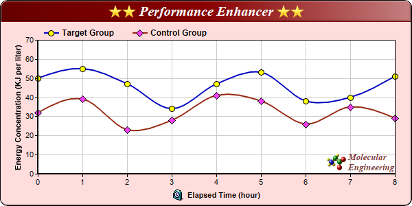
data0 = [32, 39, 23, 28, 41, 38, 26, 35, 29]
data1 = [50, 55, 47, 34, 47, 53, 38, 40, 51]
# The labels for the chart
labels = ["0", "1", "2", "3", "4", "5", "6", "7", "8"]
# Create a XYChart object of size 600 x 300 pixels, with a pale red (ffdddd) background, black
# border, 1 pixel 3D border effect and rounded corners.
c = XYChart(600, 300, 0xffdddd, 0x000000, 1)
c.setRoundedFrame()
# Set the plotarea at (55, 58) and of size 520 x 195 pixels, with white (ffffff) background. Set
# horizontal and vertical grid lines to grey (cccccc).
c.setPlotArea(55, 58, 520, 195, 0xffffff, -1, -1, 0xcccccc, 0xcccccc)
# Add a legend box at (55, 32) (top of the chart) with horizontal layout. Use 9pt Arial Bold font.
# Set the background and border color to Transparent.
c.addLegend(55, 32, 0, "Arial Bold", 9).setBackground(Transparent)
# Add a title box to the chart using 15pt Times Bold Italic font. The title is in CDML and includes
# embedded images for highlight. The text is white (ffffff) on a dark red (880000) background, with
# soft lighting effect from the right side.
c.addTitle(
"<*block,valign=absmiddle*><*img=star.png*><*img=star.png*> Performance Enhancer " \
"<*img=star.png*><*img=star.png*><*/*>", "Times New Roman Bold Italic", 15, 0xffffff
).setBackground(0x880000, -1, softLighting(Right))
# Add a title to the y axis
c.yAxis().setTitle("Energy Concentration (KJ per liter)")
# Set the labels on the x axis
c.xAxis().setLabels(labels)
# Add a title to the x axis using CMDL
c.xAxis().setTitle("<*block,valign=absmiddle*><*img=clock.png*> Elapsed Time (hour)<*/*>")
# Set the axes width to 2 pixels
c.xAxis().setWidth(2)
c.yAxis().setWidth(2)
# Add a spline layer to the chart
layer = c.addSplineLayer()
# Set the default line width to 2 pixels
layer.setLineWidth(2)
# Add a data set to the spline layer, using blue (0000c0) as the line color, with yellow (ffff00)
# circle symbols.
layer.addDataSet(data1, 0x0000c0, "Target Group").setDataSymbol(CircleSymbol, 9, 0xffff00)
# Add a data set to the spline layer, using brown (982810) as the line color, with pink (f040f0)
# diamond symbols.
layer.addDataSet(data0, 0x982810, "Control Group").setDataSymbol(DiamondSymbol, 11, 0xf040f0)
# Add a custom CDML text at the bottom right of the plot area as the logo
c.addText(575, 250,
"<*block,valign=absmiddle*><*img=small_molecule.png*> <*block*><*font=Times New Roman Bold " \
"Italic,size=10,color=804040*>Molecular\nEngineering<*/*>").setAlignment(BottomRight)
# Output the chart
c.makeChart("splineline.png")
© 2021 Advanced Software Engineering Limited. All rights reserved.