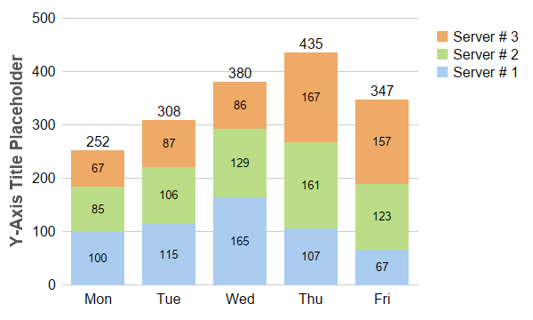
This example demonstrates creating a stacked bar chart, completed with bar labels and legend box.
The key features demonstrated in this example are:
For bar labels,
Layer.setDataLabelStyle and
Layer.setAggregateLabelStyle control the styles (fonts, colors, backgrounds, etc), while
Layer.setDataLabelFormat and
Layer.setAggregateLabelFormat control the formats (the label text, number of decimal points, etc). You can also add custom labels to the bars using
Layer.addCustomDataLabel,
Layer.addCustomAggregateLabel and
Layer.addCustomGroupLabel.
pythondemo\stackedbar.py
#!/usr/bin/python

# The ChartDirector for Python module is assumed to be in "../lib"
import sys, os
sys.path.insert(0, os.path.join(os.path.abspath(sys.path[0]), "..", "lib"))

from pychartdir import *

# The data for the bar chart
data0 = [100, 115, 165, 107, 67]
data1 = [85, 106, 129, 161, 123]
data2 = [67, 87, 86, 167, 157]

# The labels for the bar chart
labels = ["Mon", "Tue", "Wed", "Thu", "Fri"]

# Create a XYChart object of size 600 x 360 pixels
c = XYChart(600, 360)

# Set the plotarea at (70, 20) and of size 400 x 300 pixels, with transparent background and border
# and light grey (0xcccccc) horizontal grid lines
c.setPlotArea(70, 20, 400, 300, Transparent, -1, Transparent, 0xcccccc)

# Add a legend box at (480, 20) using vertical layout and 12pt Arial font. Set background and border
# to transparent and key icon border to the same as the fill color.
b = c.addLegend(480, 20, 1, "Arial", 12)
b.setBackground(Transparent, Transparent)
b.setKeyBorder(SameAsMainColor)

# Set the x and y axis stems to transparent and the label font to 12pt Arial
c.xAxis().setColors(Transparent)
c.yAxis().setColors(Transparent)
c.xAxis().setLabelStyle("Arial", 12)
c.yAxis().setLabelStyle("Arial", 12)

# Add a stacked bar layer
layer = c.addBarLayer2(Stack)

# Add the three data sets to the bar layer
layer.addDataSet(data0, 0xaaccee, "Server # 1")
layer.addDataSet(data1, 0xbbdd88, "Server # 2")
layer.addDataSet(data2, 0xeeaa66, "Server # 3")

# Set the bar border to transparent
layer.setBorderColor(Transparent)

# Enable labelling for the entire bar and use 12pt Arial font
layer.setAggregateLabelStyle("Arial", 12)

# Enable labelling for the bar segments and use 12pt Arial font with center alignment
layer.setDataLabelStyle("Arial", 10).setAlignment(Center)

# For a vertical stacked bar with positive data, the first data set is at the bottom. For the legend
# box, by default, the first entry at the top. We can reverse the legend order to make the legend
# box consistent with the stacked bar.
layer.setLegendOrder(ReverseLegend)

# Set the labels on the x axis.
c.xAxis().setLabels(labels)

# For the automatic y-axis labels, set the minimum spacing to 40 pixels.
c.yAxis().setTickDensity(40)

# Add a title to the y axis using dark grey (0x555555) 14pt Arial Bold font
c.yAxis().setTitle("Y-Axis Title Placeholder", "Arial Bold", 14, 0x555555)

# Output the chart
c.makeChart("stackedbar.png")
© 2021 Advanced Software Engineering Limited. All rights reserved.