This example demonstrates the basic steps in creating surface charts.
pythondemo\surface.py
#!/usr/bin/python
# The ChartDirector for Python module is assumed to be in "../lib"
import sys, os
sys.path.insert(0, os.path.join(os.path.abspath(sys.path[0]), "..", "lib"))
from pychartdir import *
import math
# The x and y coordinates of the grid
dataX = [-10, -9, -8, -7, -6, -5, -4, -3, -2, -1, 0, 1, 2, 3, 4, 5, 6, 7, 8, 9, 10]
dataY = [-10, -9, -8, -7, -6, -5, -4, -3, -2, -1, 0, 1, 2, 3, 4, 5, 6, 7, 8, 9, 10]
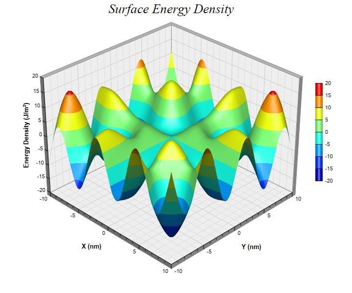
# The values at the grid points. In this example, we will compute the values using the formula z = x
# * sin(y) + y * sin(x).
dataZ = [0] * (len(dataX) * len(dataY))
for yIndex in range(0, len(dataY)) :
y = dataY[yIndex]
for xIndex in range(0, len(dataX)) :
x = dataX[xIndex]
dataZ[yIndex * len(dataX) + xIndex] = x * math.sin(y) + y * math.sin(x)
# Create a SurfaceChart object of size 720 x 600 pixels
c = SurfaceChart(720, 600)
# Add a title to the chart using 20 points Times New Roman Italic font
c.addTitle("Surface Energy Density ", "Times New Roman Italic", 20)
# Set the center of the plot region at (350, 280), and set width x depth x height to 360 x 360 x 270
# pixels
c.setPlotRegion(350, 280, 360, 360, 270)
# Set the data to use to plot the chart
c.setData(dataX, dataY, dataZ)
# Spline interpolate data to a 80 x 80 grid for a smooth surface
c.setInterpolation(80, 80)
# Add a color axis (the legend) in which the left center is anchored at (645, 270). Set the length
# to 200 pixels and the labels on the right side.
c.setColorAxis(645, 270, Left, 200, Right)
# Set the x, y and z axis titles using 10 points Arial Bold font
c.xAxis().setTitle("X (nm)", "Arial Bold", 10)
c.yAxis().setTitle("Y (nm)", "Arial Bold", 10)
c.zAxis().setTitle("Energy Density (J/m<*font,super*>2<*/font*>)", "Arial Bold", 10)
# Output the chart
c.makeChart("surface.jpg")
© 2021 Advanced Software Engineering Limited. All rights reserved.