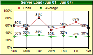
This example demonstrates using symbols to represent data points, and putting data labels on top of the symbols.
Note that in this example, the chart title background is not a solid color but a 1 x 2 pixels pattern.
pythondemo\symbolline.py
#!/usr/bin/python

# The ChartDirector for Python module is assumed to be in "../lib"
import sys, os
sys.path.insert(0, os.path.join(os.path.abspath(sys.path[0]), "..", "lib"))

from pychartdir import *

# The data for the line chart
data0 = [60.2, 51.7, 81.3, 48.6, 56.2, 68.9, 52.8]
data1 = [30.0, 32.7, 33.9, 29.5, 32.2, 28.4, 29.8]
labels = ["Sun", "Mon", "Tue", "Wed", "Thu", "Fri", "Sat"]

# Create a XYChart object of size 300 x 180 pixels, with a pale yellow (0xffffc0) background, a
# black border, and 1 pixel 3D border effect.
c = XYChart(300, 180, 0xffffc0, 0x000000, 1)

# Set the plotarea at (45, 35) and of size 240 x 120 pixels, with white background. Turn on both
# horizontal and vertical grid lines with light grey color (0xc0c0c0)
c.setPlotArea(45, 35, 240, 120, 0xffffff, -1, -1, 0xc0c0c0, -1)

# Add a legend box at (45, 12) (top of the chart) using horizontal layout and 8pt Arial font Set the
# background and border color to Transparent.
c.addLegend(45, 12, 0, "", 8).setBackground(Transparent)

# Add a title to the chart using 9pt Arial Bold/white font. Use a 1 x 2 bitmap pattern as the
# background.
c.addTitle("Server Load (Jun 01 - Jun 07)", "Arial Bold", 9, 0xffffff).setBackground(c.patternColor(
    [0x004000, 0x008000], 2))

# Set the y axis label format to nn%
c.yAxis().setLabelFormat("{value}%")

# Set the labels on the x axis
c.xAxis().setLabels(labels)

# Add a line layer to the chart
layer = c.addLineLayer()

# Add the first line. Plot the points with a 7 pixel square symbol
layer.addDataSet(data0, 0xcf4040, "Peak").setDataSymbol(SquareSymbol, 7)

# Add the second line. Plot the points with a 9 pixel dismond symbol
layer.addDataSet(data1, 0x40cf40, "Average").setDataSymbol(DiamondSymbol, 9)

# Enable data label on the data points. Set the label format to nn%.
layer.setDataLabelFormat("{value|0}%")

# Output the chart
c.makeChart("symbolline.png")
© 2021 Advanced Software Engineering Limited. All rights reserved.