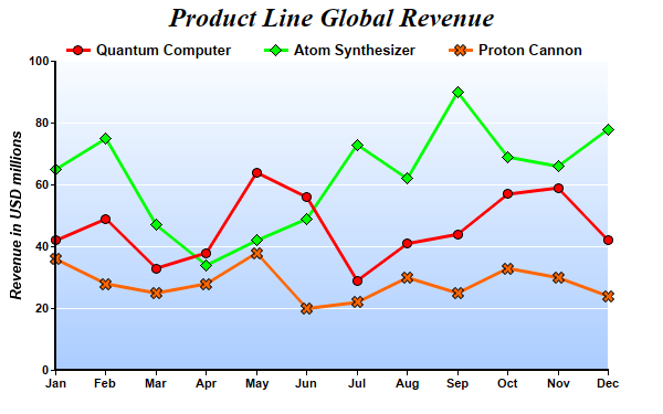
This example demonstrates using symbols to represent data points and using gradient color for plot area background.
pythondemo\symbolline2.py
#!/usr/bin/python

# The ChartDirector for Python module is assumed to be in "../lib"
import sys, os
sys.path.insert(0, os.path.join(os.path.abspath(sys.path[0]), "..", "lib"))

from pychartdir import *

# The data for the line chart
data0 = [42, 49, 33, 38, 64, 56, 29, 41, 44, 57, 59, 42]
data1 = [65, 75, 47, 34, 42, 49, 73, 62, 90, 69, 66, 78]
data2 = [36, 28, 25, 28, 38, 20, 22, 30, 25, 33, 30, 24]
labels = ["Jan", "Feb", "Mar", "Apr", "May", "Jun", "Jul", "Aug", "Sep", "Oct", "Nov", "Dec"]

# Create a XYChart object of size 600 x 375 pixels
c = XYChart(600, 375)

# Add a title to the chart using 18pt Times Bold Italic font
c.addTitle("Product Line Global Revenue", "Times New Roman Bold Italic", 18)

# Set the plotarea at (50, 55) and of 500 x 280 pixels in size. Use a vertical gradient color from
# light blue (f9f9ff) to sky blue (aaccff) as background. Set border to transparent and grid lines
# to white (ffffff).
c.setPlotArea(50, 55, 500, 280, c.linearGradientColor(0, 55, 0, 335, 0xf9fcff, 0xaaccff), -1,
    Transparent, 0xffffff)

# Add a legend box at (50, 28) using horizontal layout. Use 10pt Arial Bold as font, with
# transparent background.
c.addLegend(50, 28, 0, "Arial Bold", 10).setBackground(Transparent)

# Set the x axis labels
c.xAxis().setLabels(labels)

# Set y-axis tick density to 30 pixels. ChartDirector auto-scaling will use this as the guideline
# when putting ticks on the y-axis.
c.yAxis().setTickDensity(30)

# Set axis label style to 8pt Arial Bold
c.xAxis().setLabelStyle("Arial Bold", 8)
c.yAxis().setLabelStyle("Arial Bold", 8)

# Set axis line width to 2 pixels
c.xAxis().setWidth(2)
c.yAxis().setWidth(2)

# Add axis title using 10pt Arial Bold Italic font
c.yAxis().setTitle("Revenue in USD millions", "Arial Bold Italic", 10)

# Add a line layer to the chart
layer = c.addLineLayer2()

# Set the line width to 3 pixels
layer.setLineWidth(3)

# Add the three data sets to the line layer, using circles, diamands and X shapes as symbols
layer.addDataSet(data0, 0xff0000, "Quantum Computer").setDataSymbol(CircleSymbol, 9)
layer.addDataSet(data1, 0x00ff00, "Atom Synthesizer").setDataSymbol(DiamondSymbol, 11)
layer.addDataSet(data2, 0xff6600, "Proton Cannon").setDataSymbol(Cross2Shape(), 11)

# Output the chart
c.makeChart("symbolline2.png")
© 2021 Advanced Software Engineering Limited. All rights reserved.