ChartDirector 6.0 (Ruby Edition)

Multi-Color Gantt Chart


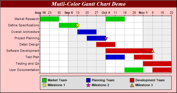
This example demonstrates a multi-color gantt chart with milestone symbols.

The bars in this chart come from a multi-color box-whisker layer created using XYChart.addBoxWhiskerLayer2. The scatter symbols come from scatter layers created using XYChart.addScatterLayer.

In this example, a data series is used to specify the task number of the bars. This allows multiple bars to associated with the same task. The task numbers act as the x coordinates of the bars and are set to the box-whisker layer using Layer.setXData. Another data series is used to specify the colors of the bars. This allows the bars to have different colors.

Source Code Listing

[Ruby On Rails Version - Controller] app/controllers/colorgantt_controller.rb
require("chartdirector")

class ColorganttController < ApplicationController

    def index()
        @title = "Multi-Color Gantt Chart"
        @ctrl_file = File.expand_path(__FILE__)
        @noOfCharts = 1
        render :template => "templates/chartview"
    end

    #
    # Render and deliver the chart
    #
    def getchart()
        # The tasks for the gantt chart
        labels = ["Market Research", "Define Specifications", "Overall Archiecture",
            "Project Planning", "Detail Design", "Software Development", "Test Plan",
            "Testing and QA", "User Documentation"]

        # The task index, start date, end date and color for each bar
        taskNo = [0, 0, 1, 2, 3, 4, 5, 6, 6, 7, 8, 8]
        startDate = [Time.mktime(2004, 8, 16), Time.mktime(2004, 10, 4), Time.mktime(2004, 8, 30),
            Time.mktime(2004, 9, 13), Time.mktime(2004, 9, 20), Time.mktime(2004, 9, 27),
            Time.mktime(2004, 10, 4), Time.mktime(2004, 10, 4), Time.mktime(2004, 10, 25),
            Time.mktime(2004, 11, 1), Time.mktime(2004, 10, 18), Time.mktime(2004, 11, 8)]
        endDate = [Time.mktime(2004, 8, 30), Time.mktime(2004, 10, 18), Time.mktime(2004, 9, 13),
            Time.mktime(2004, 9, 27), Time.mktime(2004, 10, 4), Time.mktime(2004, 10, 11),
            Time.mktime(2004, 11, 8), Time.mktime(2004, 10, 18), Time.mktime(2004, 11, 8),
            Time.mktime(2004, 11, 22), Time.mktime(2004, 11, 1), Time.mktime(2004, 11, 22)]
        colors = [0x00cc00, 0x00cc00, 0x00cc00, 0x0000cc, 0x0000cc, 0xcc0000, 0xcc0000, 0x0000cc,
            0xcc0000, 0xcc0000, 0x00cc00, 0xcc0000]

        # Create a XYChart object of size 620 x 325 pixels. Set background color to light red
        # (0xffcccc), with 1 pixel 3D border effect.
        c = ChartDirector::XYChart.new(620, 325, 0xffcccc, 0x000000, 1)

        # Add a title to the chart using 15 points Times Bold Itatic font, with white (ffffff) text
        # on a dark red (800000) background
        c.addTitle("Mutli-Color Gantt Chart Demo", "timesbi.ttf", 15, 0xffffff).setBackground(
            0x800000)

        # Set the plotarea at (140, 55) and of size 460 x 200 pixels. Use alternative white/grey
        # background. Enable both horizontal and vertical grids by setting their colors to grey
        # (c0c0c0). Set vertical major grid (represents month boundaries) 2 pixels in width
        c.setPlotArea(140, 55, 460, 200, 0xffffff, 0xeeeeee, ChartDirector::LineColor, 0xc0c0c0,
            0xc0c0c0).setGridWidth(2, 1, 1, 1)

        # swap the x and y axes to create a horziontal box-whisker chart
        c.swapXY()

        # Set the y-axis scale to be date scale from Aug 16, 2004 to Nov 22, 2004, with ticks every
        # 7 days (1 week)
        c.yAxis().setDateScale(Time.mktime(2004, 8, 16), Time.mktime(2004, 11, 22), 86400 * 7)

        # Set multi-style axis label formatting. Month labels are in Arial Bold font in "mmm d"
        # format. Weekly labels just show the day of month and use minor tick (by using '-' as first
        # character of format string).
        c.yAxis().setMultiFormat(ChartDirector::StartOfMonthFilter(),
            "<*font=arialbd.ttf*>{value|mmm d}", ChartDirector::StartOfDayFilter(), "-{value|d}")

        # Set the y-axis to shown on the top (right + swapXY = top)
        c.setYAxisOnRight()

        # Set the labels on the x axis
        c.xAxis().setLabels(labels)

        # Reverse the x-axis scale so that it points downwards.
        c.xAxis().setReverse()

        # Set the horizontal ticks and grid lines to be between the bars
        c.xAxis().setTickOffset(0.5)

        # Add some symbols to the chart to represent milestones. The symbols are added using scatter
        # layers. We need to specify the task index, date, name, symbol shape, size and color.
        c.addScatterLayer([1], [Time.mktime(2004, 9, 13)], "Milestone 1",
            ChartDirector::Cross2Shape(), 13, 0xffff00)
        c.addScatterLayer([3], [Time.mktime(2004, 10, 4)], "Milestone 2", ChartDirector::StarShape(5
            ), 15, 0xff00ff)
        c.addScatterLayer([5], [Time.mktime(2004, 11, 8)], "Milestone 3",
            ChartDirector::TriangleSymbol, 13, 0xff9933)

        # Add a multi-color box-whisker layer to represent the gantt bars
        layer = c.addBoxWhiskerLayer2(startDate, endDate, nil, nil, nil, colors)
        layer.setXData(taskNo)
        layer.setBorderColor(ChartDirector::SameAsMainColor)

        # Divide the plot area height ( = 200 in this chart) by the number of tasks to get the
        # height of each slot. Use 80% of that as the bar height.
        layer.setDataWidth((200 * 4 / 5 / labels.length).to_i)

        # Add a legend box at (140, 265) - bottom of the plot area. Use 8pt Arial Bold as the font
        # with auto-grid layout. Set the width to the same width as the plot area. Set the
        # backgorund to grey (dddddd).
        legendBox = c.addLegend2(140, 265, ChartDirector::AutoGrid, "arialbd.ttf", 8)
        legendBox.setWidth(461)
        legendBox.setBackground(0xdddddd)

        # The keys for the scatter layers (milestone symbols) will automatically be added to the
        # legend box. We just need to add keys to show the meanings of the bar colors.
        legendBox.addKey("Market Team", 0x00cc00)
        legendBox.addKey("Planning Team", 0x0000cc)
        legendBox.addKey("Development Team", 0xcc0000)

        # Output the chart
        send_data(c.makeChart2(ChartDirector::PNG), :type => "image/png", :disposition => "inline")

    end

end

[Ruby On Rails Version - View] app/views/templates/chartview.html.erb
<html>
<body style="margin:5px 0px 0px 5px">

<!-- Title -->
<div style="font-size:18pt; font-family:verdana; font-weight:bold">
    <%= @title %>
</div>
<hr style="border:solid 1px #000080" />

<!-- Source Code Listing Link -->
<div style="font-size:9pt; font-family:verdana; margin-bottom:1.5em">
    <%= link_to "Source Code Listing", 
        :controller => "cddemo", :action => "viewsource",
        :ctrl_file => @ctrl_file, :view_file => File.expand_path(__FILE__) %>
</div>

<!-- Create one or more IMG tags to display the demo chart(s) -->
<% 0.upto(@noOfCharts - 1) do |i| %>
    <img src="<%= url_for(:action => "getchart", :img => i) %>">
<% end %>

</body>
</html>

[Command Line Version] rubydemo/colorgantt.rb
#!/usr/bin/env ruby
require("chartdirector")

# The tasks for the gantt chart
labels = ["Market Research", "Define Specifications", "Overall Archiecture", "Project Planning",
    "Detail Design", "Software Development", "Test Plan", "Testing and QA", "User Documentation"]

# The task index, start date, end date and color for each bar
taskNo = [0, 0, 1, 2, 3, 4, 5, 6, 6, 7, 8, 8]
startDate = [Time.mktime(2004, 8, 16), Time.mktime(2004, 10, 4), Time.mktime(2004, 8, 30),
    Time.mktime(2004, 9, 13), Time.mktime(2004, 9, 20), Time.mktime(2004, 9, 27), Time.mktime(2004,
    10, 4), Time.mktime(2004, 10, 4), Time.mktime(2004, 10, 25), Time.mktime(2004, 11, 1),
    Time.mktime(2004, 10, 18), Time.mktime(2004, 11, 8)]
endDate = [Time.mktime(2004, 8, 30), Time.mktime(2004, 10, 18), Time.mktime(2004, 9, 13),
    Time.mktime(2004, 9, 27), Time.mktime(2004, 10, 4), Time.mktime(2004, 10, 11), Time.mktime(2004,
    11, 8), Time.mktime(2004, 10, 18), Time.mktime(2004, 11, 8), Time.mktime(2004, 11, 22),
    Time.mktime(2004, 11, 1), Time.mktime(2004, 11, 22)]
colors = [0x00cc00, 0x00cc00, 0x00cc00, 0x0000cc, 0x0000cc, 0xcc0000, 0xcc0000, 0x0000cc, 0xcc0000,
    0xcc0000, 0x00cc00, 0xcc0000]

# Create a XYChart object of size 620 x 325 pixels. Set background color to light red (0xffcccc),
# with 1 pixel 3D border effect.
c = ChartDirector::XYChart.new(620, 325, 0xffcccc, 0x000000, 1)

# Add a title to the chart using 15 points Times Bold Itatic font, with white (ffffff) text on a
# dark red (800000) background
c.addTitle("Mutli-Color Gantt Chart Demo", "timesbi.ttf", 15, 0xffffff).setBackground(0x800000)

# Set the plotarea at (140, 55) and of size 460 x 200 pixels. Use alternative white/grey background.
# Enable both horizontal and vertical grids by setting their colors to grey (c0c0c0). Set vertical
# major grid (represents month boundaries) 2 pixels in width
c.setPlotArea(140, 55, 460, 200, 0xffffff, 0xeeeeee, ChartDirector::LineColor, 0xc0c0c0, 0xc0c0c0
    ).setGridWidth(2, 1, 1, 1)

# swap the x and y axes to create a horziontal box-whisker chart
c.swapXY()

# Set the y-axis scale to be date scale from Aug 16, 2004 to Nov 22, 2004, with ticks every 7 days
# (1 week)
c.yAxis().setDateScale(Time.mktime(2004, 8, 16), Time.mktime(2004, 11, 22), 86400 * 7)

# Set multi-style axis label formatting. Month labels are in Arial Bold font in "mmm d" format.
# Weekly labels just show the day of month and use minor tick (by using '-' as first character of
# format string).
c.yAxis().setMultiFormat(ChartDirector::StartOfMonthFilter(), "<*font=arialbd.ttf*>{value|mmm d}",
    ChartDirector::StartOfDayFilter(), "-{value|d}")

# Set the y-axis to shown on the top (right + swapXY = top)
c.setYAxisOnRight()

# Set the labels on the x axis
c.xAxis().setLabels(labels)

# Reverse the x-axis scale so that it points downwards.
c.xAxis().setReverse()

# Set the horizontal ticks and grid lines to be between the bars
c.xAxis().setTickOffset(0.5)

# Add some symbols to the chart to represent milestones. The symbols are added using scatter layers.
# We need to specify the task index, date, name, symbol shape, size and color.
c.addScatterLayer([1], [Time.mktime(2004, 9, 13)], "Milestone 1", ChartDirector::Cross2Shape(), 13,
    0xffff00)
c.addScatterLayer([3], [Time.mktime(2004, 10, 4)], "Milestone 2", ChartDirector::StarShape(5), 15,
    0xff00ff)
c.addScatterLayer([5], [Time.mktime(2004, 11, 8)], "Milestone 3", ChartDirector::TriangleSymbol, 13,
    0xff9933)

# Add a multi-color box-whisker layer to represent the gantt bars
layer = c.addBoxWhiskerLayer2(startDate, endDate, nil, nil, nil, colors)
layer.setXData(taskNo)
layer.setBorderColor(ChartDirector::SameAsMainColor)

# Divide the plot area height ( = 200 in this chart) by the number of tasks to get the height of
# each slot. Use 80% of that as the bar height.
layer.setDataWidth((200 * 4 / 5 / labels.length).to_i)

# Add a legend box at (140, 265) - bottom of the plot area. Use 8pt Arial Bold as the font with
# auto-grid layout. Set the width to the same width as the plot area. Set the backgorund to grey
# (dddddd).
legendBox = c.addLegend2(140, 265, ChartDirector::AutoGrid, "arialbd.ttf", 8)
legendBox.setWidth(461)
legendBox.setBackground(0xdddddd)

# The keys for the scatter layers (milestone symbols) will automatically be added to the legend box.
# We just need to add keys to show the meanings of the bar colors.
legendBox.addKey("Market Team", 0x00cc00)
legendBox.addKey("Planning Team", 0x0000cc)
legendBox.addKey("Development Team", 0xcc0000)

# Output the chart
c.makeChart("colorgantt.png")