require("financechart")
class FinancesymbolsController < ApplicationController
def index()
@title = "Finance Chart Custom Symbols"
@ctrl_file = File.expand_path(__FILE__)
@noOfCharts = 1
render :template => "templates/chartview"
end
#
# Render and deliver the chart
#
def getchart()
# This script can draw different charts depending on the chartIndex
chartIndex = (params["img"]).to_i
# Create a finance chart demo containing 100 days of data
noOfDays = 100
# To compute moving averages starting from the first day, we need to get extra data points
# before the first day
extraDays = 30
# In this exammple, we use a random number generator utility to simulate the data. We set up
# the random table to create 6 cols x (noOfDays + extraDays) rows, using 9 as the seed.
rantable = ChartDirector::RanTable.new(9, 6, noOfDays + extraDays)
# Set the 1st col to be the timeStamp, starting from Sep 4, 2014, with each row representing
# one day, and counting week days only (jump over Sat and Sun)
rantable.setDateCol(0, Time.mktime(2014, 9, 4), 86400, true)
# Set the 2nd, 3rd, 4th and 5th columns to be high, low, open and close data. The open value
# starts from 100, and the daily change is random from -5 to 5.
rantable.setHLOCCols(1, 100, -5, 5)
# Set the 6th column as the vol data from 5 to 25 million
rantable.setCol(5, 50000000, 250000000)
# Now we read the data from the table into arrays
timeStamps = rantable.getCol(0)
highData = rantable.getCol(1)
lowData = rantable.getCol(2)
openData = rantable.getCol(3)
closeData = rantable.getCol(4)
volData = rantable.getCol(5)
# Custom data series should be of the same length as the OHLC data series
buySignal = Array.new(closeData.length, 0)
sellSignal = Array.new(closeData.length, 0)
#
# The following is just an arbitrary algorithm to create some meaningless buySignal and
# sellSignal. They are just for demonstrating the charting engine. Please do not use them
# for actual trading.
#
sma5 = ChartDirector::ArrayMath.new(closeData).movAvg(5).result()
sma20 = ChartDirector::ArrayMath.new(closeData).movAvg(20).result()
0.upto(sma5.length - 1) do |i|
buySignal[i] = ChartDirector::NoValue
sellSignal[i] = ChartDirector::NoValue
if i > 0
if (sma5[i - 1] <= sma20[i - 1]) && (sma5[i] > sma20[i])
buySignal[i] = lowData[i]
end
if (sma5[i - 1] >= sma20[i - 1]) && (sma5[i] < sma20[i])
sellSignal[i] = highData[i]
end
end
end
# Create a FinanceChart object of width 640 pixels
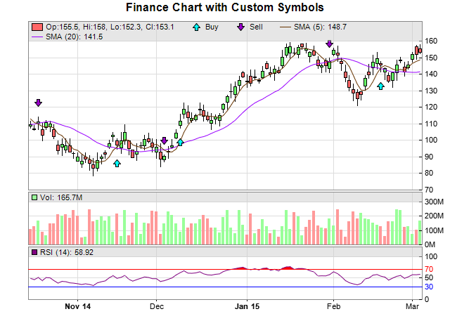
c = ChartDirector::FinanceChart.new(640)
# Add a title to the chart
c.addTitle("Finance Chart with Custom Symbols")
# Set the data into the finance chart object
c.setData(timeStamps, highData, lowData, openData, closeData, volData, extraDays)
# Add the main chart with 240 pixels in height
mainChart = c.addMainChart(240)
# Add buy signal symbols to the main chart, using cyan (0x00ffff) upward pointing arrows as
# symbols
buyLayer = mainChart.addScatterLayer(nil, buySignal, "Buy", ChartDirector::ArrowShape(0, 1,
0.4, 0.4), 11, 0x00ffff)
# Shift the symbol lower by 20 pixels
buyLayer.getDataSet(0).setSymbolOffset(0, 20)
# Add sell signal symbols to the main chart, using purple (0x9900cc) downward pointing
# arrows as symbols
sellLayer = mainChart.addScatterLayer(nil, sellSignal, "Sell", ChartDirector::ArrowShape(
180, 1, 0.4, 0.4), 11, 0x9900cc)
# Shift the symbol higher by 20 pixels
sellLayer.getDataSet(0).setSymbolOffset(0, -20)
# Add a 5 period simple moving average to the main chart, using brown color
c.addSimpleMovingAvg(5, 0x663300)
# Add a 20 period simple moving average to the main chart, using purple color
c.addSimpleMovingAvg(20, 0x9900ff)
# Add candlestick symbols to the main chart, using green/red for up/down days
c.addCandleStick(0x66ff66, 0xff6666)
# Add a volume indicator chart (75 pixels high) after the main chart, using green/red/grey
# for up/down/flat days
c.addVolIndicator(75, 0x99ff99, 0xff9999, 0x808080)
# Append a 14-days RSI indicator chart (75 pixels high) after the main chart. The main RSI
# line is purple (800080). Set threshold region to +/- 20 (that is, RSI = 50 +/- 25). The
# upper/lower threshold regions will be filled with red (ff0000)/blue (0000ff).
c.addRSI(75, 14, 0x800080, 20, 0xff0000, 0x0000ff)
# Output the chart
send_data(c.makeChart2(ChartDirector::PNG), :type => "image/png", :disposition => "inline")
end
end |