ChartDirector 6.0 (Ruby Edition)

Glass Bar Shading


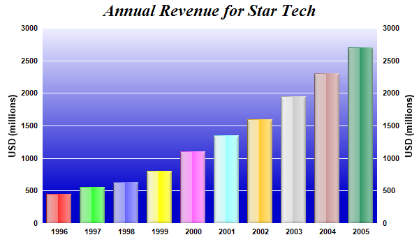
This example demonstrates using glass shading effect for bars and gradient color for plot area background. It also demonstrates axis labels on both sides of the plot area.

Glass lighting is a complex shading effect that gives a look and feel of tinted glass or semi-transparent plastic material. This effect involves glare and variation of lighting caused by reflection and refraction inside the material.

Source Code Listing

[Ruby On Rails Version - Controller] app/controllers/glasslightbar_controller.rb
require("chartdirector")

class GlasslightbarController < ApplicationController

    def index()
        @title = "Glass Bar Shading"
        @ctrl_file = File.expand_path(__FILE__)
        @noOfCharts = 1
        render :template => "templates/chartview"
    end

    #
    # Render and deliver the chart
    #
    def getchart()
        # The data for the bar chart
        data = [450, 560, 630, 800, 1100, 1350, 1600, 1950, 2300, 2700]

        # The labels for the bar chart
        labels = ["1996", "1997", "1998", "1999", "2000", "2001", "2002", "2003", "2004", "2005"]

        # Create a XYChart object of size 600 x 360 pixels
        c = ChartDirector::XYChart.new(600, 360)

        # Set the plotarea at (60, 40) and of size 480 x 280 pixels. Use a vertical gradient color
        # from light blue (eeeeff) to deep blue (0000cc) as background. Set border and grid lines to
        # white (ffffff).
        c.setPlotArea(60, 40, 480, 280, c.linearGradientColor(60, 40, 60, 280, 0xeeeeff, 0x0000cc),
            -1, 0xffffff, 0xffffff)

        # Add a title to the chart using 18pt Times Bold Italic font
        c.addTitle("Annual Revenue for Star Tech", "timesbi.ttf", 18)

        # Add a multi-color bar chart layer using the supplied data. Use glass lighting effect with
        # light direction from the left.
        c.addBarLayer3(data).setBorderColor(ChartDirector::Transparent, ChartDirector::glassEffect(
            ChartDirector::NormalGlare, ChartDirector::Left))

        # Set the x axis labels
        c.xAxis().setLabels(labels)

        # Show the same scale on the left and right y-axes
        c.syncYAxis()

        # Set the left y-axis and right y-axis title using 10pt Arial Bold font
        c.yAxis().setTitle("USD (millions)", "arialbd.ttf", 10)
        c.yAxis2().setTitle("USD (millions)", "arialbd.ttf", 10)

        # Set all axes to transparent
        c.xAxis().setColors(ChartDirector::Transparent)
        c.yAxis().setColors(ChartDirector::Transparent)
        c.yAxis2().setColors(ChartDirector::Transparent)

        # Set the label styles of all axes to 8pt Arial Bold font
        c.xAxis().setLabelStyle("arialbd.ttf", 8)
        c.yAxis().setLabelStyle("arialbd.ttf", 8)
        c.yAxis2().setLabelStyle("arialbd.ttf", 8)

        # Output the chart
        send_data(c.makeChart2(ChartDirector::PNG), :type => "image/png", :disposition => "inline")

    end

end

[Ruby On Rails Version - View] app/views/templates/chartview.html.erb
<html>
<body style="margin:5px 0px 0px 5px">

<!-- Title -->
<div style="font-size:18pt; font-family:verdana; font-weight:bold">
    <%= @title %>
</div>
<hr style="border:solid 1px #000080" />

<!-- Source Code Listing Link -->
<div style="font-size:9pt; font-family:verdana; margin-bottom:1.5em">
    <%= link_to "Source Code Listing", 
        :controller => "cddemo", :action => "viewsource",
        :ctrl_file => @ctrl_file, :view_file => File.expand_path(__FILE__) %>
</div>

<!-- Create one or more IMG tags to display the demo chart(s) -->
<% 0.upto(@noOfCharts - 1) do |i| %>
    <img src="<%= url_for(:action => "getchart", :img => i) %>">
<% end %>

</body>
</html>

[Command Line Version] rubydemo/glasslightbar.rb
#!/usr/bin/env ruby
require("chartdirector")

# The data for the bar chart
data = [450, 560, 630, 800, 1100, 1350, 1600, 1950, 2300, 2700]

# The labels for the bar chart
labels = ["1996", "1997", "1998", "1999", "2000", "2001", "2002", "2003", "2004", "2005"]

# Create a XYChart object of size 600 x 360 pixels
c = ChartDirector::XYChart.new(600, 360)

# Set the plotarea at (60, 40) and of size 480 x 280 pixels. Use a vertical gradient color from
# light blue (eeeeff) to deep blue (0000cc) as background. Set border and grid lines to white
# (ffffff).
c.setPlotArea(60, 40, 480, 280, c.linearGradientColor(60, 40, 60, 280, 0xeeeeff, 0x0000cc), -1,
    0xffffff, 0xffffff)

# Add a title to the chart using 18pt Times Bold Italic font
c.addTitle("Annual Revenue for Star Tech", "timesbi.ttf", 18)

# Add a multi-color bar chart layer using the supplied data. Use glass lighting effect with light
# direction from the left.
c.addBarLayer3(data).setBorderColor(ChartDirector::Transparent, ChartDirector::glassEffect(
    ChartDirector::NormalGlare, ChartDirector::Left))

# Set the x axis labels
c.xAxis().setLabels(labels)

# Show the same scale on the left and right y-axes
c.syncYAxis()

# Set the left y-axis and right y-axis title using 10pt Arial Bold font
c.yAxis().setTitle("USD (millions)", "arialbd.ttf", 10)
c.yAxis2().setTitle("USD (millions)", "arialbd.ttf", 10)

# Set all axes to transparent
c.xAxis().setColors(ChartDirector::Transparent)
c.yAxis().setColors(ChartDirector::Transparent)
c.yAxis2().setColors(ChartDirector::Transparent)

# Set the label styles of all axes to 8pt Arial Bold font
c.xAxis().setLabelStyle("arialbd.ttf", 8)
c.yAxis().setLabelStyle("arialbd.ttf", 8)
c.yAxis2().setLabelStyle("arialbd.ttf", 8)

# Output the chart
c.makeChart("glasslightbar.png")