require("chartdirector")
class HistogramController < ApplicationController
def index()
@title = "Histogram with Bell Curve"
@ctrl_file = File.expand_path(__FILE__)
@noOfCharts = 1
render :template => "templates/chartview"
end
#
# Render and deliver the chart
#
def getchart()
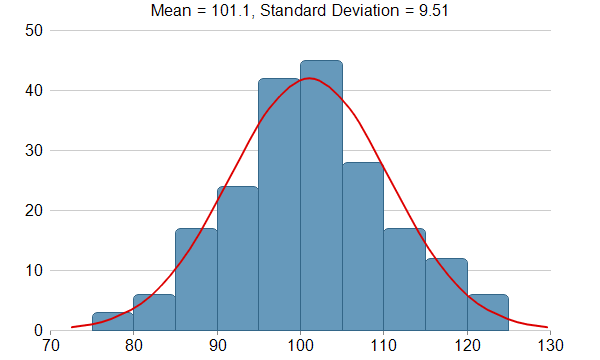
#
# This example demonstrates creating a histogram with a bell curve from raw data. About half
# of the code is to sort the raw data into slots and to generate the points on the bell
# curve. The remaining half of the code is the actual charting code.
#
# Generate a random guassian distributed data series as the input data for this example.
r = ChartDirector::RanSeries.new(66)
samples = r.getGaussianSeries(200, 100, 10)
#
# Classify the numbers into slots. In this example, the slot width is 5 units.
#
slotSize = 5
# Compute the min and max values, and extend them to the slot boundary.
m = ChartDirector::ArrayMath.new(samples)
minX = (m.min() / slotSize).floor * slotSize
maxX = (m.max() / slotSize).floor * slotSize + slotSize
# We can now determine the number of slots
slotCount = ((maxX - minX + 0.5) / slotSize).to_i
frequency = Array.new(slotCount, 0)
# Count the data points contained in each slot
0.upto(samples.length - 1) do |i|
slotIndex = ((samples[i] - minX) / slotSize).to_i
frequency[slotIndex] = frequency[slotIndex] + 1
end
#
# Compute Normal Distribution Curve
#
# The mean and standard deviation of the data
mean = m.avg()
stdDev = m.stdDev()
# The normal distribution curve (bell curve) is a standard statistics curve. We need to
# vertically scale it to make it proportion to the frequency count.
scaleFactor = slotSize * samples.length / stdDev / Math.sqrt(6.2832)
# In this example, we plot the bell curve up to 3 standard deviations.
stdDevWidth = 3.0
# We generate 4 points per standard deviation to be joined with a spline curve.
bellCurveResolution = (stdDevWidth * 4 + 1).to_i
bellCurve = Array.new(bellCurveResolution, 0)
0.upto(bellCurve.length - 1) do |i|
z = (2 * i - (bellCurve.length - 1)) * stdDevWidth / (bellCurve.length - 1)
bellCurve[i] = Math.exp(-z * z / 2) * scaleFactor
end
#
# At this stage, we have obtained all data and can plot the chart.
#
# Create a XYChart object of size 600 x 360 pixels
c = ChartDirector::XYChart.new(600, 360)
# Set the plotarea at (50, 30) and of size 500 x 300 pixels, with transparent background and
# border and light grey (0xcccccc) horizontal grid lines
c.setPlotArea(50, 30, 500, 300, ChartDirector::Transparent, -1, ChartDirector::Transparent,
0xcccccc)
# Display the mean and standard deviation on the chart
c.addTitle(sprintf("Mean = %s, Standard Deviation = %s", c.formatValue(mean, "{value|1}"),
c.formatValue(stdDev, "{value|2}")), "arial.ttf")
# Set the x and y axis label font to 12pt Arial
c.xAxis().setLabelStyle("arial.ttf", 12)
c.yAxis().setLabelStyle("arial.ttf", 12)
# Set the x and y axis stems to transparent, and the x-axis tick color to grey (0x888888)
c.xAxis().setColors(ChartDirector::Transparent, ChartDirector::TextColor,
ChartDirector::TextColor, 0x888888)
c.yAxis().setColors(ChartDirector::Transparent)
# Draw the bell curve as a spline layer in red (0xdd0000) with 2-pixel line width
bellLayer = c.addSplineLayer(bellCurve, 0xdd0000)
bellLayer.setXData2(mean - stdDevWidth * stdDev, mean + stdDevWidth * stdDev)
bellLayer.setLineWidth(2)
# Draw the histogram as bars in blue (0x6699bb) with dark blue (0x336688) border
histogramLayer = c.addBarLayer(frequency, 0x6699bb)
histogramLayer.setBorderColor(0x336688)
# The center of the bars span from minX + half_bar_width to maxX - half_bar_width
histogramLayer.setXData2(minX + slotSize / 2.0, maxX - slotSize / 2.0)
# Configure the bars to touch each other with no gap in between
histogramLayer.setBarGap(ChartDirector::TouchBar)
# Use rounded corners for decoration
histogramLayer.setRoundedCorners()
# ChartDirector by default will extend the x-axis scale by 0.5 unit to cater for the bar
# width. It is because a bar plotted at x actually occupies (x +/- half_bar_width), and the
# bar width is normally 1 for label based x-axis. However, this chart is using a linear
# x-axis instead of label based. So we disable the automatic extension and add a dummy layer
# to extend the x-axis scale to cover minX to maxX.
c.xAxis().setIndent(false)
c.addLineLayer2().setXData(minX, maxX)
# For the automatic y-axis labels, set the minimum spacing to 40 pixels.
c.yAxis().setTickDensity(40)
# Output the chart
send_data(c.makeChart2(ChartDirector::PNG), :type => "image/png", :disposition => "inline")
end
end |