require("chartdirector")
class PosnegbarController < ApplicationController
def index()
@title = "Positive Negative Bars"
@ctrl_file = File.expand_path(__FILE__)
@noOfCharts = 1
render :template => "templates/chartview"
end
#
# Render and deliver the chart
#
def getchart()
# The data for the bar chart
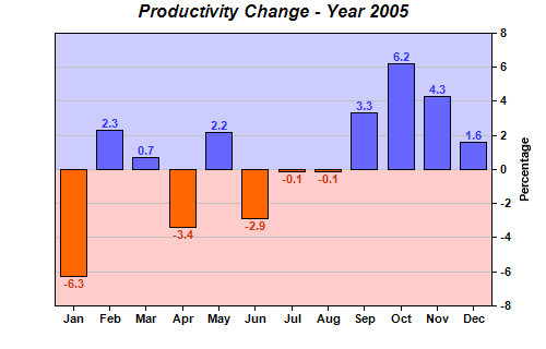
data = [-6.3, 2.3, 0.7, -3.4, 2.2, -2.9, -0.1, -0.1, 3.3, 6.2, 4.3, 1.6]
# The labels for the bar chart
labels = ["Jan", "Feb", "Mar", "Apr", "May", "Jun", "Jul", "Aug", "Sep", "Oct", "Nov", "Dec"
]
# Create a XYChart object of size 500 x 320 pixels
c = ChartDirector::XYChart.new(500, 320)
# Add a title to the chart using Arial Bold Italic font
c.addTitle("Productivity Change - Year 2005", "arialbi.ttf")
# Set the plotarea at (50, 30) and of size 400 x 250 pixels
c.setPlotArea(50, 30, 400, 250)
# Add a bar layer to the chart using the Overlay data combine method
layer = c.addBarLayer2(ChartDirector::Overlay)
# Select positive data and add it as data set with blue (6666ff) color
layer.addDataSet(ChartDirector::ArrayMath.new(data).selectGEZ(nil, ChartDirector::NoValue
).result(), 0x6666ff)
# Select negative data and add it as data set with orange (ff6600) color
layer.addDataSet(ChartDirector::ArrayMath.new(data).selectLTZ(nil, ChartDirector::NoValue
).result(), 0xff6600)
# Add labels to the top of the bar using 8 pt Arial Bold font. The font color is configured
# to be red (0xcc3300) below zero, and blue (0x3333ff) above zero.
layer.setAggregateLabelStyle("arialbd.ttf", 8, layer.yZoneColor(0, 0xcc3300, 0x3333ff))
# Set the labels on the x axis and use Arial Bold as the label font
c.xAxis().setLabels(labels).setFontStyle("arialbd.ttf")
# Draw the y axis on the right of the plot area
c.setYAxisOnRight(true)
# Use Arial Bold as the y axis label font
c.yAxis().setLabelStyle("arialbd.ttf")
# Add a title to the y axis
c.yAxis().setTitle("Percentage")
# Add a light blue (0xccccff) zone for positive part of the plot area
c.yAxis().addZone(0, 9999, 0xccccff)
# Add a pink (0xffffcc) zone for negative part of the plot area
c.yAxis().addZone(-9999, 0, 0xffcccc)
# Output the chart
send_data(c.makeChart2(ChartDirector::PNG), :type => "image/png", :disposition => "inline")
end
end |