require("chartdirector")
class RealtimedemoController < ApplicationController
def getchart()
#
# Data to draw the chart. In this demo, the data buffer will be filled by a random data
# generator. In real life, the data is probably stored in a buffer (eg. a database table, a
# text file, or some global memory) and updated by other means.
#
# We use a data buffer to emulate the last 240 samples.
sampleSize = 240
dataSeries1 = Array.new(sampleSize, 0)
dataSeries2 = Array.new(sampleSize, 0)
dataSeries3 = Array.new(sampleSize, 0)
timeStamps = Array.new(sampleSize, 0)
# Our pseudo random number generator
firstDate = Time.new - timeStamps.length
0.upto(timeStamps.length - 1) do |i|
timeStamps[i] = firstDate + i
p = timeStamps[i].to_i
dataSeries1[i] = Math.cos(p * 2.1) * 10 + 1 / (Math.cos(p) * Math.cos(p) + 0.01) + 20
dataSeries2[i] = 100 * Math.sin(p / 27.7) * Math.sin(p / 10.1) + 150
dataSeries3[i] = 100 * Math.cos(p / 6.7) * Math.cos(p / 11.9) + 150
end
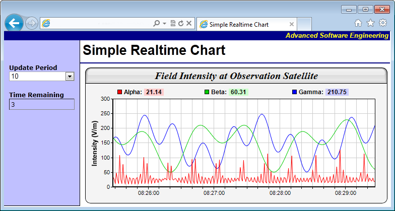
# Create an XYChart object 600 x 270 pixels in size, with light grey (f4f4f4) background,
# black (000000) border, 1 pixel raised effect, and with a rounded frame.
c = ChartDirector::XYChart.new(600, 270, 0xf4f4f4, 0x000000, 0)
c.setRoundedFrame()
# Set the plotarea at (55, 62) and of size 520 x 175 pixels. Use white (ffffff) background.
# Enable both horizontal and vertical grids by setting their colors to grey (cccccc). Set
# clipping mode to clip the data lines to the plot area.
c.setPlotArea(55, 62, 520, 175, 0xffffff, -1, -1, 0xcccccc, 0xcccccc)
c.setClipping()
# Add a title to the chart using 15pt Times New Roman Bold Italic font, with a light grey
# (dddddd) background, black (000000) border, and a glass like raised effect.
c.addTitle("Field Intensity at Observation Satellite", "timesbi.ttf", 15).setBackground(
0xdddddd, 0x000000, ChartDirector::glassEffect())
# Add a legend box at the top of the plot area with 9pt Arial Bold font. We set the legend
# box to the same width as the plot area and use grid layout (as opposed to flow or top/down
# layout). This distributes the 3 legend icons evenly on top of the plot area.
b = c.addLegend2(55, 33, 3, "arialbd.ttf", 9)
b.setBackground(ChartDirector::Transparent, ChartDirector::Transparent)
b.setWidth(520)
# Configure the y-axis with a 10pt Arial Bold axis title
c.yAxis().setTitle("Intensity (V/m)", "arialbd.ttf", 10)
# Configure the x-axis to auto-scale with at least 75 pixels between major tick and 15
# pixels between minor ticks. This shows more minor grid lines on the chart.
c.xAxis().setTickDensity(75, 15)
# Set the axes width to 2 pixels
c.xAxis().setWidth(2)
c.yAxis().setWidth(2)
# Set the x-axis label format
c.xAxis().setLabelFormat("{value|hh:nn:ss}")
# Create a line layer to plot the lines
layer = c.addLineLayer2()
# The x-coordinates are the timeStamps.
layer.setXData(timeStamps)
# The 3 data series are used to draw 3 lines. Here we put the latest data values as part of
# the data set name, so you can see them updated in the legend box.
layer.addDataSet(dataSeries1, 0xff0000, c.formatValue(dataSeries1[dataSeries1.length - 1],
"Alpha: <*bgColor=FFCCCC*> {value|2} "))
layer.addDataSet(dataSeries2, 0x00cc00, c.formatValue(dataSeries2[dataSeries2.length - 1],
"Beta: <*bgColor=CCFFCC*> {value|2} "))
layer.addDataSet(dataSeries3, 0x0000ff, c.formatValue(dataSeries3[dataSeries3.length - 1],
"Gamma: <*bgColor=CCCCFF*> {value|2} "))
# Output the chart
send_data(c.makeChart2(ChartDirector::PNG), :type => "image/png", :disposition => "inline")
end
end |