ChartDirector 6.0 (Ruby Edition)

Rotated Area Chart


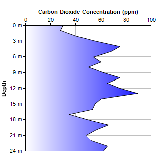
This example demonstrates swapping the x and y axes to produce an rotated area chart in which the area goes from left to right (instead of bottom to top).

The x and y axes in the example are configured as follows:

The area in this chart is filled using a gradient color created with BaseChart.gradientColor.

Source Code Listing

[Ruby On Rails Version - Controller] app/controllers/rotatedarea_controller.rb
require("chartdirector")

class RotatedareaController < ApplicationController

    def index()
        @title = "Rotated Area Chart"
        @ctrl_file = File.expand_path(__FILE__)
        @noOfCharts = 1
        render :template => "templates/chartview"
    end

    #
    # Render and deliver the chart
    #
    def getchart()
        # The data for the area chart
        data = [30, 28, 40, 55, 75, 68, 54, 60, 50, 62, 75, 65, 75, 89, 60, 55, 53, 35, 50, 66, 56,
            48, 52, 65, 62]

        # The labels for the area chart
        labels = [0, 1, 2, 3, 4, 5, 6, 7, 8, 9, 10, 11, 12, 13, 14, 15, 16, 17, 18, 19, 20, 21, 22,
            23, 24]

        # Create a XYChart object of size 320 x 320 pixels
        c = ChartDirector::XYChart.new(320, 320)

        # Swap the x and y axis to become a rotated chart
        c.swapXY()

        # Set the y axis on the top side (right + rotated = top)
        c.setYAxisOnRight()

        # Reverse the x axis so it is pointing downwards
        c.xAxis().setReverse()

        # Set the plotarea at (50, 50) and of size 200 x 200 pixels. Enable horizontal and vertical
        # grids by setting their colors to grey (0xc0c0c0).
        c.setPlotArea(50, 50, 250, 250).setGridColor(0xc0c0c0, 0xc0c0c0)

        # Add a line chart layer using the given data
        c.addAreaLayer(data, c.gradientColor(50, 0, 300, 0, 0xffffff, 0x0000ff))

        # Set the labels on the x axis. Append "m" after the value to show the unit.
        c.xAxis().setLabels2(labels, "{value} m")

        # Display 1 out of 3 labels.
        c.xAxis().setLabelStep(3)

        # Add a title to the x axis
        c.xAxis().setTitle("Depth")

        # Add a title to the y axis
        c.yAxis().setTitle("Carbon Dioxide Concentration (ppm)")

        # Output the chart
        send_data(c.makeChart2(ChartDirector::PNG), :type => "image/png", :disposition => "inline")

    end

end

[Ruby On Rails Version - View] app/views/templates/chartview.html.erb
<html>
<body style="margin:5px 0px 0px 5px">

<!-- Title -->
<div style="font-size:18pt; font-family:verdana; font-weight:bold">
    <%= @title %>
</div>
<hr style="border:solid 1px #000080" />

<!-- Source Code Listing Link -->
<div style="font-size:9pt; font-family:verdana; margin-bottom:1.5em">
    <%= link_to "Source Code Listing", 
        :controller => "cddemo", :action => "viewsource",
        :ctrl_file => @ctrl_file, :view_file => File.expand_path(__FILE__) %>
</div>

<!-- Create one or more IMG tags to display the demo chart(s) -->
<% 0.upto(@noOfCharts - 1) do |i| %>
    <img src="<%= url_for(:action => "getchart", :img => i) %>">
<% end %>

</body>
</html>

[Command Line Version] rubydemo/rotatedarea.rb
#!/usr/bin/env ruby
require("chartdirector")

# The data for the area chart
data = [30, 28, 40, 55, 75, 68, 54, 60, 50, 62, 75, 65, 75, 89, 60, 55, 53, 35, 50, 66, 56, 48, 52,
    65, 62]

# The labels for the area chart
labels = [0, 1, 2, 3, 4, 5, 6, 7, 8, 9, 10, 11, 12, 13, 14, 15, 16, 17, 18, 19, 20, 21, 22, 23, 24]

# Create a XYChart object of size 320 x 320 pixels
c = ChartDirector::XYChart.new(320, 320)

# Swap the x and y axis to become a rotated chart
c.swapXY()

# Set the y axis on the top side (right + rotated = top)
c.setYAxisOnRight()

# Reverse the x axis so it is pointing downwards
c.xAxis().setReverse()

# Set the plotarea at (50, 50) and of size 200 x 200 pixels. Enable horizontal and vertical grids by
# setting their colors to grey (0xc0c0c0).
c.setPlotArea(50, 50, 250, 250).setGridColor(0xc0c0c0, 0xc0c0c0)

# Add a line chart layer using the given data
c.addAreaLayer(data, c.gradientColor(50, 0, 300, 0, 0xffffff, 0x0000ff))

# Set the labels on the x axis. Append "m" after the value to show the unit.
c.xAxis().setLabels2(labels, "{value} m")

# Display 1 out of 3 labels.
c.xAxis().setLabelStep(3)

# Add a title to the x axis
c.xAxis().setTitle("Depth")

# Add a title to the y axis
c.yAxis().setTitle("Carbon Dioxide Concentration (ppm)")

# Output the chart
c.makeChart("rotatedarea.png")