require("chartdirector")
class ScatterlabelsController < ApplicationController
def index()
@title = "Custom Scatter Labels"
@ctrl_file = File.expand_path(__FILE__)
@noOfCharts = 1
render :template => "templates/chartview"
end
#
# Render and deliver the chart
#
def getchart()
# The XY points for the scatter chart
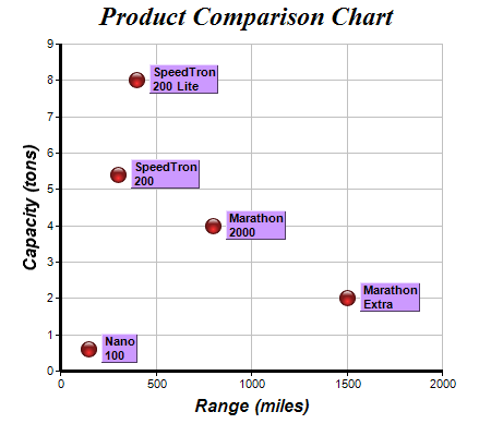
dataX = [150, 400, 300, 1500, 800]
dataY = [0.6, 8, 5.4, 2, 4]
# The labels for the points
labels = ["Nano\n100", "SpeedTron\n200 Lite", "SpeedTron\n200", "Marathon\nExtra",
"Marathon\n2000"]
# Create a XYChart object of size 450 x 400 pixels
c = ChartDirector::XYChart.new(450, 400)
# Set the plotarea at (55, 40) and of size 350 x 300 pixels, with a light grey border
# (0xc0c0c0). Turn on both horizontal and vertical grid lines with light grey color
# (0xc0c0c0)
c.setPlotArea(55, 40, 350, 300, 0xffffff, -1, 0xc0c0c0, 0xc0c0c0, -1)
# Add a title to the chart using 18pt Times Bold Itatic font.
c.addTitle("Product Comparison Chart", "timesbi.ttf", 18)
# Add a title to the y axis using 12pt Arial Bold Italic font
c.yAxis().setTitle("Capacity (tons)", "arialbi.ttf", 12)
# Add a title to the x axis using 12pt Arial Bold Italic font
c.xAxis().setTitle("Range (miles)", "arialbi.ttf", 12)
# Set the axes line width to 3 pixels
c.xAxis().setWidth(3)
c.yAxis().setWidth(3)
# Add the data as a scatter chart layer, using a 15 pixel circle as the symbol
layer = c.addScatterLayer(dataX, dataY, "", ChartDirector::GlassSphereShape, 15, 0xff3333,
0xff3333)
# Add labels to the chart as an extra field
layer.addExtraField(labels)
# Set the data label format to display the extra field
layer.setDataLabelFormat("{field0}")
# Use 8pt Arial Bold to display the labels
textbox = layer.setDataLabelStyle("arialbd.ttf", 8)
# Set the background to purple with a 1 pixel 3D border
textbox.setBackground(0xcc99ff, ChartDirector::Transparent, 1)
# Put the text box 4 pixels to the right of the data point
textbox.setAlignment(ChartDirector::Left)
textbox.setPos(4, 0)
# Output the chart
send_data(c.makeChart2(ChartDirector::PNG), :type => "image/png", :disposition => "inline")
end
end |