require("chartdirector")
class SymbollineController < ApplicationController
def index()
@title = "Symbol Line Chart"
@ctrl_file = File.expand_path(__FILE__)
@noOfCharts = 1
render :template => "templates/chartview"
end
#
# Render and deliver the chart
#
def getchart()
# The data for the line chart
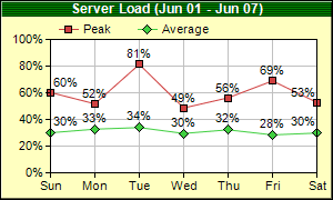
data0 = [60.2, 51.7, 81.3, 48.6, 56.2, 68.9, 52.8]
data1 = [30.0, 32.7, 33.9, 29.5, 32.2, 28.4, 29.8]
labels = ["Sun", "Mon", "Tue", "Wed", "Thu", "Fri", "Sat"]
# Create a XYChart object of size 300 x 180 pixels, with a pale yellow (0xffffc0)
# background, a black border, and 1 pixel 3D border effect.
c = ChartDirector::XYChart.new(300, 180, 0xffffc0, 0x000000, 1)
# Set the plotarea at (45, 35) and of size 240 x 120 pixels, with white background. Turn on
# both horizontal and vertical grid lines with light grey color (0xc0c0c0)
c.setPlotArea(45, 35, 240, 120, 0xffffff, -1, -1, 0xc0c0c0, -1)
# Add a legend box at (45, 12) (top of the chart) using horizontal layout and 8pt Arial font
# Set the background and border color to Transparent.
c.addLegend(45, 12, false, "", 8).setBackground(ChartDirector::Transparent)
# Add a title to the chart using 9pt Arial Bold/white font. Use a 1 x 2 bitmap pattern as
# the background.
c.addTitle("Server Load (Jun 01 - Jun 07)", "arialbd.ttf", 9, 0xffffff).setBackground(
c.patternColor([0x004000, 0x008000], 2))
# Set the y axis label format to nn%
c.yAxis().setLabelFormat("{value}%")
# Set the labels on the x axis
c.xAxis().setLabels(labels)
# Add a line layer to the chart
layer = c.addLineLayer()
# Add the first line. Plot the points with a 7 pixel square symbol
layer.addDataSet(data0, 0xcf4040, "Peak").setDataSymbol(ChartDirector::SquareSymbol, 7)
# Add the second line. Plot the points with a 9 pixel dismond symbol
layer.addDataSet(data1, 0x40cf40, "Average").setDataSymbol(ChartDirector::DiamondSymbol, 9)
# Enable data label on the data points. Set the label format to nn%.
layer.setDataLabelFormat("{value|0}%")
# Output the chart
send_data(c.makeChart2(ChartDirector::PNG), :type => "image/png", :disposition => "inline")
end
end |