require("chartdirector")
class XylineController < ApplicationController
def index()
@title = "Arbitrary XY Line Chart"
@ctrl_file = File.expand_path(__FILE__)
@noOfCharts = 1
render :template => "templates/chartview"
end
#
# Render and deliver the chart
#
def getchart()
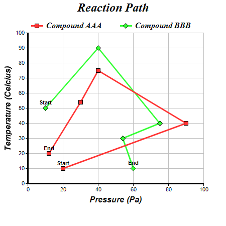
# The (x, y) data for the first line
dataX0 = [20, 90, 40, 30, 12]
dataY0 = [10, 40, 75, 54, 20]
# The (x, y) data for the second line
dataX1 = [10, 40, 75, 54, 60]
dataY1 = [50, 90, 40, 30, 10]
# Create a XYChart object of size 450 x 450 pixels
c = ChartDirector::XYChart.new(450, 450)
# Set the plotarea at (55, 65) and of size 350 x 300 pixels, with white background and a
# light grey border (0xc0c0c0). Turn on both horizontal and vertical grid lines with light
# grey color (0xc0c0c0)
c.setPlotArea(55, 65, 350, 300, 0xffffff, -1, 0xc0c0c0, 0xc0c0c0, -1)
# Add a legend box at (50, 30) (top of the chart) with horizontal layout. Use 12pt Times
# Bold Italic font. Set the background and border color to Transparent.
c.addLegend(50, 30, false, "timesbi.ttf", 12).setBackground(ChartDirector::Transparent)
# Add a title to the chart using 18pt Times Bold Itatic font
c.addTitle("Reaction Path", "timesbi.ttf", 18)
# Add a title to the y axis using 12pt Arial Bold Italic font
c.yAxis().setTitle("Temperature (Celcius)", "arialbi.ttf", 12)
# Set the y axis line width to 3 pixels
c.yAxis().setWidth(3)
# Add a title to the x axis using 12pt Arial Bold Italic font
c.xAxis().setTitle("Pressure (Pa)", "arialbi.ttf", 12)
# Set the x axis line width to 3 pixels
c.xAxis().setWidth(3)
# Add a red (0xff3333) line layer using dataX0 and dataY0
layer1 = c.addLineLayer(dataY0, 0xff3333, "Compound AAA")
layer1.setXData(dataX0)
# Set the line width to 3 pixels
layer1.setLineWidth(3)
# Use 9 pixel square symbols for the data points
layer1.getDataSet(0).setDataSymbol(ChartDirector::SquareSymbol, 9)
# Add custom text labels to the first and last point on the scatter plot using Arial Bold
# font
layer1.addCustomDataLabel(0, 0, "Start", "arialbd.ttf")
layer1.addCustomDataLabel(0, 4, "End", "arialbd.ttf")
# Add a green (0x33ff33) line layer using dataX1 and dataY1
layer2 = c.addLineLayer(dataY1, 0x33ff33, "Compound BBB")
layer2.setXData(dataX1)
# Set the line width to 3 pixels
layer2.setLineWidth(3)
# Use 11 pixel diamond symbols for the data points
layer2.getDataSet(0).setDataSymbol(ChartDirector::DiamondSymbol, 11)
# Add custom text labels to the first and last point on the scatter plot using Arial Bold
# font
layer2.addCustomDataLabel(0, 0, "Start", "arialbd.ttf")
layer2.addCustomDataLabel(0, 4, "End", "arialbd.ttf")
# Output the chart
send_data(c.makeChart2(ChartDirector::PNG), :type => "image/png", :disposition => "inline")
end
end |