require("chartdirector")
class YzonecolorController < ApplicationController
def index()
@title = "Y Zone Coloring"
@ctrl_file = File.expand_path(__FILE__)
@noOfCharts = 1
render :template => "templates/chartview"
end
#
# Render and deliver the chart
#
def getchart()
# The data for the chart
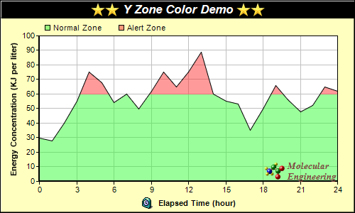
data = [30, 28, 40, 55, 75, 68, 54, 60, 50, 62, 75, 65, 75, 89, 60, 55, 53, 35, 50, 66, 56,
48, 52, 65, 62]
# The labels for the chart
labels = ["0", "1", "2", "3", "4", "5", "6", "7", "8", "9", "10", "11", "12", "13", "14",
"15", "16", "17", "18", "19", "20", "21", "22", "23", "24"]
# Create a XYChart object of size 500 x 300 pixels, with a pale yellow (0xffffc0)
# background, a black border, and 1 pixel 3D border effect
c = ChartDirector::XYChart.new(500, 300, 0xffffc0, 0x000000, 1)
# Set directory for loading images to current script directory
c.setSearchPath(File.dirname(__FILE__))
# Set the plotarea at (55, 50) and of size 420 x 205 pixels, with white background. Turn on
# both horizontal and vertical grid lines with light grey color (0xc0c0c0)
c.setPlotArea(55, 50, 420, 205, 0xffffff).setGridColor(0xc0c0c0, 0xc0c0c0)
# Add a legend box at (55, 25) (top of the chart) with horizontal layout. Use 8pt Arial
# font. Set the background and border color to Transparent.
legendBox = c.addLegend(55, 25, false, "", 8)
legendBox.setBackground(ChartDirector::Transparent)
# Add keys to the legend box to explain the color zones
legendBox.addKey("Normal Zone", 0x8033ff33)
legendBox.addKey("Alert Zone", 0x80ff3333)
# Add a title box to the chart using 13pt Arial Bold Italic font. The title is in CDML and
# includes embedded images for highlight. The text is white (0xffffff) on a black
# background, with a 1 pixel 3D border.
c.addTitle(
"<*block,valign=absmiddle*><*img=star.png*><*img=star.png*> Y Zone Color Demo " \
"<*img=star.png*><*img=star.png*><*/*>", "arialbi.ttf", 13, 0xffffff).setBackground(
0x000000, -1, 1)
# Add a title to the y axis
c.yAxis().setTitle("Energy Concentration (KJ per liter)")
# Set the labels on the x axis.
c.xAxis().setLabels(labels)
# Display 1 out of 3 labels on the x-axis.
c.xAxis().setLabelStep(3)
# Add a title to the x axis using CDML
c.xAxis().setTitle("<*block,valign=absmiddle*><*img=clock.png*> Elapsed Time (hour)<*/*>")
# Set the axes width to 2 pixels
c.xAxis().setWidth(2)
c.yAxis().setWidth(2)
# Add an area layer to the chart. The area is using a y zone color, where the color is
# semi-transparent green below 60, and semi-transparent red above 60.
c.addAreaLayer(data, c.yZoneColor(60, 0x8033ff33, 0x80ff3333))
# Add a custom CDML text at the bottom right of the plot area as the logo
c.addText(475, 255,
"<*block,valign=absmiddle*><*img=small_molecule.png*> <*block*>" \
"<*font=timesbi.ttf,size=10,color=804040*>Molecular\nEngineering<*/*>").setAlignment(
ChartDirector::BottomRight)
# Output the chart
send_data(c.makeChart2(ChartDirector::PNG), :type => "image/png", :disposition => "inline")
end
end |