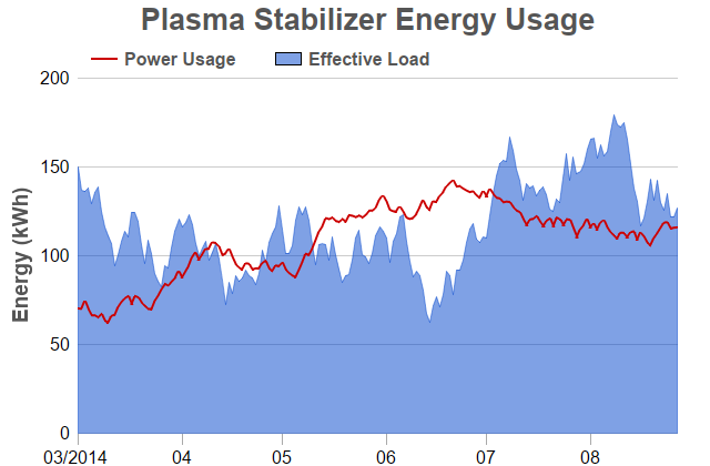
This example demonstrates an area chart with a line layer overlap on top. It also demonstrates using date/time x coordinates for the data points (as opposed to using x-axis labels), and also various methods to control the chart appearance.
In ChartDirector, x coordinates for the data points are optional. If no x coordinates are provided for the data points, the x coordinates will be assumed to be the array indexes (0, 1, 2, 3 ...), and the data points would be evenly spaced in the x direction. Axis labels specified using
Axis.setLabels or
Axis.setLabels2 are also positioned using the array indexes as the x coordinates, so the labels will match with the data points.
In some applications, it may be necessary or more convenient to provide x coordinates for the data points. For example, if the data points are unevenly spaced, or if there are multiple data series with different data point spacing in the x direction, x coordinates are needed. In this case,
Layer.setXData or
Layer.setXData2 can be used to provide the x coordinates. By default, ChartDirector will then automatically determine the x-axis scale and labels, just like how the y-axis is handled. The axis scale and labels can also be specified by using various
Axis methods, such as
Axis.setLinearScale,
Axis.setLogScale and
Axis.setDateScale (please refer to
Axis for the full list).
Axis.setLabels or
Axis.setLabels2 should not be used if x coordinates are provided, as they use array indexes as the x coordinates, which is unlikely to be consistent with the provided x coordinates.
In this example, x coordinates are used to demonstrate the automatic x-axis scale and labels.
[Web Version (in ASP)] aspdemo\arealine.asp
<%@ language="vbscript" %>
<%
Set cd = CreateObject("ChartDirector.API")

' In this example, we simply use random data for the 2 data series.
Set r = cd.RanSeries(127)
data0 = r.getSeries(180, 70, -5, 5)
data1 = r.getSeries(180, 150, -15, 15)
timeStamps = r.getDateSeries(180, DateSerial(2014, 3, 1), 86400)

' Create a XYChart object of size 640 x 420 pixels
Set c = cd.XYChart(640, 420)

' Add a title box using grey (0x555555) 20pt Arial Bold font
Call c.addTitle("   Plasma Stabilizer Energy Usage", "Arial Bold", 20, &H555555)

' Set the plotarea at (70, 70) and of size 540 x 320 pixels, with transparent background and border
' and light grey (0xcccccc) horizontal grid lines
Call c.setPlotArea(70, 70, 540, 320, -1, -1, cd.Transparent, &Hcccccc)

' Add a legend box with horizontal layout above the plot area at (70, 32). Use 12pt Arial Bold dark
' grey (0x555555) font, transparent background and border, and line style legend icon.
Set b = c.addLegend(70, 32, False, "Arial Bold", 12)
Call b.setFontColor(&H555555)
Call b.setBackground(cd.Transparent, cd.Transparent)
Call b.setLineStyleKey()

' Set axis label font to 12pt Arial
Call c.xAxis().setLabelStyle("Arial", 12)
Call c.yAxis().setLabelStyle("Arial", 12)

' Set the x and y axis stems to transparent, and the x-axis tick color to grey (0xaaaaaa)
Call c.xAxis().setColors(cd.Transparent, cd.TextColor, cd.TextColor, &Haaaaaa)
Call c.yAxis().setColors(cd.Transparent)

' Set the major/minor tick lengths for the x-axis to 10 and 0.
Call c.xAxis().setTickLength(10, 0)

' For the automatic axis labels, set the minimum spacing to 80/40 pixels for the x/y axis.
Call c.xAxis().setTickDensity(80)
Call c.yAxis().setTickDensity(40)

' Use "mm/yyyy" as the x-axis label format for the first plotted month of a year, and "mm" for other
' months
Call c.xAxis().setMultiFormat(cd.StartOfYearFilter(), "{value|mm/yyyy} ", cd.StartOfMonthFilter(), _
    "{value|mm}")

' Add a title to the y axis using dark grey (0x555555) 12pt Arial Bold font
Call c.yAxis().setTitle("Energy (kWh)", "Arial Bold", 14, &H555555)

' Add a line layer with 2-pixel line width
Set layer0 = c.addLineLayer(data0, &Hcc0000, "Power Usage")
Call layer0.setXData(timeStamps)
Call layer0.setLineWidth(2)

' Add an area layer using semi-transparent blue (0x7f0044cc) as the fill color
Set layer1 = c.addAreaLayer(data1, &H7f0044cc, "Effective Load")
Call layer1.setXData(timeStamps)
Call layer1.setBorderColor(cd.SameAsMainColor)

' Output the chart
Set viewer = cd.WebChartViewer(Request, "chart1")
Call viewer.setChart(c, cd.SVG)

' Include tool tip for the chart
viewer.ImageMap = c.getHTMLImageMap("", "", "title='[{x|mm dd, yyyy}] {value} kWh'")
%>

<!DOCTYPE html>
<html>
<head>
    <title>Area Line Chart</title>
    <!-- Include ChartDirector Javascript Library to support chart interactions -->
    <script type="text/javascript" src="cdjcv.js"></script>
</head>
<body style="margin:5px 0px 0px 5px">
    <div style="font:bold 18pt verdana;">
        Area Line Chart
    </div>
    <hr style="border:solid 1px #000080; background:#000080" />
    <div style="font:10pt verdana; margin-bottom:1.5em">
        <a href="viewsource.asp?file=<%= Request("SCRIPT_NAME") %>">View Chart Source Code</a>
    </div>
    <!-- ****** Here is the chart image ****** -->
    <%= viewer.renderHTML() %>
</body>
</html>
[Windows Version (in Visual Basic)] vbdemo\arealine.cls
Public Sub createChart(viewer As Object, chartIndex As Integer)

    Dim cd As New ChartDirector.API

    ' In this example, we simply use random data for the 2 data series.
    Dim r As RanSeries
    Set r = cd.RanSeries(127)
    Dim data0()
    data0 = r.getSeries(180, 70, -5, 5)
    Dim data1()
    data1 = r.getSeries(180, 150, -15, 15)
    Dim timeStamps()
    timeStamps = r.getDateSeries(180, DateSerial(2014, 3, 1), 86400)

    ' Create a XYChart object of size 640 x 420 pixels
    Dim c As XYChart
    Set c = cd.XYChart(640, 420)

    ' Add a title box using grey (0x555555) 20pt Arial Bold font
    Call c.addTitle("   Plasma Stabilizer Energy Usage", "arialbd.ttf", 20, &H555555)

    ' Set the plotarea at (70, 70) and of size 540 x 320 pixels, with transparent background and
    ' border and light grey (0xcccccc) horizontal grid lines
    Call c.setPlotArea(70, 70, 540, 320, -1, -1, cd.Transparent, &Hcccccc)

    ' Add a legend box with horizontal layout above the plot area at (70, 32). Use 12pt Arial Bold
    ' dark grey (0x555555) font, transparent background and border, and line style legend icon.
    Dim b As LegendBox
    Set b = c.addLegend(70, 32, False, "arialbd.ttf", 12)
    Call b.setFontColor(&H555555)
    Call b.setBackground(cd.Transparent, cd.Transparent)
    Call b.setLineStyleKey()

    ' Set axis label font to 12pt Arial
    Call c.xAxis().setLabelStyle("arial.ttf", 12)
    Call c.yAxis().setLabelStyle("arial.ttf", 12)

    ' Set the x and y axis stems to transparent, and the x-axis tick color to grey (0xaaaaaa)
    Call c.xAxis().setColors(cd.Transparent, cd.TextColor, cd.TextColor, &Haaaaaa)
    Call c.yAxis().setColors(cd.Transparent)

    ' Set the major/minor tick lengths for the x-axis to 10 and 0.
    Call c.xAxis().setTickLength(10, 0)

    ' For the automatic axis labels, set the minimum spacing to 80/40 pixels for the x/y axis.
    Call c.xAxis().setTickDensity(80)
    Call c.yAxis().setTickDensity(40)

    ' Use "mm/yyyy" as the x-axis label format for the first plotted month of a year, and "mm" for
    ' other months
    Call c.xAxis().setMultiFormat(cd.StartOfYearFilter(), "{value|mm/yyyy} ", _
        cd.StartOfMonthFilter(), "{value|mm}")

    ' Add a title to the y axis using dark grey (0x555555) 12pt Arial Bold font
    Call c.yAxis().setTitle("Energy (kWh)", "arialbd.ttf", 14, &H555555)

    ' Add a line layer with 2-pixel line width
    Dim layer0 As LineLayer
    Set layer0 = c.addLineLayer(data0, &Hcc0000, "Power Usage")
    Call layer0.setXData(timeStamps)
    Call layer0.setLineWidth(2)

    ' Add an area layer using semi-transparent blue (0x7f0044cc) as the fill color
    Dim layer1 As AreaLayer
    Set layer1 = c.addAreaLayer(data1, &H7f0044cc, "Effective Load")
    Call layer1.setXData(timeStamps)
    Call layer1.setBorderColor(cd.SameAsMainColor)

    ' Output the chart
    Set viewer.Picture = c.makePicture()

    'include tool tip for the chart
    viewer.ImageMap = c.getHTMLImageMap("clickable", "", "title='[{x|mm dd, yyyy}] {value} kWh'")

End Sub
© 2021 Advanced Software Engineering Limited. All rights reserved.