[Web Version (in ASP)] aspdemo\datatable2.asp
<%@ language="vbscript" %>
<%
Set cd = CreateObject("ChartDirector.API")
' The data for the line chart
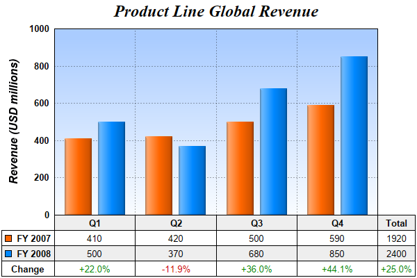
data0 = Array(410, 420, 500, 590)
data1 = Array(500, 370, 680, 850)
labels = Array("Q1", "Q2", "Q3", "Q4")
' Create a XYChart object of size 600 x 400 pixels
Set c = cd.XYChart(600, 400)
' Add a title to the chart using 18pt Times Bold Italic font
Set title = c.addTitle("Product Line Global Revenue", "Times New Roman Bold Italic", 18)
' Tentatively set the plotarea at (50, 55) and of (chart_width - 100) x (chart_height - 150) pixels
' in size. Use a vertical gradient color from sky blue (aaccff) t0 light blue (f9f9ff) as
' background. Set both horizontal and vertical grid lines to dotted semi-transprent black
' (aa000000).
Set plotArea = c.setPlotArea(50, 55, c.getWidth() - 100, c.getHeight() - 150, _
c.linearGradientColor(0, 55, 0, 55 + c.getHeight() - 150, &Haaccff, &Hf9fcff), -1, -1, _
c.dashLineColor(&Haa000000, cd.DotLine), -1)
' Set y-axis title using 12 points Arial Bold Italic font, and set its position 10 pixels from the
' axis.
Call c.yAxis().setTitle("Revenue (USD millions)", "Arial Bold Italic", 12)
Call c.yAxis().setTitlePos(cd.Left, 10)
' Set y-axis label style to 10 points Arial Bold and axis color to transparent
Call c.yAxis().setLabelStyle("Arial Bold", 10)
Call c.yAxis().setColors(cd.Transparent)
' Set y-axis tick density to 30 pixels. ChartDirector auto-scaling will use this as the guideline
' when putting ticks on the y-axis.
Call c.yAxis().setTickDensity(30)
' Add a bar layer to the chart with side layout
Set layer = c.addBarLayer2(cd.Side)
' Add two data sets to the bar layer
Call layer.addDataSet(data0, &Hff6600, "FY 2007")
Call layer.addDataSet(data1, &H0088ff, "FY 2008")
' Use soft lighting effect with light direction from the left
Call layer.setBorderColor(cd.Transparent, cd.softLighting(cd.Left))
' Set the x axis labels
Call c.xAxis().setLabels(labels)
' Convert the labels on the x-axis to a CDMLTable
Set table = c.xAxis().makeLabelTable()
' Set the default left/right margins to 5 pixels and top/bottom margins to 3 pixels. Set the default
' font size to 10 points
Set cellStyle = table.getStyle()
Call cellStyle.setMargin2(5, 5, 4, 3)
Call cellStyle.setFontSize(10)
' Set the first row to use Arial Bold font, with a light grey (eeeeee) background.
Set firstRowStyle = table.getRowStyle(0)
Call firstRowStyle.setFontStyle("Arial Bold")
Call firstRowStyle.setBackground(&Heeeeee, cd.LineColor)
'
' We can add more information to the table. In this sample code, we add the data series and the
' legend icons to the table.
'
' Add 3 more rows to the table. Set the background of the 2nd row to light grey (eeeeee).
Call table.appendRow()
Call table.appendRow().setBackground(&Heeeeee, cd.LineColor)
Call table.appendRow()
' Put the values of the 2 data series in the first 2 rows. Put the percentage differences in the 3rd
' row.
For i = 0 To UBound(data0)
Call table.setText(i, 1, CStr(data0(i)))
Call table.setText(i, 2, CStr(data1(i)))
percentageDiff = 100.0 * (data1(i) - data0(i)) / data0(i)
' Use red or green color depending on whether the difference is positive or negative
formatString = "<*color=008800*>+{value|1}%"
If percentageDiff < 0 Then
formatString = "<*color=cc0000*>{value|1}%"
End If
Call table.setText(i, 3, c.formatValue(percentageDiff, formatString))
Next
' Insert a column on the left for the legend icons using Arial Bold font.
Call table.insertCol(0).setFontStyle("Arial Bold")
' The top cell is set to transparent, so it is invisible
Call table.getCell(0, 0).setBackground(cd.Transparent, cd.Transparent)
' The next 2 cells are set to the legend icons and names of the 2 data series
Call table.setText(0, 1, layer.getLegendIcon(0) & " FY 2007")
Call table.setText(0, 2, layer.getLegendIcon(1) & " FY 2008")
' The last cell is set to "Change"
Call table.setText(0, 3, "Change")
' Append a column on the right for the total values.
Call table.appendCol()
' Put "Total" in the top cell as the heading of this column
Call table.setText(table.getColCount() - 1, 0, "Total")
' The next two cells are the total of the data series
total0 = cd.ArrayMath(data0).sum()
total1 = cd.ArrayMath(data1).sum()
Call table.setText(table.getColCount() - 1, 1, CStr(total0))
Call table.setText(table.getColCount() - 1, 2, CStr(total1))
' The last cell is the percentage differences of the total
totalPercentageDiff = (total1 - total0) / total0 * 100
' Use red or green color depending on whether the difference is positive or negative
totalFormatString = "<*color=008800*>+{value|1}%"
If totalPercentageDiff < 0 Then
totalFormatString = "<*color=cc0000*>{value|1}%"
End If
Call table.setText(table.getColCount() - 1, 3, c.formatValue(totalPercentageDiff, _
totalFormatString))
'
' We now demonstrate how to adjust the plot area positions, to allow space for the newly inserted
' left and right columns in the table.
'
' We layout the axis first in order to get the axis metrics (including table metrics)
Call c.layoutAxes()
' If the first column is wider than the left y-axis, we need to reserve for some left margin to
' ensure the first column stays within the chart.
leftMargin = 0
If table.getColWidth(0) > c.yAxis().getThickness() Then
leftMargin = table.getColWidth(0) - c.yAxis().getThickness()
End If
' Similarly, we need to reserve some right margin for the last column
rightMargin = table.getColWidth(table.getColCount() - 1)
' Adjust the plot area size, such that the bounding box (inclusive of axes) using the given left and
' right margin, plus 2 more pixels. Put the plot area 10 pixels below the title and use 2 pixels as
' the bottom margin. from the left, right and bottom edge, and is just under the legend box.
Call c.packPlotArea(leftMargin + 2, title.getHeight() + 10, c.getWidth() - 3 - rightMargin, _
c.getHeight() - 3)
' After determining the exact plot area position, we may adjust title position so that it is
' centered relative to the plot area (instead of the chart)
Call title.setPos(plotArea.getLeftX() + (plotArea.getWidth() - title.getWidth()) / 2, _
title.getTopY())
' Output the chart
Set viewer = cd.WebChartViewer(Request, "chart1")
Call viewer.setChart(c, cd.SVG)
' Include tool tip for the chart
viewer.ImageMap = c.getHTMLImageMap("", "", _
"title='Revenue in {xLabel} {dataSetName}: US$ {value}M'")
%>
<!DOCTYPE html>
<html>
<head>
<title>Data Table (2)</title>
<!-- Include ChartDirector Javascript Library to support chart interactions -->
<script type="text/javascript" src="cdjcv.js"></script>
</head>
<body style="margin:5px 0px 0px 5px">
<div style="font:bold 18pt verdana;">
Data Table (2)
</div>
<hr style="border:solid 1px #000080; background:#000080" />
<div style="font:10pt verdana; margin-bottom:1.5em">
<a href="viewsource.asp?file=<%= Request("SCRIPT_NAME") %>">View Chart Source Code</a>
</div>
<!-- ****** Here is the chart image ****** -->
<%= viewer.renderHTML() %>
</body>
</html>
[Windows Version (in Visual Basic)] vbdemo\datatable2.cls
Public Sub createChart(viewer As Object, chartIndex As Integer)

    Dim cd As New ChartDirector.API

    ' The data for the line chart
    Dim data0()
    data0 = Array(410, 420, 500, 590)
    Dim data1()
    data1 = Array(500, 370, 680, 850)
    Dim labels()
    labels = Array("Q1", "Q2", "Q3", "Q4")

    ' Create a XYChart object of size 600 x 400 pixels
    Dim c As XYChart
    Set c = cd.XYChart(600, 400)

    ' Add a title to the chart using 18pt Times Bold Italic font
    Dim title As ChartDirector.TextBox
    Set title = c.addTitle("Product Line Global Revenue", "timesbi.ttf", 18)

    ' Tentatively set the plotarea at (50, 55) and of (chart_width - 100) x (chart_height - 150)
    ' pixels in size. Use a vertical gradient color from sky blue (aaccff) t0 light blue (f9f9ff) as
    ' background. Set both horizontal and vertical grid lines to dotted semi-transprent black
    ' (aa000000).
    Dim plotArea As PlotArea
    Set plotArea = c.setPlotArea(50, 55, c.getWidth() - 100, c.getHeight() - 150, _
        c.linearGradientColor(0, 55, 0, 55 + c.getHeight() - 150, &Haaccff, &Hf9fcff), -1, -1, _
        c.dashLineColor(&Haa000000, cd.DotLine), -1)

    ' Set y-axis title using 12 points Arial Bold Italic font, and set its position 10 pixels from
    ' the axis.
    Call c.yAxis().setTitle("Revenue (USD millions)", "arialbi.ttf", 12)
    Call c.yAxis().setTitlePos(cd.Left, 10)

    ' Set y-axis label style to 10 points Arial Bold and axis color to transparent
    Call c.yAxis().setLabelStyle("arialbd.ttf", 10)
    Call c.yAxis().setColors(cd.Transparent)

    ' Set y-axis tick density to 30 pixels. ChartDirector auto-scaling will use this as the
    ' guideline when putting ticks on the y-axis.
    Call c.yAxis().setTickDensity(30)

    ' Add a bar layer to the chart with side layout
    Dim layer As BarLayer
    Set layer = c.addBarLayer2(cd.Side)

    ' Add two data sets to the bar layer
    Call layer.addDataSet(data0, &Hff6600, "FY 2007")
    Call layer.addDataSet(data1, &H0088ff, "FY 2008")

    ' Use soft lighting effect with light direction from the left
    Call layer.setBorderColor(cd.Transparent, cd.softLighting(cd.Left))

    ' Set the x axis labels
    Call c.xAxis().setLabels(labels)

    ' Convert the labels on the x-axis to a CDMLTable
    Dim table As CDMLTable
    Set table = c.xAxis().makeLabelTable()

    ' Set the default left/right margins to 5 pixels and top/bottom margins to 3 pixels. Set the
    ' default font size to 10 points
    Dim cellStyle As ChartDirector.TextBox
    Set cellStyle = table.getStyle()
    Call cellStyle.setMargin2(5, 5, 4, 3)
    Call cellStyle.setFontSize(10)

    ' Set the first row to use Arial Bold font, with a light grey (eeeeee) background.
    Dim firstRowStyle As ChartDirector.TextBox
    Set firstRowStyle = table.getRowStyle(0)
    Call firstRowStyle.setFontStyle("arialbd.ttf")
    Call firstRowStyle.setBackground(&Heeeeee, cd.LineColor)

    '
    ' We can add more information to the table. In this sample code, we add the data series and the
    ' legend icons to the table.
    '

    ' Add 3 more rows to the table. Set the background of the 2nd row to light grey (eeeeee).
    Call table.appendRow()
    Call table.appendRow().setBackground(&Heeeeee, cd.LineColor)
    Call table.appendRow()

    ' Put the values of the 2 data series in the first 2 rows. Put the percentage differences in the
    ' 3rd row.
    Dim i As Long
    For i = 0 To UBound(data0)
        Call table.setText(i, 1, CStr(data0(i)))
        Call table.setText(i, 2, CStr(data1(i)))

        Dim percentageDiff As Double
        percentageDiff = 100.0 * (data1(i) - data0(i)) / data0(i)

        ' Use red or green color depending on whether the difference is positive or negative
        Dim formatString As String
        formatString = "<*color=008800*>+{value|1}%"
        If percentageDiff < 0 Then
            formatString = "<*color=cc0000*>{value|1}%"
        End If
        Call table.setText(i, 3, c.formatValue(percentageDiff, formatString))
    Next

    ' Insert a column on the left for the legend icons using Arial Bold font.
    Call table.insertCol(0).setFontStyle("arialbd.ttf")

    ' The top cell is set to transparent, so it is invisible
    Call table.getCell(0, 0).setBackground(cd.Transparent, cd.Transparent)

    ' The next 2 cells are set to the legend icons and names of the 2 data series
    Call table.setText(0, 1, layer.getLegendIcon(0) & "  FY 2007")
    Call table.setText(0, 2, layer.getLegendIcon(1) & "  FY 2008")

    ' The last cell is set to "Change"
    Call table.setText(0, 3, "Change")

    ' Append a column on the right for the total values.
    Call table.appendCol()

    ' Put "Total" in the top cell as the heading of this column
    Call table.setText(table.getColCount() - 1, 0, "Total")

    ' The next two cells are the total of the data series
    Dim total0 As Double
    total0 = cd.ArrayMath(data0).sum()
    Dim total1 As Double
    total1 = cd.ArrayMath(data1).sum()
    Call table.setText(table.getColCount() - 1, 1, CStr(total0))
    Call table.setText(table.getColCount() - 1, 2, CStr(total1))

    ' The last cell is the percentage differences of the total
    Dim totalPercentageDiff As Double
    totalPercentageDiff = (total1 - total0) / total0 * 100

    ' Use red or green color depending on whether the difference is positive or negative
    Dim totalFormatString As String
    totalFormatString = "<*color=008800*>+{value|1}%"
    If totalPercentageDiff < 0 Then
        totalFormatString = "<*color=cc0000*>{value|1}%"
    End If
    Call table.setText(table.getColCount() - 1, 3, c.formatValue(totalPercentageDiff, _
        totalFormatString))

    '
    ' We now demonstrate how to adjust the plot area positions, to allow space for the newly
    ' inserted left and right columns in the table.
    '

    ' We layout the axis first in order to get the axis metrics (including table metrics)
    Call c.layoutAxes()

    ' If the first column is wider than the left y-axis, we need to reserve for some left margin to
    ' ensure the first column stays within the chart.
    Dim leftMargin As Long
    leftMargin = 0
    If table.getColWidth(0) > c.yAxis().getThickness() Then
        leftMargin = table.getColWidth(0) - c.yAxis().getThickness()
    End If

    ' Similarly, we need to reserve some right margin for the last column
    Dim rightMargin As Long
    rightMargin = table.getColWidth(table.getColCount() - 1)

    ' Adjust the plot area size, such that the bounding box (inclusive of axes) using the given left
    ' and right margin, plus 2 more pixels. Put the plot area 10 pixels below the title and use 2
    ' pixels as the bottom margin. from the left, right and bottom edge, and is just under the
    ' legend box.
    Call c.packPlotArea(leftMargin + 2, title.getHeight() + 10, c.getWidth() - 3 - rightMargin, _
        c.getHeight() - 3)

    ' After determining the exact plot area position, we may adjust title position so that it is
    ' centered relative to the plot area (instead of the chart)
    Call title.setPos(plotArea.getLeftX() + (plotArea.getWidth() - title.getWidth()) / 2, _
        title.getTopY())

    ' Output the chart
    Set viewer.Picture = c.makePicture()

    'include tool tip for the chart
    viewer.ImageMap = c.getHTMLImageMap("clickable", "", _
        "title='Revenue in {xLabel} {dataSetName}: US$ {value}M'")

End Sub
© 2021 Advanced Software Engineering Limited. All rights reserved.