[Web Version (in ASP)] aspdemo\multisymbolline.asp
<%@ language="vbscript" %>
<%
Set cd = CreateObject("ChartDirector.API")
' In this example, the data points are unevenly spaced on the x-axis
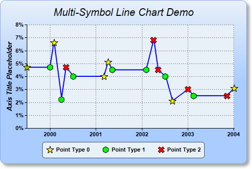
dataY = Array(4.7, 4.7, 6.6, 2.2, 4.7, 4.0, 4.0, 5.1, 4.5, 4.5, 6.8, 4.5, 4, 2.1, 3, 2.5, 2.5, 3.1)
dataX = Array(DateSerial(1999, 7, 1), DateSerial(2000, 1, 1), DateSerial(2000, 2, 1), DateSerial( _
2000, 4, 1), DateSerial(2000, 5, 8), DateSerial(2000, 7, 5), DateSerial(2001, 3, 5), _
DateSerial(2001, 4, 7), DateSerial(2001, 5, 9), DateSerial(2002, 2, 4), DateSerial(2002, 4, 4 _
), DateSerial(2002, 5, 8), DateSerial(2002, 7, 7), DateSerial(2002, 8, 30), DateSerial(2003, _
1, 2), DateSerial(2003, 2, 16), DateSerial(2003, 11, 6), DateSerial(2004, 1, 4))
' Data points are assigned different symbols based on point type
pointType = Array(0, 1, 0, 1, 2, 1, 0, 0, 1, 1, 2, 2, 1, 0, 2, 1, 2, 0)
' Create a XYChart object of size 480 x 320 pixels. Use a vertical gradient color from pale blue
' (e8f0f8) to sky blue (aaccff) spanning half the chart height as background. Set border to blue
' (88aaee). Use rounded corners. Enable soft drop shadow.
Set c = cd.XYChart(480, 320)
Call c.setBackground(c.linearGradientColor(0, 0, 0, c.getHeight() / 2, &He8f0f8, &Haaccff), _
&H88aaee)
Call c.setRoundedFrame()
Call c.setDropShadow()
' Add a title to the chart using 15 points Arial Italic font. Set top/bottom margins to 12 pixels.
Set title = c.addTitle("Multi-Symbol Line Chart Demo", "Arial Italic", 15)
Call title.setMargin2(0, 0, 12, 12)
' Tentatively set the plotarea to 50 pixels from the left edge to allow for the y-axis, and to just
' under the title. Set the width to 65 pixels less than the chart width, and the height to reserve
' 90 pixels at the bottom for the x-axis and the legend box. Use pale blue (e8f0f8) background,
' transparent border, and grey (888888) dotted horizontal and vertical grid lines.
Call c.setPlotArea(50, title.getHeight(), c.getWidth() - 65, c.getHeight() - title.getHeight() - _
90, &He8f0f8, -1, cd.Transparent, c.dashLineColor(&H888888, cd.DotLine), -1)
' Add a legend box where the bottom-center is anchored to the 12 pixels above the bottom-center of
' the chart. Use horizontal layout and 8 points Arial font.
Set legendBox = c.addLegend(c.getWidth() / 2, c.getHeight() - 12, False, "Arial Bold", 8)
Call legendBox.setAlignment(cd.BottomCenter)
' Set the legend box background and border to pale blue (e8f0f8) and bluish grey (445566)
Call legendBox.setBackground(&He8f0f8, &H445566)
' Use rounded corners of 5 pixel radius for the legend box
Call legendBox.setRoundedCorners(5)
' Set the y axis label format to display a percentage sign
Call c.yAxis().setLabelFormat("{value}%")
' Set y-axis title to use 10 points Arial Bold Italic font
Call c.yAxis().setTitle("Axis Title Placeholder", "Arial Bold Italic", 10)
' Set axis labels to use Arial Bold font
Call c.yAxis().setLabelStyle("Arial Bold")
Call c.xAxis().setLabelStyle("Arial Bold")
' We add the different data symbols using scatter layers. The scatter layers are added before the
' line layer to make sure the data symbols stay on top of the line layer.
' We select the points with pointType = 0 (the non-selected points will be set to NoValue), and use
' yellow (ffff00) 15 pixels high 5 pointed star shape symbols for the points. (This example uses
' both x and y coordinates. For charts that have no x explicitly coordinates, use an empty array as
' dataX.)
Call c.addScatterLayer(dataX, cd.ArrayMath(dataY).selectEQZ(pointType, cd.NoValue).result(), _
"Point Type 0", cd.StarShape(5), 15, &Hffff00)
' Similar to above, we select the points with pointType - 1 = 0 and use green (ff00) 13 pixels high
' six-sided polygon as symbols.
Call c.addScatterLayer(dataX, cd.ArrayMath(dataY).selectEQZ(cd.ArrayMath(pointType).subtract(1 _
).result(), cd.NoValue).result(), "Point Type 1", cd.PolygonShape(6), 13, &H00ff00)
' Similar to above, we select the points with pointType - 2 = 0 and use red (ff0000) 13 pixels high
' X shape as symbols.
Call c.addScatterLayer(dataX, cd.ArrayMath(dataY).selectEQZ(cd.ArrayMath(pointType).subtract(2 _
).result(), cd.NoValue).result(), "Point Type 2", cd.Cross2Shape(), 13, &Hff0000)
' Finally, add a blue (0000ff) line layer with line width of 2 pixels
Set layer = c.addLineLayer(dataY, &H0000ff)
Call layer.setXData(dataX)
Call layer.setLineWidth(2)
' Adjust the plot area size, such that the bounding box (inclusive of axes) is 10 pixels from the
' left edge, just below the title, 25 pixels from the right edge, and 8 pixels above the legend box.
Call c.packPlotArea(10, title.getHeight(), c.getWidth() - 25, c.layoutLegend().getTopY() - 8)
' Output the chart
Set viewer = cd.WebChartViewer(Request, "chart1")
Call viewer.setChart(c, cd.SVG)
' Include tool tip for the chart
viewer.ImageMap = c.getHTMLImageMap("", "", "title='{x|mmm dd, yyyy}: {value}%'")
%>
<!DOCTYPE html>
<html>
<head>
<title>Multi-Symbol Line Chart</title>
<!-- Include ChartDirector Javascript Library to support chart interactions -->
<script type="text/javascript" src="cdjcv.js"></script>
</head>
<body style="margin:5px 0px 0px 5px">
<div style="font:bold 18pt verdana;">
Multi-Symbol Line Chart
</div>
<hr style="border:solid 1px #000080; background:#000080" />
<div style="font:10pt verdana; margin-bottom:1.5em">
<a href="viewsource.asp?file=<%= Request("SCRIPT_NAME") %>">View Chart Source Code</a>
</div>
<!-- ****** Here is the chart image ****** -->
<%= viewer.renderHTML() %>
</body>
</html>
[Windows Version (in Visual Basic)] vbdemo\multisymbolline.cls
Public Sub createChart(viewer As Object, chartIndex As Integer)

    Dim cd As New ChartDirector.API

    ' In this example, the data points are unevenly spaced on the x-axis
    Dim dataY()
    dataY = Array(4.7, 4.7, 6.6, 2.2, 4.7, 4.0, 4.0, 5.1, 4.5, 4.5, 6.8, 4.5, 4, 2.1, 3, 2.5, 2.5, _
        3.1)
    Dim dataX()
    dataX = Array(DateSerial(1999, 7, 1), DateSerial(2000, 1, 1), DateSerial(2000, 2, 1), _
        DateSerial(2000, 4, 1), DateSerial(2000, 5, 8), DateSerial(2000, 7, 5), DateSerial(2001, _
        3, 5), DateSerial(2001, 4, 7), DateSerial(2001, 5, 9), DateSerial(2002, 2, 4), DateSerial( _
        2002, 4, 4), DateSerial(2002, 5, 8), DateSerial(2002, 7, 7), DateSerial(2002, 8, 30), _
        DateSerial(2003, 1, 2), DateSerial(2003, 2, 16), DateSerial(2003, 11, 6), DateSerial(2004, _
        1, 4))

    ' Data points are assigned different symbols based on point type
    Dim pointType()
    pointType = Array(0, 1, 0, 1, 2, 1, 0, 0, 1, 1, 2, 2, 1, 0, 2, 1, 2, 0)

    ' Create a XYChart object of size 480 x 320 pixels. Use a vertical gradient color from pale blue
    ' (e8f0f8) to sky blue (aaccff) spanning half the chart height as background. Set border to blue
    ' (88aaee). Use rounded corners. Enable soft drop shadow.
    Dim c As XYChart
    Set c = cd.XYChart(480, 320)
    Call c.setBackground(c.linearGradientColor(0, 0, 0, c.getHeight() / 2, &He8f0f8, &Haaccff), _
        &H88aaee)
    Call c.setRoundedFrame()
    Call c.setDropShadow()

    ' Add a title to the chart using 15 points Arial Italic font. Set top/bottom margins to 12
    ' pixels.
    Dim title As ChartDirector.TextBox
    Set title = c.addTitle("Multi-Symbol Line Chart Demo", "ariali.ttf", 15)
    Call title.setMargin2(0, 0, 12, 12)

    ' Tentatively set the plotarea to 50 pixels from the left edge to allow for the y-axis, and to
    ' just under the title. Set the width to 65 pixels less than the chart width, and the height to
    ' reserve 90 pixels at the bottom for the x-axis and the legend box. Use pale blue (e8f0f8)
    ' background, transparent border, and grey (888888) dotted horizontal and vertical grid lines.
    Call c.setPlotArea(50, title.getHeight(), c.getWidth() - 65, c.getHeight() - title.getHeight() _
         - 90, &He8f0f8, -1, cd.Transparent, c.dashLineColor(&H888888, cd.DotLine), -1)

    ' Add a legend box where the bottom-center is anchored to the 12 pixels above the bottom-center
    ' of the chart. Use horizontal layout and 8 points Arial font.
    Dim legendBox As LegendBox
    Set legendBox = c.addLegend(c.getWidth() / 2, c.getHeight() - 12, False, "arialbd.ttf", 8)
    Call legendBox.setAlignment(cd.BottomCenter)

    ' Set the legend box background and border to pale blue (e8f0f8) and bluish grey (445566)
    Call legendBox.setBackground(&He8f0f8, &H445566)

    ' Use rounded corners of 5 pixel radius for the legend box
    Call legendBox.setRoundedCorners(5)

    ' Set the y axis label format to display a percentage sign
    Call c.yAxis().setLabelFormat("{value}%")

    ' Set y-axis title to use 10 points Arial Bold Italic font
    Call c.yAxis().setTitle("Axis Title Placeholder", "arialbi.ttf", 10)

    ' Set axis labels to use Arial Bold font
    Call c.yAxis().setLabelStyle("arialbd.ttf")
    Call c.xAxis().setLabelStyle("arialbd.ttf")

    ' We add the different data symbols using scatter layers. The scatter layers are added before
    ' the line layer to make sure the data symbols stay on top of the line layer.

    ' We select the points with pointType = 0 (the non-selected points will be set to NoValue), and
    ' use yellow (ffff00) 15 pixels high 5 pointed star shape symbols for the points. (This example
    ' uses both x and y coordinates. For charts that have no x explicitly coordinates, use an empty
    ' array as dataX.)
    Call c.addScatterLayer(dataX, cd.ArrayMath(dataY).selectEQZ(pointType, cd.NoValue).result(), _
        "Point Type 0", cd.StarShape(5), 15, &Hffff00)

    ' Similar to above, we select the points with pointType - 1 = 0 and use green (ff00) 13 pixels
    ' high six-sided polygon as symbols.
    Call c.addScatterLayer(dataX, cd.ArrayMath(dataY).selectEQZ(cd.ArrayMath(pointType).subtract(1 _
        ).result(), cd.NoValue).result(), "Point Type 1", cd.PolygonShape(6), 13, &H00ff00)

    ' Similar to above, we select the points with pointType - 2 = 0 and use red (ff0000) 13 pixels
    ' high X shape as symbols.
    Call c.addScatterLayer(dataX, cd.ArrayMath(dataY).selectEQZ(cd.ArrayMath(pointType).subtract(2 _
        ).result(), cd.NoValue).result(), "Point Type 2", cd.Cross2Shape(), 13, &Hff0000)

    ' Finally, add a blue (0000ff) line layer with line width of 2 pixels
    Dim layer As LineLayer
    Set layer = c.addLineLayer(dataY, &H0000ff)
    Call layer.setXData(dataX)
    Call layer.setLineWidth(2)

    ' Adjust the plot area size, such that the bounding box (inclusive of axes) is 10 pixels from
    ' the left edge, just below the title, 25 pixels from the right edge, and 8 pixels above the
    ' legend box.
    Call c.packPlotArea(10, title.getHeight(), c.getWidth() - 25, c.layoutLegend().getTopY() - 8)

    ' Output the chart
    Set viewer.Picture = c.makePicture()

    'include tool tip for the chart
    viewer.ImageMap = c.getHTMLImageMap("clickable", "", "title='{x|mmm dd, yyyy}: {value}%'")

End Sub
© 2021 Advanced Software Engineering Limited. All rights reserved.