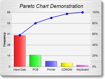
This example demonstrates the pareto chart style.
A pareto chart is a bar chart with the data sorted in descending order, together with a line chart showing the same data in accumulated form. In the current example, the data is shown as both percentages and values on the two y-axes.
The chart in this example is composed of two layers - a
BarLayer created using
XYChart.addBarLayer, and a
LineLayer created using
XYChart.addLineLayer.
This example employs the
ArrayMath utility class for computing the accumulated line, obtaining the scaling factor between the two y-axes, and re-scaling the line data as percentages.
The two y-axes are synchronized using
Axis.syncAxis.
[Web Version (in ASP)] aspdemo\pareto.asp
<%@ language="vbscript" %>
<%
Set cd = CreateObject("ChartDirector.API")

' The data for the chart
data = Array(40, 15, 7, 5, 2)

' The labels for the chart
labels = Array("Hard Disk", "PCB", "Printer", "CDROM", "Keyboard")

' In the pareto chart, the line data are just the accumulation of the raw data, scaled to a range of
' 0 - 100%
Set lineData = cd.ArrayMath(data)
Call lineData.acc()
scaleFactor = lineData.max() / 100
If scaleFactor = 0 Then
    ' Avoid division by zero error for zero data
    scaleFactor = 1
End If
Call lineData.div2(scaleFactor)

' Create a XYChart object of size 480 x 300 pixels. Set background color to brushed silver, with a
' grey (bbbbbb) border and 2 pixel 3D raised effect. Use rounded corners. Enable soft drop shadow.
Set c = cd.XYChart(400, 300, cd.brushedSilverColor(), &Hbbbbbb, 2)
Call c.setRoundedFrame()
Call c.setDropShadow()

' Add a title to the chart using 15 points Arial Italic. Set top/bottom margins to 12 pixels.
Set title = c.addTitle("Pareto Chart Demonstration", "Arial Italic", 15)
Call title.setMargin2(0, 0, 12, 12)

' Tentatively set the plotarea at (50, 40). Set the width to 100 pixels less than the chart width,
' and the height to 80 pixels less than the chart height. Use pale grey (f4f4f4) background,
' transparent border, and dark grey (444444) dotted grid lines.
Call c.setPlotArea(50, 40, c.getWidth() - 100, c.getHeight() - 80, &Hf4f4f4, -1, cd.Transparent, _
    c.dashLineColor(&H444444, cd.DotLine))

' Add a line layer for the pareto line
Set lineLayer = c.addLineLayer2()

' Add the pareto line using deep blue (0000ff) as the color, with circle symbols
Call lineLayer.addDataSet(lineData.result(), &H0000ff).setDataSymbol(cd.CircleShape, 9, &H0000ff, _
    &H0000ff)

' Set the line width to 2 pixel
Call lineLayer.setLineWidth(2)

' Bind the line layer to the secondary (right) y-axis.
Call lineLayer.setUseYAxis2()

' Tool tip for the line layer
Call lineLayer.setHTMLImageMap("", "", "title='Top {={x}+1} items: {value|2}%'")

' Add a multi-color bar layer using the given data.
Set barLayer = c.addBarLayer3(data)

' Set soft lighting for the bars with light direction from the right
Call barLayer.setBorderColor(cd.Transparent, cd.softLighting(cd.Right))

' Tool tip for the bar layer
Call barLayer.setHTMLImageMap("", "", "title='{xLabel}: {value} pieces'")

' Set the labels on the x axis.
Call c.xAxis().setLabels(labels)

' Set the secondary (right) y-axis scale as 0 - 100 with a tick every 20 units
Call c.yAxis2().setLinearScale(0, 100, 20)

' Set the format of the secondary (right) y-axis label to include a percentage sign
Call c.yAxis2().setLabelFormat("{value}%")

' Set the relationship between the two y-axes, which only differ by a scaling factor
Call c.yAxis().syncAxis(c.yAxis2(), scaleFactor)

' Set the format of the primary y-axis label foramt to show no decimal point
Call c.yAxis().setLabelFormat("{value|0}")

' Add a title to the primary y-axis
Call c.yAxis().setTitle("Frequency")

' Set all axes to transparent
Call c.xAxis().setColors(cd.Transparent)
Call c.yAxis().setColors(cd.Transparent)
Call c.yAxis2().setColors(cd.Transparent)

' Adjust the plot area size, such that the bounding box (inclusive of axes) is 10 pixels from the
' left edge, just below the title, 10 pixels from the right edge, and 20 pixels from the bottom
' edge.
Call c.packPlotArea(10, title.getHeight(), c.getWidth() - 10, c.getHeight() - 20)

' Output the chart
Set viewer = cd.WebChartViewer(Request, "chart1")
Call viewer.setChart(c, cd.SVG)

' Include tool tip for the chart
viewer.ImageMap = c.getHTMLImageMap("")
%>

<!DOCTYPE html>
<html>
<head>
    <title>Pareto Chart</title>
    <!-- Include ChartDirector Javascript Library to support chart interactions -->
    <script type="text/javascript" src="cdjcv.js"></script>
</head>
<body style="margin:5px 0px 0px 5px">
    <div style="font:bold 18pt verdana;">
        Pareto Chart
    </div>
    <hr style="border:solid 1px #000080; background:#000080" />
    <div style="font:10pt verdana; margin-bottom:1.5em">
        <a href="viewsource.asp?file=<%= Request("SCRIPT_NAME") %>">View Chart Source Code</a>
    </div>
    <!-- ****** Here is the chart image ****** -->
    <%= viewer.renderHTML() %>
</body>
</html>
[Windows Version (in Visual Basic)] vbdemo\pareto.cls
Public Sub createChart(viewer As Object, chartIndex As Integer)

    Dim cd As New ChartDirector.API

    ' The data for the chart
    Dim data()
    data = Array(40, 15, 7, 5, 2)

    ' The labels for the chart
    Dim labels()
    labels = Array("Hard Disk", "PCB", "Printer", "CDROM", "Keyboard")

    ' In the pareto chart, the line data are just the accumulation of the raw data, scaled to a
    ' range of 0 - 100%
    Dim lineData As ArrayMath
    Set lineData = cd.ArrayMath(data)
    Call lineData.acc()
    Dim scaleFactor As Double
    scaleFactor = lineData.max() / 100
    If scaleFactor = 0 Then
        ' Avoid division by zero error for zero data
        scaleFactor = 1
    End If
    Call lineData.div2(scaleFactor)

    ' Create a XYChart object of size 480 x 300 pixels. Set background color to brushed silver, with
    ' a grey (bbbbbb) border and 2 pixel 3D raised effect. Use rounded corners. Enable soft drop
    ' shadow.
    Dim c As XYChart
    Set c = cd.XYChart(400, 300, cd.brushedSilverColor(), &Hbbbbbb, 2)
    Call c.setRoundedFrame()
    Call c.setDropShadow()

    ' Add a title to the chart using 15 points Arial Italic. Set top/bottom margins to 12 pixels.
    Dim title As ChartDirector.TextBox
    Set title = c.addTitle("Pareto Chart Demonstration", "ariali.ttf", 15)
    Call title.setMargin2(0, 0, 12, 12)

    ' Tentatively set the plotarea at (50, 40). Set the width to 100 pixels less than the chart
    ' width, and the height to 80 pixels less than the chart height. Use pale grey (f4f4f4)
    ' background, transparent border, and dark grey (444444) dotted grid lines.
    Call c.setPlotArea(50, 40, c.getWidth() - 100, c.getHeight() - 80, &Hf4f4f4, -1, _
        cd.Transparent, c.dashLineColor(&H444444, cd.DotLine))

    ' Add a line layer for the pareto line
    Dim lineLayer As LineLayer
    Set lineLayer = c.addLineLayer2()

    ' Add the pareto line using deep blue (0000ff) as the color, with circle symbols
    Call lineLayer.addDataSet(lineData.result(), &H0000ff).setDataSymbol(cd.CircleShape, 9, _
        &H0000ff, &H0000ff)

    ' Set the line width to 2 pixel
    Call lineLayer.setLineWidth(2)

    ' Bind the line layer to the secondary (right) y-axis.
    Call lineLayer.setUseYAxis2()

    ' Tool tip for the line layer
    Call lineLayer.setHTMLImageMap("", "", "title='Top {={x}+1} items: {value|2}%'")

    ' Add a multi-color bar layer using the given data.
    Dim barLayer As BarLayer
    Set barLayer = c.addBarLayer3(data)

    ' Set soft lighting for the bars with light direction from the right
    Call barLayer.setBorderColor(cd.Transparent, cd.softLighting(cd.Right))

    ' Tool tip for the bar layer
    Call barLayer.setHTMLImageMap("", "", "title='{xLabel}: {value} pieces'")

    ' Set the labels on the x axis.
    Call c.xAxis().setLabels(labels)

    ' Set the secondary (right) y-axis scale as 0 - 100 with a tick every 20 units
    Call c.yAxis2().setLinearScale(0, 100, 20)

    ' Set the format of the secondary (right) y-axis label to include a percentage sign
    Call c.yAxis2().setLabelFormat("{value}%")

    ' Set the relationship between the two y-axes, which only differ by a scaling factor
    Call c.yAxis().syncAxis(c.yAxis2(), scaleFactor)

    ' Set the format of the primary y-axis label foramt to show no decimal point
    Call c.yAxis().setLabelFormat("{value|0}")

    ' Add a title to the primary y-axis
    Call c.yAxis().setTitle("Frequency")

    ' Set all axes to transparent
    Call c.xAxis().setColors(cd.Transparent)
    Call c.yAxis().setColors(cd.Transparent)
    Call c.yAxis2().setColors(cd.Transparent)

    ' Adjust the plot area size, such that the bounding box (inclusive of axes) is 10 pixels from
    ' the left edge, just below the title, 10 pixels from the right edge, and 20 pixels from the
    ' bottom edge.
    Call c.packPlotArea(10, title.getHeight(), c.getWidth() - 10, c.getHeight() - 20)

    ' Output the chart
    Set viewer.Picture = c.makePicture()

    ' Include tool tip for the chart
    viewer.ImageMap = c.getHTMLImageMap("clickable")

End Sub
© 2021 Advanced Software Engineering Limited. All rights reserved.