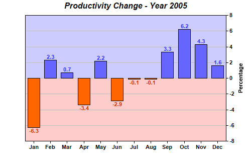
This example demonstrates a bar chart containing positive and negative data, represented by different colors.
In this example, the two colors of the plot area background are configured using background zones, while the bar colors are configured by splitting the bars into two layers.
[Web Version (in ASP)] aspdemo\posnegbar.asp
<%@ language="vbscript" %>
<%
Set cd = CreateObject("ChartDirector.API")

' The data for the bar chart
data = Array(-6.3, 2.3, 0.7, -3.4, 2.2, -2.9, -0.1, -0.1, 3.3, 6.2, 4.3, 1.6)

' The labels for the bar chart
labels = Array("Jan", "Feb", "Mar", "Apr", "May", "Jun", "Jul", "Aug", "Sep", "Oct", "Nov", "Dec")

' Create a XYChart object of size 500 x 320 pixels
Set c = cd.XYChart(500, 320)

' Add a title to the chart using Arial Bold Italic font
Call c.addTitle("Productivity Change - Year 2005", "Arial Bold Italic")

' Set the plotarea at (50, 30) and of size 400 x 250 pixels
Call c.setPlotArea(50, 30, 400, 250)

' Add a bar layer to the chart using the Overlay data combine method
Set layer = c.addBarLayer2(cd.Overlay)

' Select positive data and add it as data set with blue (6666ff) color
Call layer.addDataSet(cd.ArrayMath(data).selectGEZ(Empty, cd.NoValue).result(), &H6666ff)

' Select negative data and add it as data set with orange (ff6600) color
Call layer.addDataSet(cd.ArrayMath(data).selectLTZ(Empty, cd.NoValue).result(), &Hff6600)

' Add labels to the top of the bar using 8 pt Arial Bold font. The font color is configured to be
' red (0xcc3300) below zero, and blue (0x3333ff) above zero.
Call layer.setAggregateLabelStyle("Arial Bold", 8, layer.yZoneColor(0, &Hcc3300, &H3333ff))

' Set the labels on the x axis and use Arial Bold as the label font
Call c.xAxis().setLabels(labels).setFontStyle("Arial Bold")

' Draw the y axis on the right of the plot area
Call c.setYAxisOnRight(True)

' Use Arial Bold as the y axis label font
Call c.yAxis().setLabelStyle("Arial Bold")

' Add a title to the y axis
Call c.yAxis().setTitle("Percentage")

' Add a light blue (0xccccff) zone for positive part of the plot area
Call c.yAxis().addZone(0, 9999, &Hccccff)

' Add a pink (0xffffcc) zone for negative part of the plot area
Call c.yAxis().addZone(-9999, 0, &Hffcccc)

' Output the chart
Set viewer = cd.WebChartViewer(Request, "chart1")
Call viewer.setChart(c, cd.SVG)

' Include tool tip for the chart
viewer.ImageMap = c.getHTMLImageMap("", "", "title='{xLabel}: {value}%'")
%>

<!DOCTYPE html>
<html>
<head>
    <title>Positive Negative Bars</title>
    <!-- Include ChartDirector Javascript Library to support chart interactions -->
    <script type="text/javascript" src="cdjcv.js"></script>
</head>
<body style="margin:5px 0px 0px 5px">
    <div style="font:bold 18pt verdana;">
        Positive Negative Bars
    </div>
    <hr style="border:solid 1px #000080; background:#000080" />
    <div style="font:10pt verdana; margin-bottom:1.5em">
        <a href="viewsource.asp?file=<%= Request("SCRIPT_NAME") %>">View Chart Source Code</a>
    </div>
    <!-- ****** Here is the chart image ****** -->
    <%= viewer.renderHTML() %>
</body>
</html>
[Windows Version (in Visual Basic)] vbdemo\posnegbar.cls
Public Sub createChart(viewer As Object, chartIndex As Integer)

    Dim cd As New ChartDirector.API

    ' The data for the bar chart
    Dim data()
    data = Array(-6.3, 2.3, 0.7, -3.4, 2.2, -2.9, -0.1, -0.1, 3.3, 6.2, 4.3, 1.6)

    ' The labels for the bar chart
    Dim labels()
    labels = Array("Jan", "Feb", "Mar", "Apr", "May", "Jun", "Jul", "Aug", "Sep", "Oct", "Nov", _
        "Dec")

    ' Create a XYChart object of size 500 x 320 pixels
    Dim c As XYChart
    Set c = cd.XYChart(500, 320)

    ' Add a title to the chart using Arial Bold Italic font
    Call c.addTitle("Productivity Change - Year 2005", "arialbi.ttf")

    ' Set the plotarea at (50, 30) and of size 400 x 250 pixels
    Call c.setPlotArea(50, 30, 400, 250)

    ' Add a bar layer to the chart using the Overlay data combine method
    Dim layer As BarLayer
    Set layer = c.addBarLayer2(cd.Overlay)

    ' Select positive data and add it as data set with blue (6666ff) color
    Call layer.addDataSet(cd.ArrayMath(data).selectGEZ(Empty, cd.NoValue).result(), &H6666ff)

    ' Select negative data and add it as data set with orange (ff6600) color
    Call layer.addDataSet(cd.ArrayMath(data).selectLTZ(Empty, cd.NoValue).result(), &Hff6600)

    ' Add labels to the top of the bar using 8 pt Arial Bold font. The font color is configured to
    ' be red (0xcc3300) below zero, and blue (0x3333ff) above zero.
    Call layer.setAggregateLabelStyle("arialbd.ttf", 8, layer.yZoneColor(0, &Hcc3300, &H3333ff))

    ' Set the labels on the x axis and use Arial Bold as the label font
    Call c.xAxis().setLabels(labels).setFontStyle("arialbd.ttf")

    ' Draw the y axis on the right of the plot area
    Call c.setYAxisOnRight(True)

    ' Use Arial Bold as the y axis label font
    Call c.yAxis().setLabelStyle("arialbd.ttf")

    ' Add a title to the y axis
    Call c.yAxis().setTitle("Percentage")

    ' Add a light blue (0xccccff) zone for positive part of the plot area
    Call c.yAxis().addZone(0, 9999, &Hccccff)

    ' Add a pink (0xffffcc) zone for negative part of the plot area
    Call c.yAxis().addZone(-9999, 0, &Hffcccc)

    ' Output the chart
    Set viewer.Picture = c.makePicture()

    'include tool tip for the chart
    viewer.ImageMap = c.getHTMLImageMap("clickable", "", "title='{xLabel}: {value}%'")

End Sub
© 2021 Advanced Software Engineering Limited. All rights reserved.