[Web Version (in ASP)] aspdemo\splineline.asp
<%@ language="vbscript" %>
<%
Set cd = CreateObject("ChartDirector.API")
' The data for the chart
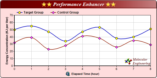
data0 = Array(32, 39, 23, 28, 41, 38, 26, 35, 29)
data1 = Array(50, 55, 47, 34, 47, 53, 38, 40, 51)
' The labels for the chart
labels = Array("0", "1", "2", "3", "4", "5", "6", "7", "8")
' Create a XYChart object of size 600 x 300 pixels, with a pale red (ffdddd) background, black
' border, 1 pixel 3D border effect and rounded corners.
Set c = cd.XYChart(600, 300, &Hffdddd, &H000000, 1)
Call c.setRoundedFrame()
' Set default directory for loading images from current script directory
Call c.setSearchPath(Server.MapPath("."))
' Set the plotarea at (55, 58) and of size 520 x 195 pixels, with white (ffffff) background. Set
' horizontal and vertical grid lines to grey (cccccc).
Call c.setPlotArea(55, 58, 520, 195, &Hffffff, -1, -1, &Hcccccc, &Hcccccc)
' Add a legend box at (55, 32) (top of the chart) with horizontal layout. Use 9pt Arial Bold font.
' Set the background and border color to Transparent.
Call c.addLegend(55, 32, False, "Arial Bold", 9).setBackground(cd.Transparent)
' Add a title box to the chart using 15pt Times Bold Italic font. The title is in CDML and includes
' embedded images for highlight. The text is white (ffffff) on a dark red (880000) background, with
' soft lighting effect from the right side.
Call c.addTitle( _
"<*block,valign=absmiddle*><*img=star.png*><*img=star.png*> Performance Enhancer " & _
"<*img=star.png*><*img=star.png*><*/*>", "Times New Roman Bold Italic", 15, &Hffffff _
).setBackground(&H880000, -1, cd.softLighting(cd.Right))
' Add a title to the y axis
Call c.yAxis().setTitle("Energy Concentration (KJ per liter)")
' Set the labels on the x axis
Call c.xAxis().setLabels(labels)
' Add a title to the x axis using CMDL
Call c.xAxis().setTitle("<*block,valign=absmiddle*><*img=clock.png*> Elapsed Time (hour)<*/*>")
' Set the axes width to 2 pixels
Call c.xAxis().setWidth(2)
Call c.yAxis().setWidth(2)
' Add a spline layer to the chart
Set layer = c.addSplineLayer()
' Set the default line width to 2 pixels
Call layer.setLineWidth(2)
' Add a data set to the spline layer, using blue (0000c0) as the line color, with yellow (ffff00)
' circle symbols.
Call layer.addDataSet(data1, &H0000c0, "Target Group").setDataSymbol(cd.CircleSymbol, 9, &Hffff00)
' Add a data set to the spline layer, using brown (982810) as the line color, with pink (f040f0)
' diamond symbols.
Call layer.addDataSet(data0, &H982810, "Control Group").setDataSymbol(cd.DiamondSymbol, 11, _
&Hf040f0)
' Add a custom CDML text at the bottom right of the plot area as the logo
Call c.addText(575, 250, _
"<*block,valign=absmiddle*><*img=small_molecule.png*> <*block*><*font=Times New Roman Bold " & _
"Italic,size=10,color=804040*>Molecular<*br*>Engineering<*/*>").setAlignment(cd.BottomRight)
' Output the chart
Set viewer = cd.WebChartViewer(Request, "chart1")
Call viewer.setChart(c, cd.SVG)
' Include tool tip for the chart
viewer.ImageMap = c.getHTMLImageMap("", "", _
"title='{dataSetName} at t = {xLabel} hour: {value} KJ/liter'")
%>
<!DOCTYPE html>
<html>
<head>
<title>Spline Line Chart</title>
<!-- Include ChartDirector Javascript Library to support chart interactions -->
<script type="text/javascript" src="cdjcv.js"></script>
</head>
<body style="margin:5px 0px 0px 5px">
<div style="font:bold 18pt verdana;">
Spline Line Chart
</div>
<hr style="border:solid 1px #000080; background:#000080" />
<div style="font:10pt verdana; margin-bottom:1.5em">
<a href="viewsource.asp?file=<%= Request("SCRIPT_NAME") %>">View Chart Source Code</a>
</div>
<!-- ****** Here is the chart image ****** -->
<%= viewer.renderHTML() %>
</body>
</html>
[Windows Version (in Visual Basic)] vbdemo\splineline.cls
Public Sub createChart(viewer As Object, chartIndex As Integer)

    Dim cd As New ChartDirector.API

    ' The data for the chart
    Dim data0()
    data0 = Array(32, 39, 23, 28, 41, 38, 26, 35, 29)
    Dim data1()
    data1 = Array(50, 55, 47, 34, 47, 53, 38, 40, 51)

    ' The labels for the chart
    Dim labels()
    labels = Array("0", "1", "2", "3", "4", "5", "6", "7", "8")

    ' Create a XYChart object of size 600 x 300 pixels, with a pale red (ffdddd) background, black
    ' border, 1 pixel 3D border effect and rounded corners.
    Dim c As XYChart
    Set c = cd.XYChart(600, 300, &Hffdddd, &H000000, 1)
    Call c.setRoundedFrame()

    ' Set the plotarea at (55, 58) and of size 520 x 195 pixels, with white (ffffff) background. Set
    ' horizontal and vertical grid lines to grey (cccccc).
    Call c.setPlotArea(55, 58, 520, 195, &Hffffff, -1, -1, &Hcccccc, &Hcccccc)

    ' Add a legend box at (55, 32) (top of the chart) with horizontal layout. Use 9pt Arial Bold
    ' font. Set the background and border color to Transparent.
    Call c.addLegend(55, 32, False, "arialbd.ttf", 9).setBackground(cd.Transparent)

    ' Add a title box to the chart using 15pt Times Bold Italic font. The title is in CDML and
    ' includes embedded images for highlight. The text is white (ffffff) on a dark red (880000)
    ' background, with soft lighting effect from the right side.
    Call c.addTitle( _
        "<*block,valign=absmiddle*><*img=star.png*><*img=star.png*> Performance Enhancer " & _
        "<*img=star.png*><*img=star.png*><*/*>", "timesbi.ttf", 15, &Hffffff).setBackground( _
        &H880000, -1, cd.softLighting(cd.Right))

    ' Add a title to the y axis
    Call c.yAxis().setTitle("Energy Concentration (KJ per liter)")

    ' Set the labels on the x axis
    Call c.xAxis().setLabels(labels)

    ' Add a title to the x axis using CMDL
    Call c.xAxis().setTitle( _
        "<*block,valign=absmiddle*><*img=clock.png*>  Elapsed Time (hour)<*/*>")

    ' Set the axes width to 2 pixels
    Call c.xAxis().setWidth(2)
    Call c.yAxis().setWidth(2)

    ' Add a spline layer to the chart
    Dim layer As SplineLayer
    Set layer = c.addSplineLayer()

    ' Set the default line width to 2 pixels
    Call layer.setLineWidth(2)

    ' Add a data set to the spline layer, using blue (0000c0) as the line color, with yellow
    ' (ffff00) circle symbols.
    Call layer.addDataSet(data1, &H0000c0, "Target Group").setDataSymbol(cd.CircleSymbol, 9, _
        &Hffff00)

    ' Add a data set to the spline layer, using brown (982810) as the line color, with pink (f040f0)
    ' diamond symbols.
    Call layer.addDataSet(data0, &H982810, "Control Group").setDataSymbol(cd.DiamondSymbol, 11, _
        &Hf040f0)

    ' Add a custom CDML text at the bottom right of the plot area as the logo
    Call c.addText(575, 250, _
        "<*block,valign=absmiddle*><*img=small_molecule.png*> <*block*>" & _
        "<*font=timesbi.ttf,size=10,color=804040*>Molecular<*br*>Engineering<*/*>").setAlignment( _
        cd.BottomRight)

    ' Output the chart
    Set viewer.Picture = c.makePicture()

    'include tool tip for the chart
    viewer.ImageMap = c.getHTMLImageMap("clickable", "", _
        "title='{dataSetName} at t = {xLabel} hour: {value} KJ/liter'")

End Sub
© 2021 Advanced Software Engineering Limited. All rights reserved.