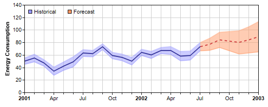
[Web Version (in ASP)] aspdemo\xzonecolor.asp
<%@ language="vbscript" %>
<%
Set cd = CreateObject("ChartDirector.API")

' The data for the chart
data = Array(50, 55, 47, 34, 42, 49, 63, 62, 73, 59, 56, 50, 64, 60, 67, 67, 58, 59, 73, 77, 84, _
    82, 80, 84, 89)

' The error data representing the error band around the data points
errData = Array(5, 6, 5.1, 6.5, 6.6, 8, 5.4, 5.1, 4.6, 5.0, 5.2, 6.0, 4.9, 5.6, 4.8, 6.2, 7.4, _
    7.1, 6.5, 9.6, 12.1, 15.3, 18.5, 20.9, 24.1)

' The timestamps for the data
labels = Array(DateSerial(2001, 1, 1), DateSerial(2001, 2, 1), DateSerial(2001, 3, 1), DateSerial( _
    2001, 4, 1), DateSerial(2001, 5, 1), DateSerial(2001, 6, 1), DateSerial(2001, 7, 1), _
    DateSerial(2001, 8, 1), DateSerial(2001, 9, 1), DateSerial(2001, 10, 1), DateSerial(2001, 11, _
    1), DateSerial(2001, 12, 1), DateSerial(2002, 1, 1), DateSerial(2002, 2, 1), DateSerial(2002, _
    3, 1), DateSerial(2002, 4, 1), DateSerial(2002, 5, 1), DateSerial(2002, 6, 1), DateSerial( _
    2002, 7, 1), DateSerial(2002, 8, 1), DateSerial(2002, 9, 1), DateSerial(2002, 10, 1), _
    DateSerial(2002, 11, 1), DateSerial(2002, 12, 1), DateSerial(2003, 1, 1))

' Create a XYChart object of size 550 x 220 pixels
Set c = cd.XYChart(550, 220)

' Set the plot area at (50, 10) and of size 480 x 180 pixels. Enabled both vertical and horizontal
' grids by setting their colors to light grey (cccccc)
Call c.setPlotArea(50, 10, 480, 180).setGridColor(&Hcccccc, &Hcccccc)

' Add a legend box (50, 10) (top of plot area) using horizontal layout. Use 8pt Arial font. Disable
' bounding box (set border to transparent).
Set legendBox = c.addLegend(50, 10, False, "", 8)
Call legendBox.setBackground(cd.Transparent)

' Add keys to the legend box to explain the color zones
Call legendBox.addKey("Historical", &H9999ff)
Call legendBox.addKey("Forecast", &Hff9966)

' Add a title to the y axis.
Call c.yAxis().setTitle("Energy Consumption")

' Set the labels on the x axis
Call c.xAxis().setLabels2(labels)

' Set multi-style axis label formatting. Use Arial Bold font for yearly labels and display them as
' "yyyy". Use default font for monthly labels and display them as "mmm". Replace some labels with
' minor ticks to ensure the labels are at least 3 units apart.
Call c.xAxis().setMultiFormat(cd.StartOfYearFilter(), "<*font=Arial Bold*>{value|yyyy}", _
    cd.StartOfMonthFilter(), "{value|mmm}", 3)

' Add a line layer to the chart
Set layer = c.addLineLayer2()

' Create the color to draw the data line. The line is blue (0x333399) to the left of x = 18, and
' become a red (0xd04040) dash line to the right of x = 18.
lineColor = layer.xZoneColor(18, &H333399, c.dashLineColor(&Hd04040, cd.DashLine))

' Add the data line
Call layer.addDataSet(data, lineColor, "Average")

' We are not showing the data set name in the legend box. The name is for showing in tool tips only.
Call layer.setLegend(cd.NoLegend)

' Create the color to draw the err zone. The color is semi-transparent blue (0x809999ff) to the left
' of x = 18, and become semi-transparent red (0x80ff9966) to the right of x = 18.
errColor = layer.xZoneColor(18, &H809999ff, &H80ff9966)

' Add the upper border of the err zone
Call layer.addDataSet(cd.ArrayMath(data).add(errData).result(), errColor, "Upper bound")

' Add the lower border of the err zone
Call layer.addDataSet(cd.ArrayMath(data).subtract(errData).result(), errColor, "Lower bound")

' Set the default line width to 2 pixels
Call layer.setLineWidth(2)

' In this example, we are not showing the data set name in the legend box
Call layer.setLegend(cd.NoLegend)

' Color the region between the err zone lines
Call c.addInterLineLayer(layer.getLine(1), layer.getLine(2), errColor)

' Output the chart
Set viewer = cd.WebChartViewer(Request, "chart1")
Call viewer.setChart(c, cd.SVG)

' Include tool tip for the chart.
viewer.ImageMap = c.getHTMLImageMap("", "", _
    "title='{dataSetName} on {xLabel|mmm yyyy}: {value} MJoule'")
%>

<!DOCTYPE html>
<html>
<head>
    <title>X Zone Coloring</title>
    <!-- Include ChartDirector Javascript Library to support chart interactions -->
    <script type="text/javascript" src="cdjcv.js"></script>
</head>
<body style="margin:5px 0px 0px 5px">
    <div style="font:bold 18pt verdana;">
        X Zone Coloring
    </div>
    <hr style="border:solid 1px #000080; background:#000080" />
    <div style="font:10pt verdana; margin-bottom:1.5em">
        <a href="viewsource.asp?file=<%= Request("SCRIPT_NAME") %>">View Chart Source Code</a>
    </div>
    <!-- ****** Here is the chart image ****** -->
    <%= viewer.renderHTML() %>
</body>
</html>
[Windows Version (in Visual Basic)] vbdemo\xzonecolor.cls
Public Sub createChart(viewer As Object, chartIndex As Integer)

    Dim cd As New ChartDirector.API

    ' The data for the chart
    Dim data()
    data = Array(50, 55, 47, 34, 42, 49, 63, 62, 73, 59, 56, 50, 64, 60, 67, 67, 58, 59, 73, 77, _
        84, 82, 80, 84, 89)

    ' The error data representing the error band around the data points
    Dim errData()
    errData = Array(5, 6, 5.1, 6.5, 6.6, 8, 5.4, 5.1, 4.6, 5.0, 5.2, 6.0, 4.9, 5.6, 4.8, 6.2, 7.4, _
        7.1, 6.5, 9.6, 12.1, 15.3, 18.5, 20.9, 24.1)

    ' The timestamps for the data
    Dim labels()
    labels = Array(DateSerial(2001, 1, 1), DateSerial(2001, 2, 1), DateSerial(2001, 3, 1), _
        DateSerial(2001, 4, 1), DateSerial(2001, 5, 1), DateSerial(2001, 6, 1), DateSerial(2001, _
        7, 1), DateSerial(2001, 8, 1), DateSerial(2001, 9, 1), DateSerial(2001, 10, 1), _
        DateSerial(2001, 11, 1), DateSerial(2001, 12, 1), DateSerial(2002, 1, 1), DateSerial(2002, _
        2, 1), DateSerial(2002, 3, 1), DateSerial(2002, 4, 1), DateSerial(2002, 5, 1), DateSerial( _
        2002, 6, 1), DateSerial(2002, 7, 1), DateSerial(2002, 8, 1), DateSerial(2002, 9, 1), _
        DateSerial(2002, 10, 1), DateSerial(2002, 11, 1), DateSerial(2002, 12, 1), DateSerial( _
        2003, 1, 1))

    ' Create a XYChart object of size 550 x 220 pixels
    Dim c As XYChart
    Set c = cd.XYChart(550, 220)

    ' Set the plot area at (50, 10) and of size 480 x 180 pixels. Enabled both vertical and
    ' horizontal grids by setting their colors to light grey (cccccc)
    Call c.setPlotArea(50, 10, 480, 180).setGridColor(&Hcccccc, &Hcccccc)

    ' Add a legend box (50, 10) (top of plot area) using horizontal layout. Use 8pt Arial font.
    ' Disable bounding box (set border to transparent).
    Dim legendBox As LegendBox
    Set legendBox = c.addLegend(50, 10, False, "", 8)
    Call legendBox.setBackground(cd.Transparent)

    ' Add keys to the legend box to explain the color zones
    Call legendBox.addKey("Historical", &H9999ff)
    Call legendBox.addKey("Forecast", &Hff9966)

    ' Add a title to the y axis.
    Call c.yAxis().setTitle("Energy Consumption")

    ' Set the labels on the x axis
    Call c.xAxis().setLabels2(labels)

    ' Set multi-style axis label formatting. Use Arial Bold font for yearly labels and display them
    ' as "yyyy". Use default font for monthly labels and display them as "mmm". Replace some labels
    ' with minor ticks to ensure the labels are at least 3 units apart.
    Call c.xAxis().setMultiFormat(cd.StartOfYearFilter(), "<*font=arialbd.ttf*>{value|yyyy}", _
        cd.StartOfMonthFilter(), "{value|mmm}", 3)

    ' Add a line layer to the chart
    Dim layer As LineLayer
    Set layer = c.addLineLayer2()

    ' Create the color to draw the data line. The line is blue (0x333399) to the left of x = 18, and
    ' become a red (0xd04040) dash line to the right of x = 18.
    Dim lineColor As Long
    lineColor = layer.xZoneColor(18, &H333399, c.dashLineColor(&Hd04040, cd.DashLine))

    ' Add the data line
    Call layer.addDataSet(data, lineColor, "Average")

    ' We are not showing the data set name in the legend box. The name is for showing in tool tips
    ' only.
    Call layer.setLegend(cd.NoLegend)

    ' Create the color to draw the err zone. The color is semi-transparent blue (0x809999ff) to the
    ' left of x = 18, and become semi-transparent red (0x80ff9966) to the right of x = 18.
    Dim errColor As Long
    errColor = layer.xZoneColor(18, &H809999ff, &H80ff9966)

    ' Add the upper border of the err zone
    Call layer.addDataSet(cd.ArrayMath(data).add(errData).result(), errColor, "Upper bound")

    ' Add the lower border of the err zone
    Call layer.addDataSet(cd.ArrayMath(data).subtract(errData).result(), errColor, "Lower bound")

    ' Set the default line width to 2 pixels
    Call layer.setLineWidth(2)

    ' In this example, we are not showing the data set name in the legend box
    Call layer.setLegend(cd.NoLegend)

    ' Color the region between the err zone lines
    Call c.addInterLineLayer(layer.getLine(1), layer.getLine(2), errColor)

    ' Output the chart
    Set viewer.Picture = c.makePicture()

    ' Include tool tip for the chart.
    viewer.ImageMap = c.getHTMLImageMap("clickable", "", _
        "title='{dataSetName} on {xLabel|mmm yyyy}: {value} MJoule'")

End Sub
© 2021 Advanced Software Engineering Limited. All rights reserved.