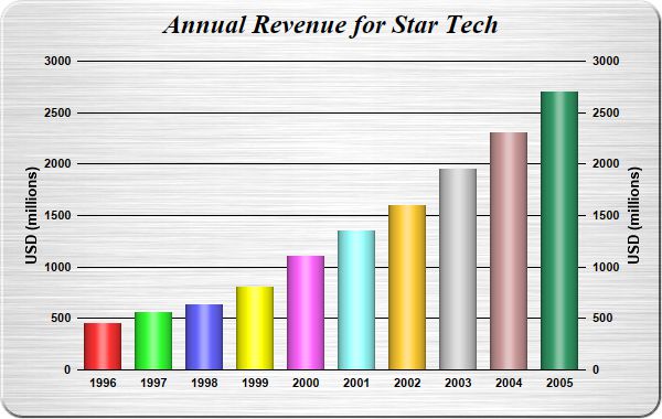
This example demonstrates using cylinder shading effect for bars. It also demonstrates brushed metal background, rounded frame, and axis labels on both sides of the plot area.
pythondemo\cylinderlightbar.py
#!/usr/bin/python

# The ChartDirector for Python module is assumed to be in "../lib"
import sys, os
sys.path.insert(0, os.path.join(os.path.abspath(sys.path[0]), "..", "lib"))

from pychartdir import *

# The data for the bar chart
data = [450, 560, 630, 800, 1100, 1350, 1600, 1950, 2300, 2700]

# The labels for the bar chart
labels = ["1996", "1997", "1998", "1999", "2000", "2001", "2002", "2003", "2004", "2005"]

# Create a XYChart object of size 600 x 380 pixels. Set background color to brushed silver, with a 2
# pixel 3D border. Use rounded corners of 20 pixels radius.
c = XYChart(600, 380, brushedSilverColor(), Transparent, 2)

# Add a title to the chart using 18pt Times Bold Italic font. Set top/bottom margins to 8 pixels.
c.addTitle("Annual Revenue for Star Tech", "Times New Roman Bold Italic", 18).setMargin2(0, 0, 8, 8)

# Set the plotarea at (70, 55) and of size 460 x 280 pixels. Use transparent border and black grid
# lines. Use rounded frame with radius of 20 pixels.
c.setPlotArea(70, 55, 460, 280, -1, -1, Transparent, 0x000000)
c.setRoundedFrame(0xffffff, 20)

# Add a multi-color bar chart layer using the supplied data. Set cylinder bar shape.
c.addBarLayer3(data).setBarShape(CircleShape)

# Set the labels on the x axis.
c.xAxis().setLabels(labels)

# Show the same scale on the left and right y-axes
c.syncYAxis()

# Set the left y-axis and right y-axis title using 10pt Arial Bold font
c.yAxis().setTitle("USD (millions)", "Arial Bold", 10)
c.yAxis2().setTitle("USD (millions)", "Arial Bold", 10)

# Set y-axes to transparent
c.yAxis().setColors(Transparent)
c.yAxis2().setColors(Transparent)

# Disable ticks on the x-axis by setting the tick color to transparent
c.xAxis().setTickColor(Transparent)

# Set the label styles of all axes to 8pt Arial Bold font
c.xAxis().setLabelStyle("Arial Bold", 8)
c.yAxis().setLabelStyle("Arial Bold", 8)
c.yAxis2().setLabelStyle("Arial Bold", 8)

# Output the chart
c.makeChart("cylinderlightbar.jpg")
© 2021 Advanced Software Engineering Limited. All rights reserved.