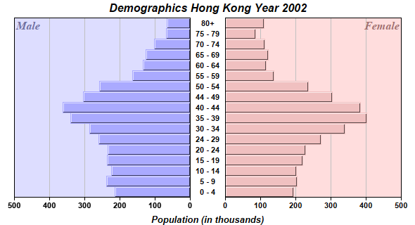
This example demonstrates combining two horizontal bar charts of opposite direction using a
MultiChart, and a number of other ChartDirector features.
- The bar charts are created as XYChart objects with Transparent backgrounds. This ensures they will not block each others when put into the MultiChart.
- The bars are configured with 3D border effects using Layer.setBorderColor.
- The bars are configured with to touch each others (no gap in between) by using BarLayer.setBarGap with the TouchBar predefined constant.
- Custom Male/Female labels are added to the internal corners of the plot areas as custom texts, using BaseChart.addText.
- Both male and female data are added to both bar charts. This technique ensures the same y-axis scale on both charts. (This example uses auto-scaling, so if the charts containing different data, the axis scales can be different.) On the right chart, the male data is configured to be Transparent, so only the female data can be seen. The opposite is done for the left chart.
- The left bar chart is configured to use a reversed y-axis (horizontal axis) that points from right to left. This is by using Axis.setReverse.
- The axis labels between the bar charts belong to the right chart. They are configured to have a width equal to the gap between the charts, with Center alignment. This is by using the TextBox object that represents the prototype of the axis labels, obtained during Axis.setLabels.
- A MultiChart object is created, and the two bar charts are added to it using MultiChart.addChart. The titles at the top and bottom of the chart belong to the MultiChart, created using BaseChart.addTitle and BaseChart.addTitle2.
pythondemo\dualhbar.py
#!/usr/bin/python

# The ChartDirector for Python module is assumed to be in "../lib"
import sys, os
sys.path.insert(0, os.path.join(os.path.abspath(sys.path[0]), "..", "lib"))

from pychartdir import *

# The age groups
labels = ["0 - 4", "5 - 9", "10 - 14", "15 - 19", "20 - 24", "24 - 29", "30 - 34", "35 - 39",
    "40 - 44", "44 - 49", "50 - 54", "55 - 59", "60 - 64", "65 - 69", "70 - 74", "75 - 79", "80+"]

# The male population (in thousands)
male = [215, 238, 225, 236, 235, 260, 286, 340, 363, 305, 259, 164, 135, 127, 102, 68, 66]

# The female population (in thousands)
female = [194, 203, 201, 220, 228, 271, 339, 401, 384, 304, 236, 137, 116, 122, 112, 85, 110]


#=============================================================
#    Draw the right bar chart
#=============================================================

# Create a XYChart object of size 320 x 300 pixels
c = XYChart(320, 300)

# Set the plotarea at (50, 0) and of size 250 x 255 pixels. Use pink (0xffdddd) as the background.
c.setPlotArea(50, 0, 250, 255, 0xffdddd)

# Add a custom text label at the top right corner of the right bar chart
c.addText(300, 0, "Female", "Times New Roman Bold Italic", 12, 0xa07070).setAlignment(TopRight)

# Add the pink (0xf0c0c0) bar chart layer using the female data
femaleLayer = c.addBarLayer(female, 0xf0c0c0)

# Swap the axis so that the bars are drawn horizontally
c.swapXY(1)

# Set the bar to touch each others
femaleLayer.setBarGap(TouchBar)

# Set the border style of the bars to 1 pixel 3D border
femaleLayer.setBorderColor(-1, 1)

# Add a Transparent line layer to the chart using the male data. As it is Transparent, only the
# female bar chart can be seen. We need to put both male and female data in both left and right
# charts, because we want auto-scaling to produce the same scale for both chart.
c.addLineLayer(male, Transparent)

# Set the y axis label font to Arial Bold
c.yAxis().setLabelStyle("Arial Bold")

# Set the labels between the two bar charts, which can be considered as the x-axis labels for the
# right chart
tb = c.xAxis().setLabels(labels)

# Use a fix width of 50 for the labels (height = automatic) with center alignment
tb.setSize(50, 0)
tb.setAlignment(Center)

# Set the label font to Arial Bold
tb.setFontStyle("Arial Bold")

# Disable ticks on the x-axis by setting the tick length to 0
c.xAxis().setTickLength(0)

#=============================================================
#    Draw the left bar chart
#=============================================================

# Create a XYChart object of size 280 x 300 pixels with a transparent background.
c2 = XYChart(280, 300, Transparent)

# Set the plotarea at (20, 0) and of size 250 x 255 pixels. Use pale blue (0xddddff) as the
# background.
c2.setPlotArea(20, 0, 250, 255, 0xddddff)

# Add a custom text label at the top left corner of the left bar chart
c2.addText(20, 0, "Male", "Times New Roman Bold Italic", 12, 0x7070a0)

# Add the pale blue (0xaaaaff) bar chart layer using the male data
maleLayer = c2.addBarLayer(male, 0xaaaaff)

# Swap the axis so that the bars are drawn horizontally
c2.swapXY(1)

# Reverse the direction of the y-axis so it runs from right to left
c2.yAxis().setReverse()

# Set the bar to touch each others
maleLayer.setBarGap(TouchBar)

# Set the border style of the bars to 1 pixel 3D border
maleLayer.setBorderColor(-1, 1)

# Add a Transparent line layer to the chart using the female data. As it is Transparent, only the
# male bar chart can be seen. We need to put both male and female data in both left and right
# charts, because we want auto-scaling to produce the same scale for both chart.
c2.addLineLayer(female, Transparent)

# Set the y axis label font to Arial Bold
c2.yAxis().setLabelStyle("Arial Bold")

#=============================================================
#    Use a MultiChart to contain both bar charts
#=============================================================

# Create a MultiChart object of size 590 x 320 pixels.
m = MultiChart(590, 320)

# Add a title to the chart using Arial Bold Italic font
m.addTitle("Demographics Hong Kong Year 2002", "Arial Bold Italic")

# Add another title at the bottom using Arial Bold Italic font
m.addTitle2(Bottom, "Population (in thousands)", "Arial Bold Italic", 10)

# Put the right chart at (270, 25)
m.addChart(270, 25, c)

# Put the left chart at (0, 25)
m.addChart(0, 25, c2)

# Output the chart
m.makeChart("dualhbar.png")
© 2021 Advanced Software Engineering Limited. All rights reserved.