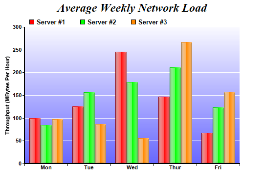
This example demonstrates a multi-bar chart with glass shading effect for bars and gradient color for plot area background.
Glass lighting is a complex shading effect that gives a look and feel of tinted glass or semi-transparent plastic material. This effect involves glare and variation of lighting caused by reflection and refraction inside the material.
pythondemo\glassmultibar.py
#!/usr/bin/python

# The ChartDirector for Python module is assumed to be in "../lib"
import sys, os
sys.path.insert(0, os.path.join(os.path.abspath(sys.path[0]), "..", "lib"))

from pychartdir import *

# The data for the bar chart
data0 = [100, 125, 245, 147, 67]
data1 = [85, 156, 179, 211, 123]
data2 = [97, 87, 56, 267, 157]
labels = ["Mon", "Tue", "Wed", "Thur", "Fri"]

# Create a XYChart object of size 540 x 375 pixels
c = XYChart(540, 375)

# Add a title to the chart using 18pt Times Bold Italic font
c.addTitle("Average Weekly Network Load", "Times New Roman Bold Italic", 18)

# Set the plotarea at (50, 55) and of 440 x 280 pixels in size. Use a vertical gradient color from
# light blue (f9f9ff) to blue (6666ff) as background. Set border and grid lines to white (ffffff).
c.setPlotArea(50, 55, 440, 280, c.linearGradientColor(0, 55, 0, 335, 0xf9f9ff, 0x6666ff), -1,
    0xffffff, 0xffffff)

# Add a legend box at (50, 28) using horizontal layout. Use 10pt Arial Bold as font, with
# transparent background.
c.addLegend(50, 28, 0, "Arial Bold", 10).setBackground(Transparent)

# Set the x axis labels
c.xAxis().setLabels(labels)

# Draw the ticks between label positions (instead of at label positions)
c.xAxis().setTickOffset(0.5)

# Set axis label style to 8pt Arial Bold
c.xAxis().setLabelStyle("Arial Bold", 8)
c.yAxis().setLabelStyle("Arial Bold", 8)

# Set axis line width to 2 pixels
c.xAxis().setWidth(2)
c.yAxis().setWidth(2)

# Add axis title
c.yAxis().setTitle("Throughput (MBytes Per Hour)")

# Add a multi-bar layer with 3 data sets
layer = c.addBarLayer2(Side)
layer.addDataSet(data0, 0xff0000, "Server #1")
layer.addDataSet(data1, 0x00ff00, "Server #2")
layer.addDataSet(data2, 0xff8800, "Server #3")

# Set bar border to transparent. Use glass lighting effect with light direction from left.
layer.setBorderColor(Transparent, glassEffect(NormalGlare, Left))

# Configure the bars within a group to touch each others (no gap)
layer.setBarGap(0.2, TouchBar)

# Output the chart
c.makeChart("glassmultibar.png")
© 2021 Advanced Software Engineering Limited. All rights reserved.