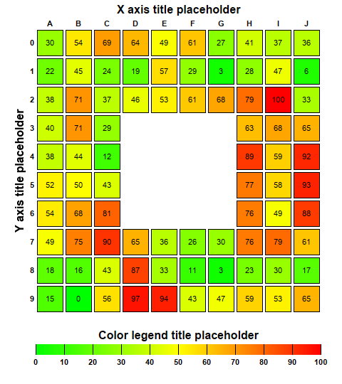
This example demonstrates adding labels to the cells, adding gaps between cells and using a custom color scale.
This example is similar to
Discrete Heat Map, with the following additions:
pythondemo\heatmapcelllabels.py
#!/usr/bin/python

# The ChartDirector for Python module is assumed to be in "../lib"
import sys, os
sys.path.insert(0, os.path.join(os.path.abspath(sys.path[0]), "..", "lib"))

from pychartdir import *

# The x-axis and y-axis labels
xLabels = ["A", "B", "C", "D", "E", "F", "G", "H", "I", "J"]
yLabels = ["0", "1", "2", "3", "4", "5", "6", "7", "8", "9"]

# Random data for the 10 x 10 cells
rand = RanSeries(2)
zData = rand.get2DSeries(len(xLabels), len(yLabels), 0, 100)

# We set the middle 5 x 5 cells to NoValue to remove them from the chart
for x in range(3, 7) :
    for y in range(3, 7) :
        zData[y * len(xLabels) + x] = NoValue

# Create an XYChart object of size 480 x 540 pixels.
c = XYChart(480, 540)

# Set the plotarea at (50, 40) and of size 400 x 400 pixels. Set the background, border, and grid
# lines to transparent.
p = c.setPlotArea(50, 40, 400, 400, -1, -1, Transparent, Transparent)

# Create a discrete heat map with 10 x 10 cells
layer = c.addDiscreteHeatMapLayer(zData, len(xLabels))

# Set the x-axis labels. Use 8pt Arial Bold font. Set axis stem to transparent, so only the labels
# are visible. Set 0.5 offset to position the labels in between the grid lines. Position the x-axis
# at the top of the chart.
c.xAxis().setLabels(xLabels)
c.xAxis().setLabelStyle("Arial Bold", 8)
c.xAxis().setColors(Transparent, TextColor)
c.xAxis().setLabelOffset(0.5)
c.xAxis().setTitle("X axis title placeholder", "Arial Bold", 12)
c.setXAxisOnTop()

# Set the y-axis labels. Use 8pt Arial Bold font. Set axis stem to transparent, so only the labels
# are visible. Set 0.5 offset to position the labels in between the grid lines. Reverse the y-axis
# so that the labels are flowing top-down instead of bottom-up.
c.yAxis().setLabels(yLabels)
c.yAxis().setLabelStyle("Arial Bold", 8)
c.yAxis().setColors(Transparent, TextColor)
c.yAxis().setLabelOffset(0.5)
c.yAxis().setTitle("Y axis title placeholder", "Arial Bold", 12)
c.yAxis().setReverse()

# Set a 3-pixel gap between cells
layer.setCellGap(3)

# Use the z value as the cell label
layer.setDataLabelFormat("{z|0}")

# Position the color axis 20 pixels below the plot area and of the width as the plot area. Put the
# labels at the bottom side of the color axis. Use 8pt Arial Bold font for the labels.
cAxis = layer.setColorAxis(p.getLeftX(), p.getBottomY() + 20, TopLeft, p.getWidth(), Bottom)
cAxis.setLabelStyle("Arial Bold", 8)
cAxis.setTitle("Color legend title placeholder", "Arial Bold", 12)

# Set the color stops and scale of the color axis
colorScale = [0, 0x00ff00, 50, 0xffff00, 80, 0xff6600, 100, 0xff0000]
cAxis.setColorScale(colorScale)
cAxis.setLinearScale(0, 100, 10)

# Output the chart
c.makeChart("heatmapcelllabels.png")
© 2021 Advanced Software Engineering Limited. All rights reserved.