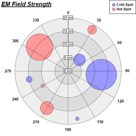
This example demonstrates how to create polar bubble charts. It also demonstrates using alternating background colors along the radial direction.
A polar bubble chart can be created as a polar line chart with circles as data symbols. The line width is set to 0, so only the symbols can be seen. The symbol sizes are then controlled using another data series. This will create the effects of a bubble chart.
The detail steps are:
Note that in this example, the polar plot area uses two alternating background colors along the radial direction. This is by using
PolarChart.setPlotAreaBg.
pythondemo\polarbubble.py
#!/usr/bin/python

# The ChartDirector for Python module is assumed to be in "../lib"
import sys, os
sys.path.insert(0, os.path.join(os.path.abspath(sys.path[0]), "..", "lib"))

from pychartdir import *

# The data for the chart
data0 = [6, 12.5, 18.2, 15]
angles0 = [45, 96, 169, 258]
size0 = [41, 105, 12, 20]

data1 = [18, 16, 11, 14]
angles1 = [30, 210, 240, 310]
size1 = [30, 45, 12, 90]

# Create a PolarChart object of size 460 x 460 pixels
c = PolarChart(460, 460)

# Add a title to the chart at the top left corner using 15pt Arial Bold Italic font
c.addTitle2(TopLeft, "<*underline=2*>EM Field Strength", "Arial Bold Italic", 15)

# Set center of plot area at (230, 240) with radius 180 pixels
c.setPlotArea(230, 240, 180)

# Use alternative light grey/dark grey circular background color
c.setPlotAreaBg(0xdddddd, 0xeeeeee)

# Set the grid style to circular grid
c.setGridStyle(0)

# Add a legend box at the top right corner of the chart using 9pt Arial Bold font
c.addLegend(459, 0, 1, "Arial Bold", 9).setAlignment(TopRight)

# Set angular axis as 0 - 360, with a spoke every 30 units
c.angularAxis().setLinearScale(0, 360, 30)

# Set the radial axis label format
c.radialAxis().setLabelFormat("{value} km")

# Add a blue (0x9999ff) line layer to the chart using (data0, angle0)
layer0 = c.addLineLayer(data0, 0x9999ff, "Cold Spot")
layer0.setAngles(angles0)

# Disable the line by setting its width to 0, so only the symbols are visible
layer0.setLineWidth(0)

# Use a circular data point symbol
layer0.setDataSymbol(CircleSymbol, 11)

# Modulate the symbol size by size0 to produce a bubble chart effect
layer0.setSymbolScale(size0)

# Add a red (0xff9999) line layer to the chart using (data1, angle1)
layer1 = c.addLineLayer(data1, 0xff9999, "Hot Spot")
layer1.setAngles(angles1)

# Disable the line by setting its width to 0, so only the symbols are visible
layer1.setLineWidth(0)

# Use a circular data point symbol
layer1.setDataSymbol(CircleSymbol, 11)

# Modulate the symbol size by size1 to produce a bubble chart effect
layer1.setSymbolScale(size1)

# Output the chart
c.makeChart("polarbubble.png")
© 2021 Advanced Software Engineering Limited. All rights reserved.